article thumbnail

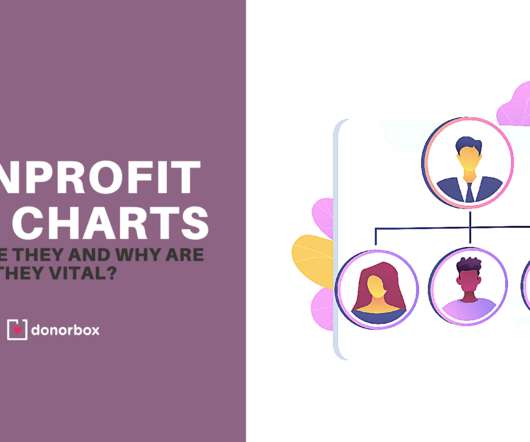
How to Make a Gift Chart to Reach Your Annual Giving Goals

NonProfit PRO

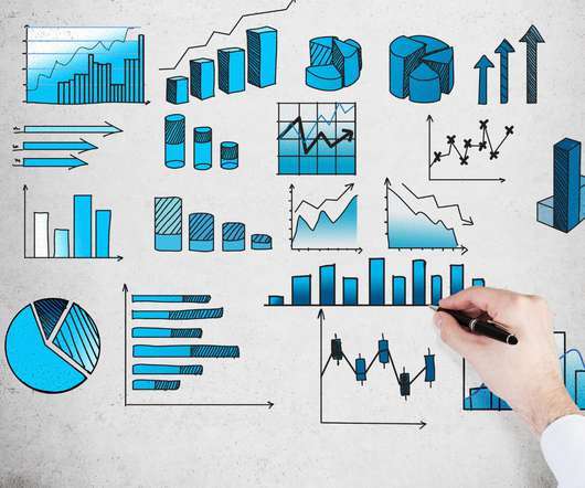
One of the most critical tools in an annual giving director’s toolkit is a gift chart. This chart should be based on accurate target ask amounts for each potential donor in your database. Follow this four-step process to create your own gift chart.

Chart 278
article thumbnail

Back to Basics: How to Set Up Your Nonprofit Chart of Accounts

Blue Fox

Introducing the Chart of Accounts (COA) Are you ready to nerd out on nonprofit accounting? Introducing the Chart of Accounts (COA) - the foundational accounting tool every nonprofit leader needs to get right for maximum financial insight and awareness. What is a Chart of Accounts? It’s just that important.

Chart 78
professionals

Sign Up for our Newsletter

This site is protected by reCAPTCHA and the Google Privacy Policy and Terms of Service apply.

article thumbnail

Topping the charts in 2022: The 10 most-read Candid blogs 

Candid

Topping the charts of most-read Candid blogs of 2022: the overhead myth. The data/crisis catch-22: How the pandemic created a social sector data gap by Cathleen Clerkin and Anna Koob of Candid. The post Topping the charts in 2022: The 10 most-read Candid blogs appeared first on Candid Blog.

Chart 98
article thumbnail

Nonprofit Org Charts: What are They and Why are They Vital?

Donorbox

A nonprofit org chart is essential when starting a nonprofit. Defining staff roles, responsibilities, and relationships with each other will make it easier to create job descriptions and hire suitable employees. The post Nonprofit Org Charts: What are They and Why are They Vital? appeared first on Nonprofit Blog.

Chart 52
article thumbnail

The data/crisis catch-22: How the pandemic created a social sector data gap  

Candid

This creates a data/crisis catch-22: While it’s important to have recent data when managing a crisis, it’s also harder to get. The chart above shows the number of 990 filings ii that Candid has for years 2017–2022. ii This chart includes 990s, 990-EZs, and 990-PFs. Unfortunately, social sector data has also been impacted.

Data 124
article thumbnail

#datanerds: Six Steps to Great Graphs and Charts

Beth's Blog: How Nonprofits Can Use Social Media

Source: Gemma Correll – I Love Charts. Note from Beth: I just knew that I was going to start obsessing about charts and graphs after my Excel spreadsheet obsessions started. I thought if I set up a tumblr blog curating great nonprofit spreadsheets , but the next logical step is create visualizations of your data.

Chart 133
article thumbnail

How Do I Say It With Charts?

Beth's Blog: How Nonprofits Can Use Social Media

Source: Juice Lab Chart Chooser. Last month, Stephanie Evergreen wrote an awesome guest post called “ Six Steps to Great Charts ” with lots of practical tips for using the Excel chart feature to visualize your social media measurement data. The six steps: Step 1: Which Chart is Best? Step 6: Annotate.

Chart 105