article thumbnail

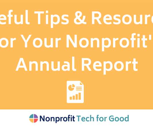
How To Write An Impactful Nonprofit Annual Report

Eric Jacobsen Blog

Consider these audience sectors when writing your report: Donors Volunteers Community leaders Future board members Supporters (in-kind) Elected officials Potential partners, grant funding entities Allow three to four months to prepare your report : Create and outline Gather an organize content Engage your management team Design Review/Proof Print Distribute (..)

Report 86
article thumbnail

Topping the charts in 2022: The 10 most-read Candid blogs 

Candid

Topping the charts of most-read Candid blogs of 2022: the overhead myth. In this blog, Jacob explains where the overhead myth comes from, what it is, and why it can be damaging for nonprofits and their ability to achieve impact. The post Topping the charts in 2022: The 10 most-read Candid blogs appeared first on Candid Blog.

Chart 98
professionals

Sign Up for our Newsletter

This site is protected by reCAPTCHA and the Google Privacy Policy and Terms of Service apply.

article thumbnail

Are You Charting Impact of Your Social Media?

Beth's Blog: How Nonprofits Can Use Social Media

What if we stepped away from the process of checking off items on our to do list, and spent a little bit of time charting impact of our nonprofit’s social media use? What if we made sure the process for identifying SMART objectives included capacity building, measurement, and reflection?

Chart 96
article thumbnail

YMCA WorkWell report charts rise of burnout amongst Canadian workers

Charity Village

YMCA WorkWell has released their Insights to Impact Report, which aims to address questions such as: How has the pandemic impacted employee well-being in our communities? The post YMCA WorkWell report charts rise of burnout amongst Canadian workers appeared first on CharityVillage. Are employees’ needs changing?

Chart 40
article thumbnail

#datanerds: Six Steps to Great Graphs and Charts

Beth's Blog: How Nonprofits Can Use Social Media

Source: Gemma Correll – I Love Charts. Note from Beth: I just knew that I was going to start obsessing about charts and graphs after my Excel spreadsheet obsessions started. What better way than in Excel. Here is how you can work with what you already own, Excel, to increase the impact of your data visualizations.

Chart 133
article thumbnail

Collaborative Grantmaking: Rethinking How to Assess Impact

sgEngage

Traditionally, we think of impact as, “For X cost, the organization will serve Y number of people in Z amount of time to create A, B, C outcomes using D, E, F strategies.” All of which combine to make impact difficult to measure and explain. Our expectations around results are powerful. Redefine Success by Solution Testing.

article thumbnail

Trends in Grantmaking: Don’t Leave Your Foundation’s Impact Story to Chance

sgEngage

If a grantmaking organization creates a funding opportunity, but there is no way for anyone to hear about it, does it make an impact? So, when it comes to communicating your impact story, many foundations need to rely on the data in their form 990 to tell their story.

Story 68