Remove Chart Remove Data Remove Map Remove Nonprofit
article thumbnail

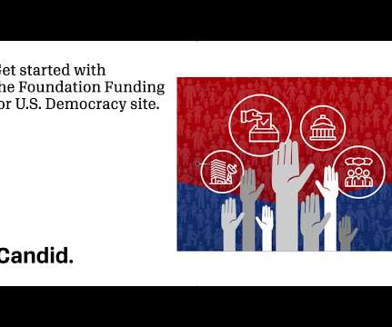
Data as Decision in Grantmaking

sgEngage

In grantmaking, one word makes more eyes glaze over than any other – data. With one shift in our understanding about data, we can reclaim a sense of wonder, creative agency, and value in our data work: Recognizing that information does not equal data and data does not equal knowledge.

Data 99
article thumbnail

Five myths and misconceptions about Candid’s grant data

Candid

In service of this, in this blog, we’re highlighting five things we’ve heard about our grants data that aren’t quite accurate. Myth 1: “Candid grants data” is the same as “990 data.” tax exempt nonprofit organizations must file various Forms 990 with the Internal Revenue Service (IRS) each year. Many of the largest U.S.

Grant 111
professionals

Sign Up for our Newsletter

This site is protected by reCAPTCHA and the Google Privacy Policy and Terms of Service apply.

article thumbnail

Information: The Better Half of IT

sgEngage

As a Database Administrator, my world revolves around helping users make sense of the information they receive, from voice-of-the-customer anecdotes and impressions to polished Key Performance Indicator (KPI) graphs, charts, and dashboards. Why pay attention to data? Data is valuable! Data fuels most activities in a nonprofit.

Chart 78
article thumbnail

Explore funding for U.S. democracy with our free data tool

Candid

You may be curious about which nonprofits are working on what initiatives, like voting access or rights, and who the funders are that support this work, along with civic participation, media access, or other democracy-related activities in the U.S. Democracy website and get started using our free data tools, please visit democracy.candid.org.

Fund 98
article thumbnail

Beyond the Pie Chart: Maps

Tech Soup

Charts and graphs are useful, but when you have any kind of location data — whether it's postal codes, state abbreviations, country names, or your own custom geocoding — you've got to see your data on a map. So demand the same informative view from your data. When to Use Maps.

Chart 36
article thumbnail

New and Improved Data Visualization Tool: Maps for Media Funding

Beth's Blog: How Nonprofits Can Use Social Media

Nonprofit data nerds will love this new resource from Media Impact Funders and Foundation Center called “ Foundation Maps for Media Funding ,” a free, interactive mapping and research tool that shows the full scope of philanthropically funded media projects worldwide since 2009. Click to See Visualization.

Map 76
article thumbnail

The Only Time You Should Use a Pie Chart for Your Nonprofit's Data

Tech Soup

We've covered bar charts, line charts, scatter plots, and maps in Beyond the Pie Chart. We finish the series by explaining the only time a pie chart actually is the right choice. When to Use a Pie Chart. As we state in our white paper, Which Chart or Graph is Right for You? Overlay pies on maps.

Chart 61