Remove Chart Remove Measure Remove Metrics Remove Report
article thumbnail

Blackbaud Discontinued Crystal Reports – Now What?

Cloud 4 Good

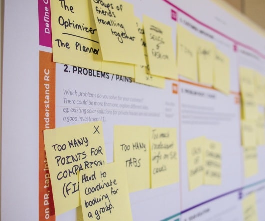
Blackbaud recently announced the end of support of a few applications hosted in their Citrix environments, including Crystal Reports (CT). While there are standard reports built in Raiser’s Edge, if you need to create custom and specialized reports, you would have previously had to use Crystal Reports for Blackbaud.

article thumbnail

How to Prepare Donor Data Reports for Your Board Members

Bloomerang

As a fundraising coordinator who prepares these reports, you work with this data every day. However, most board members aren’t familiar with various fundraising metrics and won’t be able to draw effective conclusions when they’re presented with data without an explanation of what the data shows. . Additional information to share.

Report 121
professionals

Sign Up for our Newsletter

This site is protected by reCAPTCHA and the Google Privacy Policy and Terms of Service apply.

article thumbnail

Information: The Better Half of IT

sgEngage

As a Database Administrator, my world revolves around helping users make sense of the information they receive, from voice-of-the-customer anecdotes and impressions to polished Key Performance Indicator (KPI) graphs, charts, and dashboards. How often has your organization struggled with answering, “How are we doing?” That’s okay!

Chart 80
article thumbnail

If a Metric Changes on a Spreadsheet and No One Notices, Does it Show Impact?

Amy Sample Ward

Give me an interactive map, a pivot table, even a plain old pie chart and I’m happy. Establishing regular meetings or processes for metrics review helps position us to learn from the data we’re collecting and be better positioned to identify opportunities to improve. —– I love data as much as the next person.

Metrics 158
article thumbnail

How Do I Say It With Charts?

Beth's Blog: How Nonprofits Can Use Social Media

Source: Juice Lab Chart Chooser. Last month, Stephanie Evergreen wrote an awesome guest post called “ Six Steps to Great Charts ” with lots of practical tips for using the Excel chart feature to visualize your social media measurement data. The six steps: Step 1: Which Chart is Best? Step 6: Annotate.

Chart 105
article thumbnail

How To Make Sense of Your Social Media Metrics

Beth's Blog: How Nonprofits Can Use Social Media

I’ve been facilitating a peer learning group with Packard Foundation grantees during the past year with a goal of improving measurement practice for social media and based on my book, “ Measuring the Networked Nonprofit.” On a call last month, participants shared examples of their measurement tools and spreadsheets.

article thumbnail

Nonprofit Finance Leaders: Don’t Miss These bbcon 2023 Sessions

sgEngage

From Chart Organizers to Dashboards, you’ll leave with practical ways you can automate and simplify your fund accounting. Improving Business Process with Process Maps : Is it really an improvement if you can’t measure the impact? They need information that helps them make data-driven decisions.