Remove 2011 Remove Chart Remove Data Remove Information
article thumbnail

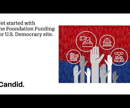
Explore funding for U.S. democracy with our free data tool

Candid

democracy-related issues from 2011 onward. The data visualization tool, which consists of a map, charts, and lists, documents foundation support across several key areas including: campaign and election processes governing institutions and processes information and media public engagement and voting . democracy.

Fund 98
article thumbnail

Bridging the Data Disconnect Between Nonprofits and Their Funders

Beth's Blog: How Nonprofits Can Use Social Media

This finding is also different from another study that looked at how nonprofits were using data conducted by NTEN and Idealware, that found that while many nonprofits were collecting data, they were not using it for decision-making and improvement. The sample in the NTEN/Idealware study is larger and broader than the CEP study.

Data 111
professionals

Sign Up for our Newsletter

This site is protected by reCAPTCHA and the Google Privacy Policy and Terms of Service apply.

article thumbnail

Research Friday: Looking Back - 2011 makes a strong case for capital

ASU Lodestar Center

As part of a continuing weekly series, each Friday we invite a nonprofit expert to highlight a research report or study and discuss how it can inform and improve day-to-day nonprofit practice. At Nonprofit Finance Fund (NFF), we use financial data every day in our work with nonprofits and their funders.

article thumbnail

New on SSIR: How does celebrity impact your fundraising?

Amy Sample Ward

The data says we should move on. Two recent reports share data about the actual role celebrity connection plays in nonprofit fundraising and both say the same thing: forget celebrities. The 2011 Millennial Donor report , the second in an annual series, focuses on engaging Millennials in fundraising.

Celebrate 201
article thumbnail

5 Good Nonprofit Infographics

sgEngage

All Blackbaud Blogs Contact Us Blackbaud.com About Nonprofit Trends Books Research Reports Speaking 5 Good Nonprofit Infographics Posted by Steve MacLaughlin on April 12th, 2011 Who doesn’t love a good infographic? Especially when they help reveal a lot of information in a visual format.

article thumbnail

Upcoming Webinar March 29: Mapping Philanthropy - Data Visualization for Good

Tech Soup

The first of these free webinars, Mapping Philanthropy: How You Can Use Data Visualization to Do Good , will be held on Thursday, March 29 at 11 a.m. As a geographer and programmer, Jake Garcia has worked on geographic information systems (GIS) projects for NASA, the U.S. Pacific time.

Map 50
article thumbnail

Great reads from around the web on June 13th

Amy Sample Ward

" 2011 donorCentrics Internet and Multichannel Giving Benchmarking Report – "Five years into the research, it is clear that direct mail giving is still the overwhelming majority of fundraising revenue, and organizations must find ways to optimize multichannel giving versus hyper-focusing on internet giving alone. ."

Web 114