Remove Analysis Remove Chart Remove Data Remove Language
article thumbnail

10 Important Features of Tableau

fusionSpan

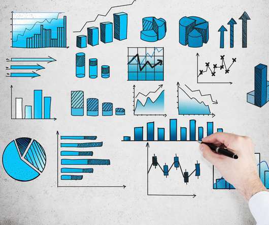
Businesses deal with a lot of data, and analyzing it in its raw form is frequently difficult. The quality and accuracy of the datasets you’re working with increase when you present them in attractive graphs, charts, shapes, and plots. Tableau is the most extensively used data visualization application.

Chart 52
article thumbnail

Recruiting Geeks for Human Rights!

Beneblog: Technology Meets Society

Scientist / Data Analysis Engineer / General Techie Want to help save the world with your code? We're Benetech's Human Rights Data Analysis Group, and we're hiring right now ! What you will do: Write computer programs for human rights data analysis projects. Process, clean, and transform data.

Analysis 150
professionals

Sign Up for our Newsletter

This site is protected by reCAPTCHA and the Google Privacy Policy and Terms of Service apply.

article thumbnail

How to Create Better Charts to Show Fundraising Results

Connection Cafe

In this post, you’ll learn from my mistakes and create better charts for your audience – to show fundraising results, organization’s impact or benchmarking. Have you seen a chart and asked yourself, “What is this? Are we guilty of creating such charts ourselves? Here’s a chart from my thesis I created about 15 years ago.

Chart 27
article thumbnail

No Sweat DIY Infographics

Beth's Blog: How Nonprofits Can Use Social Media

You don’t have to be the world’s best artist to create a respectable infographic to help you make sense of your data, but it does take a little consideration and small amount of inspiration. But the bonus was the tutorial to help you better understand and apply charts. Most are in the public domain.

Chart 130
article thumbnail

Top Lessons from GivingTuesday 2023

Neon CRM

Instead of repeating those numbers, we’ll focus on the practical “in the weeds” analysis that can support you in making data-driven decisions that go well beyond this time of year. The chart above shows that 2023 saw higher overall volumes throughout the day, with a small spike at 9:00 a.m.

Lesson 52
article thumbnail

14+ Excellent Nonprofit Annual Reports

Whole Whale

In our data culture , we suggest your nonprofit takes the time to put one together as a means of showing your organization’s transparency — and bragging about your success in the past year. In a traditional PDF, this would take 5 separate charts and even then we wouldn’t get the same effect of watching this program grow on a national level.

Report 85
article thumbnail

Nonprofit Strategic Planning: Ultimate Guide + 7 Examples

Bloomerang

A good strategic plan ensures you have charted the necessary pathways to meet (and hopefully exceed) your organization’s goals. You may begin with a SWOT (strengths, weaknesses, opportunities, threats) analysis. This statement should use precise language but non-finite verbs. What is it that you’re trying to accomplish?

Examples 122