Remove Analysis Remove Chart Remove Images Remove Interaction
article thumbnail

Beyond the Pie Chart: Maps

Tech Soup

Charts and graphs are useful, but when you have any kind of location data — whether it's postal codes, state abbreviations, country names, or your own custom geocoding — you've got to see your data on a map. Part 4 in our Beyond the Pie Chart series covers mapping. Image 1: Wes Holing. white papers.

Chart 36
article thumbnail

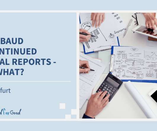
Blackbaud Discontinued Crystal Reports – Now What?

Cloud 4 Good

It is available inside your CRM as shown in the image above of Tableau CRM or as a standalone application that allows you to bring data from multiple data sources as shown in the example below. . As an advanced analytics and business intelligence tool, Tableau can help you identify patterns in your data and develop your strategy.

professionals

Sign Up for our Newsletter

This site is protected by reCAPTCHA and the Google Privacy Policy and Terms of Service apply.

article thumbnail

Beyond the Pie Chart: What Scatter Plots Can Do for You

Tech Soup

Part 3 in our Beyond the Pie Chart series digs into the wonderful world of scatter plots. These tips from Tableau's Visual Analysis Best Practices and Which Chart or Graph is Right for You? By creating this interactive scatter plot, an insurance investigator can quickly evaluate where there might be fraudulent activity.

Chart 36
article thumbnail

Data as Decision in Grantmaking

sgEngage

It can contribute to exchanges and interactions that are at the heart of nonprofit network building. Datamaking can enhance capacity building efforts through group questioning and analysis. The following image conveys what this looked like in practice for the same cultural intermediary that used the matrix tool above.

Data 96
article thumbnail

10 Important Features of Tableau

fusionSpan

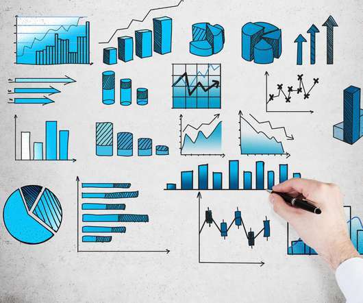
The quality and accuracy of the datasets you’re working with increase when you present them in attractive graphs, charts, shapes, and plots. Tableau Dashboards combine images, visual objects, text, and other components to present a comprehensive view of your data. Trend Lines & Predictive Analysis. Conclusion.

Chart 52
article thumbnail

14+ Excellent Nonprofit Annual Reports

Whole Whale

However, throwing a million charts and graphs together or writing a 10,000-word essay on why your nonprofit is the best isn’t going to be so effective (or worth anyone’s time). DREAM’s annual report is doing everything right: beautiful images, student stories, and (of course) thanking their donors. The annual report from 350.org

Report 85
article thumbnail

Highest Online Donations for Nonprofits in 2016

Tech Soup

These results are based on the largest analysis of charitable giving data and come from the 2016 Charitable Giving Report. Visit the Blackbaud Index to stay up to date on the latest fundraising trends and experience the recently enhanced interactive index charts. Image 1 : Farknot Architect / Shutterstock. spanhidden.