article thumbnail

Open for comment: Proposed changes to Candid’s taxonomy

Candid

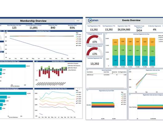
All this work would be significantly more difficult if it weren’t for Candid’s taxonomy, the Philanthropy Classification System (or PCS). A taxonomy is simply a system of classification, or a way of organizing things. This year, Candid is updating its taxonomy.

article thumbnail

A crash course on trends analysis using Candid’s Foundation 1000 data set 

Candid

One of the most common reasons people analyze Candid’s grant data is to understand year-over-year giving trends in the sector. So, you may be surprised to learn that when we do trends analyses at Candid, we often don’t start with our full data set. These facets are captured in Candid’s Philanthropy Classification System.

Analysis 116
professionals

Sign Up for our Newsletter

This site is protected by reCAPTCHA and the Google Privacy Policy and Terms of Service apply.

article thumbnail

Level Up Your Marketing with Analytics

Association Analytics

In addition to the tools, a very important piece of successful marketing is Taxonomy & Metadata – the foundation of your marketing. By carefully implementing taxonomy and metadata, you will learn more about your members and their preferences. You can learn more about content tagging and taxonomy in this blog.

Analytics 169
article thumbnail

Who is sharing nonprofit demographic data with Candid? 

Candid

The subject area is based on the National Taxonomy of Exempt Entities (NTEE). Here, we see a clear trend: Over 90% of nonprofits shared some demographic data about their leader. Organizations serving racial/ethnic populations were identified based on coding by Candid using the Philanthropy Classification System.

article thumbnail

AI at Candid: Powering technology to support the sector’s lasting success

Candid

Generative AI products, such as ChatGPT, are examples of a branch of AI called machine learning, which is concerned with learning from data to surface trends and predictions. When ChatGPT launched late last year, it widely became an instant sensation for its uncanny abilities to produce human-like text.

Support 98
article thumbnail

New and Improved Data Visualization Tool: Maps for Media Funding

Beth's Blog: How Nonprofits Can Use Social Media

Charts: Compare funding for different activities and display it on a trends chart, bar chart or wind rose (circular bar chart). On the grantmaker side, it allows you to do a systems analysis to see how your funding investment fits into the sector. List: View and sort foundation, recipients and grants data in table form.

Map 76
article thumbnail

3 Reasons to Love Outcomes Measurement

Tech Soup

With a sector-sourced (and always growing) taxonomy of outcomes and output measurements, this common language will enable those who are already successful in achieving impact to share best practices and for those who are struggling, or just starting their outcomes journey, the ability to jump in. I had to become a part of this!

Measure 36