Remove Chart Remove Comparison Remove Report Remove Slides
article thumbnail

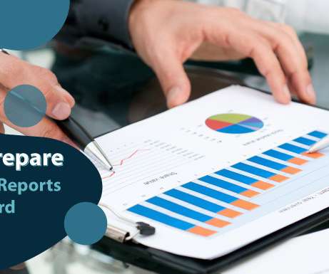
How to Prepare Donor Data Reports for Your Board Members

Bloomerang

As a fundraising coordinator who prepares these reports, you work with this data every day. The last thing you want to do is waste their time and bog their donor reports down with unnecessary metrics. . Donor data to exclude from your report. Information to include in your donor report. Additional information to share.

Report 120
article thumbnail

#datanerds: Six Steps to Great Graphs and Charts

Beth's Blog: How Nonprofits Can Use Social Media

Source: Gemma Correll – I Love Charts. Note from Beth: I just knew that I was going to start obsessing about charts and graphs after my Excel spreadsheet obsessions started. What better way than in Excel. Step 1: Which Chart is Best? If your data adds up to 100%, you might choose a pie chart.

Chart 133
professionals

Sign Up for our Newsletter

This site is protected by reCAPTCHA and the Google Privacy Policy and Terms of Service apply.

article thumbnail

Why Movement Is the Killer Learning App for Nonprofits

Beth's Blog: How Nonprofits Can Use Social Media

They help “air out the brain” and can help a tired group regain focus. I incorporate energizers into webinars (see slide 22) and virtual meetings. Chuck Hillman from University of Illinois Neurocognitive Kinesiology Laboratory. The lab does research on the relationship between physical fitness and cognitive function.

article thumbnail

NTEN and TechSoup Webinar: Share Your Story - ROI and Social Media - Slides and Notes

Beth's Blog: How Nonprofits Can Use Social Media

It is a flow chart that calculates business performance taking into account not only whether the company had a profit, but whether that profit was good enough relative to the assets it took to generate it. Over those 80 years, the chart has been polished, refined and so deeply embedded in business thinking. Secondary research reports.

ROI 50
article thumbnail

Year End Resource Roundup

Connection Cafe

Year over Year Comparison. Once you’re there, look in the Fundraising section for the webinar called “End-of-Year and Year-Over-Year Donation & Email Reporting.” ” You’ll end up with some pretty well formatted charts and graphs to showcase your findings, too! .” Group Rebuilding Specifics.

article thumbnail

Nonprofit Web Design Process Part 2a: Analytics Data as User Research

Connection Cafe

Once we get access to a client’s Google Analytics data, we first establish a timeframe for reporting. see the Traffic Sources pie chart on the right for an example of this data). It’s always great to pull screenshots from Google Analytics to show reports and add some interest to the slides. Methodology.