Remove Analysis Remove Comparison Remove Map Remove Practice
article thumbnail

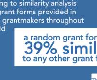
We’re 39 percent similar; how can we be exponentially better?

Candid

Analysis of grant applications from 130 funders. Organizational Budgeting, Revenue Practices, and Forecasts (20 percent). consider mapping the common fields identified here to any data fields available via Application Programming Interface (API) in your public database. You can find Robinson's scripts used in this analysis here.

article thumbnail

Lessons from 2019 to maximize future disaster giving decisions

Candid

We invite you to dive into key findings from the report and explore granular data on our funding map. . We’ve included their recommendations below, along with examples from the 2019 analysis of donors who use these tactics. . This has been a dominant trend in the past eight years of our analysis.

professionals

Sign Up for our Newsletter

This site is protected by reCAPTCHA and the Google Privacy Policy and Terms of Service apply.

article thumbnail

Mapping funding for racial justice: A political imperative

Candid

Since 2010, Human Rights Funders Network (HRFN) and Candid have partnered on research that maps funding for human rights globally. Our analysis provides an evidence base to understand and strengthen resourcing for social change. We are changing our analysis and shifting our practices to be fully accountable to racial justice movements.

Map 94
article thumbnail

Convio Opens the Kimono

Beth's Blog: How Nonprofits Can Use Social Media

As Michael Hoffman describes the practical benefits: Imagine you run one program for your main donor database and another program for your email and online data. Judi Sohn has a comparison of the two approaches. Plaxo, Facebook, Flickr, Google Maps, blogging, forums???and Better yet it allows for seamless data integration.

Convio 50
article thumbnail

Donor Management: The Ultimate Guide

Neon CRM

Donor management encompasses a whole host of practices from donor engagement, stewardship, and appreciation to demonstrating your nonprofit’s impact. It also involves careful analysis and upkeep of your donors’ data. Fundraising Donor Management Software Comparison: What’s Right for Your Nonprofit? 7 min read Read Now 2.

article thumbnail

Nonprofits and Libraries: It's Time to Move Beyond the Pie Chart

Tech Soup

If you understand a few data visualization best practices, you'll be able to learn more from your data. "It can be difficult to make these comparisons with pie charts. Maybe it's answering a question as simple as mapping where all your top donors live in a particular city? Why You Need to Move Beyond the Pie Chart.

Chart 36
article thumbnail

Podcamp Session on Social Media Metrics: Thank You Jeremiah

Beth's Blog: How Nonprofits Can Use Social Media

What metric(s) you select depends on your strategy map, tool selection, and context. This session will use a training game as a conversation starter for participants to begin to identify the most important metric mapped with strategy. He gives a great list of what goes into the map. Session Learning Goals. source: Chris Brogan).

Metrics 56