Remove Analysis Remove Chart Remove Map Remove Video
article thumbnail

New and Improved Data Visualization Tool: Maps for Media Funding

Beth's Blog: How Nonprofits Can Use Social Media

Nonprofit data nerds will love this new resource from Media Impact Funders and Foundation Center called “ Foundation Maps for Media Funding ,” a free, interactive mapping and research tool that shows the full scope of philanthropically funded media projects worldwide since 2009. Click to See Visualization.

Map 76
article thumbnail

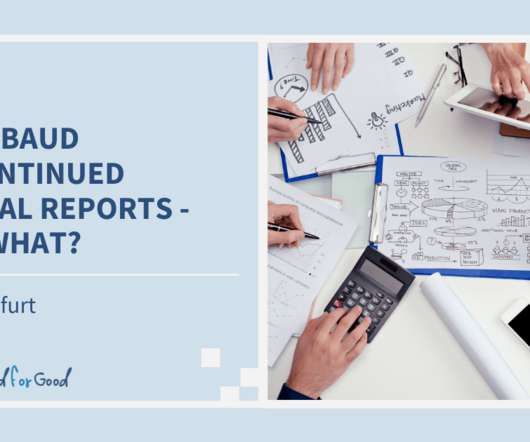
Blackbaud Discontinued Crystal Reports – Now What?

Cloud 4 Good

When configured correctly, Tableau dashboards can support your fundraising team members through greater self-service access to reports and data analysis, distributing the understanding of your key metrics across the organization far more efficiently. . You May Also Enjoy: Video: Tableau for Advancement .

professionals

Sign Up for our Newsletter

This site is protected by reCAPTCHA and the Google Privacy Policy and Terms of Service apply.

article thumbnail

14+ Excellent Nonprofit Annual Reports

Whole Whale

However, throwing a million charts and graphs together or writing a 10,000-word essay on why your nonprofit is the best isn’t going to be so effective (or worth anyone’s time). We love how Girls Who Code built an interactive map of the U.S. A unique element to this report that we don’t see very often: video.

Report 85
article thumbnail

Women Who Tech: Tools and Apps to Energize your Base

Amy Sample Ward

If you are new to RSS, here’s a great video to explain it! Community Mapping. Community Mapping helps you identify not just the various segments of your audience, but also create a clear picture of which tools/platforms are associated with those groups and which messages are best to target where.

Tools 162
article thumbnail

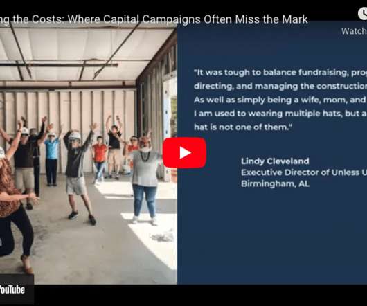
[VIDEO] Counting the Costs: Where Capital Campaigns Often Miss the Mark

Bloomerang

Lots of videos on there you can watch. And so before their case for support was even dry, before they mapped out their gift tables, their leadership team was. . And that starts kind of with a readiness assessment and a gap analysis. You know, that all flows up the org chart to me at the top. Steven: That’s cool.

article thumbnail

Remember Paint by Number? SAP Visual Intelligence: A Visual Treat for Reporting Data

Tech Soup

Oftentimes with other applications, data needs to be prepped before it can be converted into visual form (such as a graph or chart), whether that means adding a column, combining data sets, inserting a new formula, or the like. The exact opposite is true. Images: SAP.

Data 44
article thumbnail

Fundraising Apps: 25+ Tools To Help Your Org Raise More

Bloomerang

With interactive maps, private meeting scheduling, and a personalized agenda, attendees have everything they need to get more from the event. Zoom — Top Fundraising App for Conferencing Zoom makes it easy to video conference and message team members during fundraising campaigns. Text and video manipulation. Image resizer.

Org 81