Remove Chart Remove Childhood Remove Fund Remove Method
article thumbnail

Pop the champagne: This year Candid’s grants data set turns 21!

Candid

Much like a developing human, our data collections have gotten bigger over time (see chart below), undergone developmental changes, and experienced the associated growing pains. 2002-2012 – Childhood During the first 10 years, Candid staff primarily focused on collecting grants of $10,000 or more awarded by a sample of the largest U.S.

Grant 98
article thumbnail

AFP ICON 2023 Recap

Qgiv

They defined data visualization as the representation of information in the form of a chart, diagram, or picture. This method makes complex concepts easier for your stakeholders to understand and makes it easier to have more informed discussions on the next steps your organization should take.

professionals

Sign Up for our Newsletter

This site is protected by reCAPTCHA and the Google Privacy Policy and Terms of Service apply.

article thumbnail

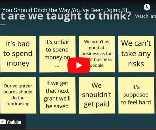
[VIDEO] Why You Should Ditch The Way You’ve Been Doing Strategic Planning

Bloomerang

And she’s got a really cool, specific framework that she has created called the Impact Method. If we try and experiment, and it doesn’t work, then we’re not going to get funding, or our donors won’t like us anymore, and they’ll go away. And you have limited funding, right? It’s a stretch. .

Video 91
article thumbnail

Report Back from the Do Good Data Conference 2015

NTEN

We had to use optical character recognition scans on five decades of Billboard Charts, get them into a database, and categorize all the entries. Make sure you’re getting credible data: ensure that your method of data collection itself is not skewing the results. It took us four months of non-stop proofreading and data entry!

Data 36