Remove Chart Remove Data Remove Language Remove Script
article thumbnail

Recruiting Geeks for Human Rights!

Beneblog: Technology Meets Society

Scientist / Data Analysis Engineer / General Techie Want to help save the world with your code? We're Benetech's Human Rights Data Analysis Group, and we're hiring right now ! What you will do: Write computer programs for human rights data analysis projects. Process, clean, and transform data.

Analysis 150
article thumbnail

How to Build Your Capital Campaign Plan

CauseVox

Check out this great donation tier chart example from the Capital Campaign Toolkit. To help you break down your overall fundraising goal into more approachable pieces, you can create donation tiers (sometimes called a gift range chart or gift table). Above is a great example of a tier chart from the Capital Campaign Toolkit.

professionals

Sign Up for our Newsletter

This site is protected by reCAPTCHA and the Google Privacy Policy and Terms of Service apply.

article thumbnail

6 Tips for Nonprofit Professionals on Speaking Brilliantly with Your Slides

Nonprofit Tech for Good

Stories, data, and explanations are your tools. Eileen on data: “As the presenter, it’s your job to bring a statistic to life. Experiment with your body language and speaking volume, and try these: A natural energy level. What is the best ratio of spoken language to visual slides in your online presentation?

Slides 304
article thumbnail

6 Online Speaking Tips for Nonprofit Professionals

Nonprofit Tech for Good

Stories, data, and explanations are your tools. Eileen on data: “As the presenter, it’s your job to bring a statistic to life. Experiment with your body language and speaking volume, and try these: A natural energy level. What is the best ratio of spoken language to visual slides in your online presentation?

article thumbnail

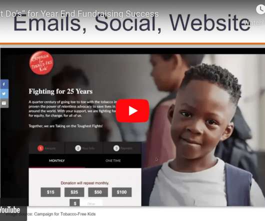
[VIDEO] 5 Must-Do’s of Year-End Fundraising Success

Bloomerang

When you match our first half million,” notice the language there, “we will make another grant of a half million.” So I have a strong desire to have data at my fingertips whenever I’m working with an organization. So one of the charts is individual giving by category. The video alone brought us to tears.

Video 95
article thumbnail

Philanthropic Leadership: Engaging Board Members As Fundraising Ambassadors

Bloomerang

And it represents the highest year of giving on record since the Giving Institute began tracking this data more than 60 years ago. And if you think about this pie chart, what I really want to call out is that bequests, which are about 9%, are gifts made by individuals. And if you haven’t read it yet, I highly recommend it.