Remove Chart Remove Comparison Remove Demographics Remove Map
article thumbnail

Data Visualization Do’s and Don’ts for Every Organization

DNL OmniMedia

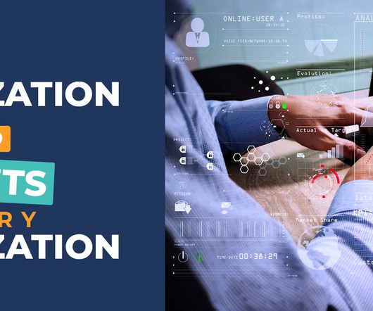
Whether you’re analyzing patient outcomes, tracking academic trends, or gathering insights from donor demographics, data visualization can be a valuable tool for any organization. Map the data journey: Determine how each audience segment interacts with your data by mapping their workflows and identifying key touchpoints.

Data 52
article thumbnail

Nonprofits and Libraries: It's Time to Move Beyond the Pie Chart

Tech Soup

That's why TechSoup has partnered with Tableau on a new blog series called "Beyond the Pie Chart." Tried to create a report and couldn't find a chart or graph that would clearly illustrate your point? Now think about making a chart comparing donation amounts for the past three years. But what about bar charts?

Chart 36