article thumbnail

MatrixMaxx 24.1 Release is Full of Visualizations and Dashboard Enhancements

The MatrixFiles

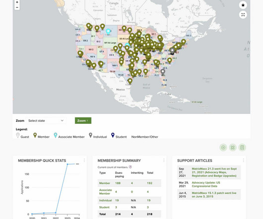
of MatrixMaxx , a leading Association Management System (AMS) that helps trade associations and professional societies manage their organizations better, have great member journeys, and be higher performing through data. Charting Churn to measure membership turnover offers a high-impact way to see how well your retention efforts are working.

Module 130
article thumbnail

The Only Time You Should Use a Pie Chart for Your Nonprofit's Data

Tech Soup

We've covered bar charts, line charts, scatter plots, and maps in Beyond the Pie Chart. We finish the series by explaining the only time a pie chart actually is the right choice. When to Use a Pie Chart. As we state in our white paper, Which Chart or Graph is Right for You? Pro Tips for Pie Charts.

Chart 61
professionals

Sign Up for our Newsletter

This site is protected by reCAPTCHA and the Google Privacy Policy and Terms of Service apply.

Trending Sources

article thumbnail

Beyond the Pie Chart: Maps

Tech Soup

Charts and graphs are useful, but when you have any kind of location data — whether it's postal codes, state abbreviations, country names, or your own custom geocoding — you've got to see your data on a map. Part 4 in our Beyond the Pie Chart series covers mapping. So demand the same informative view from your data.

Chart 36
article thumbnail

Infographic Tools for Nonprofits and Libraries

Tech Soup

Tools for Creating Infographics, Charts, and Diagrams. Making a useful, shareable infographic or chart takes some planning. I preferred starting from scratch and using Easel.ly's library of shapes, images, and fonts to create my infographic. is my tool of choice when it comes to making visually-appealing charts.

Library 74
article thumbnail

Beyond the Pie Chart: What Scatter Plots Can Do for You

Tech Soup

Part 3 in our Beyond the Pie Chart series digs into the wonderful world of scatter plots. These tips from Tableau's Visual Analysis Best Practices and Which Chart or Graph is Right for You? As we can see from the chart (specifically when we add a trend line), there is a clear negative correlation between sales price and quantity.

Chart 36
article thumbnail

Fair Use Victory Advances a Future of Accessibility for All

Beneblog: Technology Meets Society

The HathiTrust Digital Library (HDL) is a partnership of academic and research institutions that had created (with help from Google ) a collection of millions of titles digitized from libraries around the world. You can read more about our position in the Amicus Brief , which we filed jointly with our peer organization, Learning Ally.

article thumbnail

Staying Relevant In A Fast-Changing World

Eric Jacobsen Blog

Alan Adamson , co-author of the book, Shift Ahead , says that “the ability for companies and organizations to stay relevant is being significantly challenged by the accelerating pace of change – and new ways of doing things – that are emerging with every passing day.” At a speed of change unlike every before.

Change 52