Remove Guidelines Remove Mobile Remove Ratio Remove Structure
article thumbnail

A Guide to Email Accessibility Best Practices for Nonprofits

Nonprofit Tech for Good

It aims to remove barriers for people with visual, auditory, cognitive, mobility, and other permanent or temporary limitations so they can effectively receive, understand, and respond to email communications. Understanding WCAG Standards WCAG stands for Web Content Accessibility Guidelines.

article thumbnail

Tech Wellness in the Nonprofit Workplace: Tips for Avoiding Collaborative Overload

Beth's Blog: How Nonprofits Can Use Social Media

Research shows that staff often resist using multiple services, often because they don’t want to open one more window on their computer or launch one more app on their mobile device. Planning is about using structure and rituals to keep organized. It is important for your team to have the right amount of structure in their workflow.

professionals

Sign Up for our Newsletter

This site is protected by reCAPTCHA and the Google Privacy Policy and Terms of Service apply.

article thumbnail

Making the Most of Your Nonprofit’s Website: Understanding the Basics

Connection Cafe

Don’t forget the mobile experience. Mobile web browsing now makes up over half of all web traffic. check your website for mobile optimization. In terms of visual frontend elements, the contrast ratio between your site’s text and its background is key. You probably do most of your web browsing on your smartphone, too.

article thumbnail

20 Best Practices to Optimize Your Nonprofit Donation Page

Bloomerang

An easy-to-use, accessible, mobile-friendly online donation page is crucial for modern nonprofits. This section offers best practices for designing and structuring your online giving form. Make your donation form mobile responsive. Is the text large enough to be read easily on mobile devices? Let’s get started.

article thumbnail

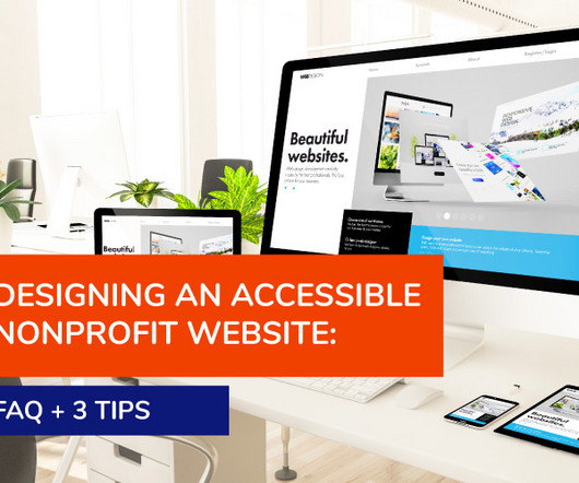
Designing an Accessible Nonprofit Website: FAQ + 3 Tips

Nonprofits Source

For instance, you could: Evaluate various aspects of your website against industry-standard checklists such as the Web Content Accessibility Guidelines (WCAG) 2.1. checklist recommends color contrast ratios of 4.5:1 Use a responsive web design framework that provides features to enhance user experience, including accessibility.

FAQ 52
article thumbnail

4 Best Practices for Accessible Nonprofit Website Design

Get Fully Funded

The generally recommended contrast ratios are 4.5:1 You can find a variety of tools online to help you check contrast ratios and test whether your website provides a positive user experience for colour blind audiences. 1 for standard text and 3:1 for headings and graphics. Use coloured overlays when displaying text over photos.