Remove Chart Remove Childhood Remove Map Remove Resource
article thumbnail

14+ Excellent Nonprofit Annual Reports

Whole Whale

However, throwing a million charts and graphs together or writing a 10,000-word essay on why your nonprofit is the best isn’t going to be so effective (or worth anyone’s time). We love how Girls Who Code built an interactive map of the U.S. Natural Resource Defense Council. Cue the giraffes. Donate Life America.

Report 85
article thumbnail

AFP ICON 2023 Recap

Qgiv

They defined data visualization as the representation of information in the form of a chart, diagram, or picture. “Map out the story you need to tell. This method makes complex concepts easier for your stakeholders to understand and makes it easier to have more informed discussions on the next steps your organization should take.

professionals

Sign Up for our Newsletter

This site is protected by reCAPTCHA and the Google Privacy Policy and Terms of Service apply.

article thumbnail

Reflections on the Meyer Memorial Trust Workshop

Beth's Blog: How Nonprofits Can Use Social Media

I always try to incorporate new learnings and observations that I've discovered from the many interviews I do on my blog, resources discovered, and stories. What's your strategy map? One of the scenarios focused on how to use social networking/media for a campaign around childhood obesity. What's the outcome? Observations.

article thumbnail

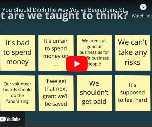
[VIDEO] Why You Should Ditch The Way You’ve Been Doing Strategic Planning

Bloomerang

There’s all kinds of videos and resources you can get a hold of to kind of get to know us and maybe even make contact if that’s something you are interested in or in need of in terms of software. . So we actually draw our strategic plans, our impact strategies, as mind maps. We are a provider of donor management software.

Video 93