Remove Brain Remove Chart Remove Interaction Remove Map
article thumbnail

14+ Excellent Nonprofit Annual Reports

Whole Whale

However, throwing a million charts and graphs together or writing a 10,000-word essay on why your nonprofit is the best isn’t going to be so effective (or worth anyone’s time). We like that this particular report’s table of contents is interactive, allowing readers to skip ahead to the sections they are most interested in.

Report 85
article thumbnail

Data and Storytelling: 6 Ways to Use Data to Move Your Mission

NTEN

In this example info-graphic from David McCandles, he was inspired by Clay Shirky's claim that the world has an enormous ‘cognitive surplus' - untapped hours that we could be using our brains, but simply are not. Again, David uses the simple comparitive size of blocks to put “A billion dollars” into context. Tell Your Story, Literally!

Data 100
professionals

Sign Up for our Newsletter

This site is protected by reCAPTCHA and the Google Privacy Policy and Terms of Service apply.

article thumbnail

Data and Storytelling: 6 Ways to Use Data to Move Your Mission

Forum One

In this example info-graphic from David McCandles, he was inspired by Clay Shirky’s claim that the world has an enormous ‘cognitive surplus’ - untapped hours that we could be using our brains, but simply are not. Again, David uses the simple comparitive size of blocks to put “A billion dollars” into context.

Data 68
article thumbnail

Data and Story Telling: 6 Ways to Use Data to Move Your Mission

Forum One

In this example info-graphic from David McCandles, he was inspired by Clay Shirky’s claim that the world has an enormous ‘cognitive surplus’ - untapped hours that we could be using our brains, but simply are not. Again, David uses the simple comparitive size of blocks to put “A billion dollars” into context.

Data 67
article thumbnail

Top Ten Chart Secrets from A Nonprofit Data Nerd

Beth's Blog: How Nonprofits Can Use Social Media

But being a nonprofit data is not just about being an Excel ninja, it is also about visualizing data and being a chart master. When Ann told me she has lots of secrets and time saving tips for charts and offered to write this guest post, I was thrilled. Charts can be one of your strongest communication tools. Secret #10.

Chart 118
article thumbnail

[VIDEO] How to Get a Return on Your Nonprofit Technology Investment

Bloomerang

But most importantly, we’d love for these sessions to be interactive. So make that map and keep it updated so when a new product comes into your environment, somebody. Adult brains don’t learn new things that easily. People love to see like the run charts or, you know, the circle getting filled in. We love it.

article thumbnail

[VIDEO] Why You Should Ditch The Way You’ve Been Doing Strategic Planning

Bloomerang

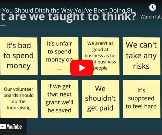
But most importantly, we love for these sessions to be interactive, so use that chat box, use the question box, you can use either of those, we would love to hear from you. So we actually draw our strategic plans, our impact strategies, as mind maps. They are not documents, there is no fancy graphic design, they are mind maps.

Video 92