Blog Insights
Using Data to Improve Health Policies and Outcomes
For health data to impact health outcomes and related policies, the data must be made accessible to policymakers, health advocates, and other interested parties.
Too often, health data is locked in massive datasets that are opaque to all but epidemiologists and statisticians. Making key health data easy to understand can change how people think, how policies are made, and, quite literally, save lives.
Forum One has worked with dozens of organizations to effectively show impact and change outcomes using data. Here are some tips for thinking through how you can use health data to create a lasting impact, including use cases from work that we’ve done with our clients at County Health Rankings and Roadmaps, NYU’s City Health Dashboard, the Congressional District Health Dashboard, and AARP’s Livability Index.
Understand the impact you want to achieve
Your entire project is predicated on what you are trying to accomplish. The data you display, the types of visualizations you show, and the complexity of the visualizations you’re working with will vary greatly depending on what your goal is—whether it’s to improve health outcomes for low-income citizens, increase cancer screening, or educate policymakers.
On the Congressional District Health Dashboard, users can easily see how their congressional district compares to the national average. This helps highlight which health outcomes have the greatest disparities, and where the citizens and Congresspeople should focus on improving health outcomes.
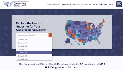
Not only can users narrow down their search to the district level, they can then choose from various impact metrics to better understand specific factors, behaviors, outcomes, etc.
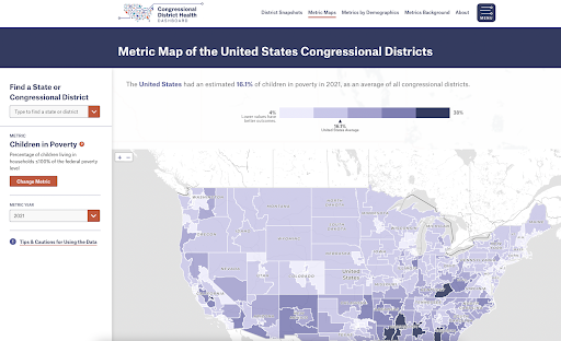
By using shaded maps, clear data points, and red/yellow/green indicators, users can easily identify areas in need of improvement.
Focus on key audiences
Some data-driven sites want to reach audiences that are already deeply knowledgeable about the topic to which the data relates. Other data-driven sites want to reach a much broader audience. For example, if you want to improve healthcare for low-income citizens, those individuals may not be the target audience. You could likely create a bigger impact by focusing your data and messaging toward other audiences such as policymakers (who can create new health programs), social workers (who can help families find healthcare resources), or doctors and nurses who accept Medicaid.
AARP’s Livability Index targets a broad set of audiences including local residents, community advocates, researchers, and local policymakers. This includes groups who are steeped in policy and others who know little about how policy is made. It includes those who understand data well (researchers), and others who are likely less familiar with complex data analysis tools.
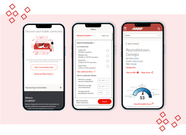
The Livability Index bridges these gaps in several ways. First, they aggregate findings into broad categories such as Housing, Transportation, and Environment. Users who want more detail can expand each to see a subset of data for each. Likewise, users can expand to see if specific policies are in place in each community. Links to data sources are available for each policy and metric so that researchers, or others who want to find source data, can easily do so. This is a great example of creating one data site that meets a variety of audiences, from generalists to specialists.
Create data visualizations that resonate
If you are focused on teachers and parents, your data visualizations will need to be much more straightforward than if you are targeting epidemiologists. Talk to your key audiences through interviews, focus groups, or surveys to understand their data needs and data sophistication.
New York University’s City Health Dashboard succinctly shows data. At a glance, users can see where a city falls on each metric, how it compares to averages, and whether it is better than average. Users can expand each factor to get significantly more data including a narrative description, map, and data source.
Users can then choose to share the data or download the data to perform their own analysis. This enables users to drill down to the level of detail that is most useful for them.
Use data to tell stories
Very few users will download a dataset and manipulate the data to find answers. It is incumbent on you to present the data in a visually interesting way that helps tell relevant stories. These stories can be highly focused, or created in ways that allow users to explore the data from many angles. Just realize that the way you present the data will impact how people interpret it, whether they take action, and which actions they take.
City Health Dashboard, for example, has created an “Impact Stories” section on its website.
Help users interpret the data
If you are providing specific infographics, you can increase the impact by providing a text-based description of what the data shows, the relevant findings, and any related information or caveats. While some people can easily interpret charts and graphs, others would rather read words. It is best to provide users with both so they can learn in the manner that is easiest for them. Putting number(s) in large, bold fonts can help draw attention to the statistic you are highlighting. On the County Health Rankings & Roadmaps platform, for example, there is a summary page for each county.
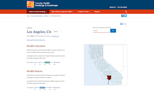
You can see that Los Angeles, California ranks #22 healthiest out of California counties. Los Angeles is in the 2nd quartile for health outcomes and in the 3rd quartile for health factors. This example includes a variety of means for conveying data – a large number, a chart labeled 0 – 100%, a map showing the location of the county, and text to describe the information. By giving users multiple ways to review the information, it helps ensure that users understand the data on their own terms.
Provide policy recommendations
If your aim is to impact policies, it helps to provide users with a clear narrative for policy change. Telling users how they can advocate for change will increase the odds of them taking action. By providing different recommended actions for different audiences, it will further increase the likelihood of action. For example, parents might advocate for changes in schools, doctors for increased funding for specific programs, and teachers might advocate for staff or funding for student health or mental health from the school board or city council.
And, if you want them to take action, then ask them to. Just telling people to take an action significantly increases the likelihood that they will. If your website says, “Sign up for our newsletter now!,” “Write your congressman today!,” or “Share with a Friend,” the portion of people who take that action will increase substantially.
How are you using data to create impact?
Effective data visualization and interpretation play a crucial role in engaging audiences and driving action. By creating easily understandable data visualizations and stories, tailored to the specific needs of different user groups, we can empower individuals to make informed decisions and advocate for policy change.
By telling compelling stories through data and providing policy recommendations, your organization can inspire action and create meaningful impact. Remember, it is not enough to present the data; you must also guide your users through its interpretation and encourage them to take concrete steps toward positive change. In this way, you are truly harnessing the power of data to drive progress and improve health outcomes for all.