Your website is the centre of your nonprofits online presence
Your nonprofit’s website is essential to the success of your nonprofit so it has to be it’s as effective and appealing as possible. It’s the centre of your digital marketing campaigns! This is where most people will go to find out more about you and your cause, and is what your other digital marketing strategies are directing supporters to.
Your site needs to work, look great, provide all the important information and stand out to potential supporters or those in need.
In this article, we run through how these 10 nonprofits got the tricky business of making a website right. Make sure to check them out for more information, and a closer look at what they do well.
There’s nothing stopping you from having a website to be proud of too, implement what you like in your own! If it sounds a bit out of your depth, Twenti can help you create a great nonprofit website that works for your cause, just arrange a free consultation with us.
10. RSPCA
The RSPCA needed a website that multitasked, as many nonprofits do. The website had to convey information, and calls to action, to potential volunteers, donors, those looking to adopt a pet and those concerned over general animal welfare.
The website balances this well, with easy navigation to different sections, and a logical home page which showcases each of the areas of information they provide.
RSPCA utilise forms, buttons and banners to help the viewer pick out, and navigate to, exactly the information they require. Make sure your website manages this too, by ensuring you aren’t trying to answer all questions in one space and understanding your different demographics.
9. Childline (NSPCC)
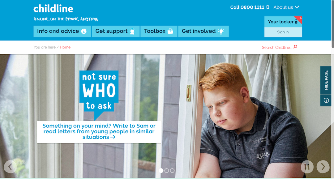
The Childline website (which is run by the NSPCC) is a website targeted at children in need, providing them with educational resources and direct access to online counselling and a helpline.
The amazing success of this service, and the amount of children they’ve been able to help, is partly down to how accessible the website is to under 16s. The website includes educational games, videos and stories of children in similar positions as they might be.
Childline is an excellent example of a nonprofit website aimed directly at those it’s trying to help. They keep their fundraising separate, with a dedicated justgiving page.
If your nonprofit needs a website to reach out to those in need, follow childline’s example. Make sure that it’s separated from all fundraising purposes so that they feel like the main concern and nothing stops them from getting the information they need.
It’s also key include resources about the issues they care about, in a way that appeals to them.
8. Greenpeace UK
Greenpeace UK is a simple website to understand, and that’s due to their use of whitespace and simple navigation.
A website that’s crammed full of as much as possible on every page won’t engage readers, it will leave them confused and unable to find the information they need. Greenpeace has made sure each feature stands out and is readable, making it a user-friendly experience.
7. Under The Weather
If your nonprofit is focused on educating people, then take inspiration from Under the Weather. Aimed at conveying the findings of the World Health Organisations Atlas of Health and Climate, UTW uses interactive infographics.
Everything from the colour scheme, to the simplicity of the website and the infographics themselves, makes the information easy to digest while still being hard-hitting.
Interactive elements on your website are key to making sure viewers stay engaged long enough to learn what you’re trying to teach and to inspire them to seek more information.
6. Malala Fund
The personal touch of the Malala fund is its main attraction to its supporters, and the website showcases this brilliantly. Front and centre of the home page is Malala herself, as well as information on her inspiring story. The home page also gives detailed information on the numerous groups of girls the fund is trying to help and the unique set of challenges each face.
This information proves to be a powerful and emotive motivator encouraging people to donate, as they feel they’ve gained a deeper understanding both of the fund itself, and of who it helps.
Try to use your website to make a personal connection with your viewer. You may not have a story as dramatic as Malala’s but giving supporters an understanding of why you do what you do will help them to trust your nonprofit.
5. Comic Relief
Red Nose Day is a massive event, held by Comic Relief, that engages people of all ages and backgrounds. A wide range of people look to Comic Relief for entertainment and an opportunity to fundraise, therefore their website needed to be appropriate and engaging for all.
Comic Relief makes all feel welcome on their site, with images featuring people of a diverse range of ages, races and abilities, and dedicated sections for schools and youths.
Make sure your website presents itself as a welcoming and inclusive environment.
4. Thorn
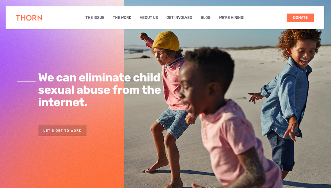
Thorn is an organisation which develops technology to combat child sexual abuse, especially online. This being an extremely difficult topic to discuss presented Thorn with more unique challenges, on how to convey the urgency of the issue without being too challenging or upsetting to read.
The solution they came to works well, using images of children at play, happy and living the life they should, and then using statistics to convey to the viewer how many children are suffering or at risk. This drives supporters to donate, rather than scaring them off.
If your nonprofit deals with a particularly upsetting issue, it may be hard to find an appropriate way to present this via your website, but it is certainly not impossible. Think of effective and simple messages you want to send to the viewer.
3. WWF
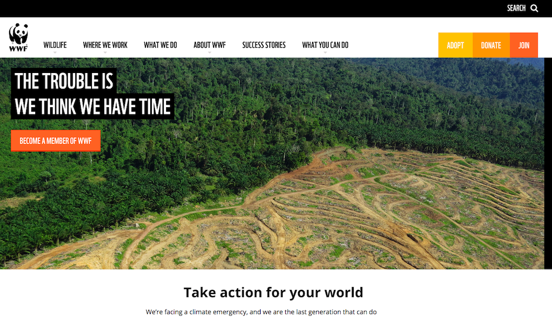
The most obvious selling point of the WWF website is the imagery. Just like their Instagram, WWF’s website draws in supporters with amazing original photographs from around the world. It’s effective at getting any viewer to see the value of their cause by showcasing the beauty of the animals and environments they’re working to protect.
Try to use photography to convey your message to viewers of your website, and entice them to learn more.
Less immediately obvious, but no less important, the WWF website also includes a wide range of donation options to appeal to all kinds of target audiences. These range from one time donations to regular donation plans, and a shop of merchandise and animal sponsorships.
This is incredibly beneficial for such a wide-reaching organisation, as it allows them to get multiple demographics involved. If your website is intended for a wide audience, make sure you are including donation opportunities to suit this.
2. ONE
The homepage of ONE’s website is unique and gets straight to the point, as there’s no time to waste when it comes to fighting poverty. There’s no clutter, just direct access to the key and most up to date resources, and multiple calls to action.
Make sure your website doesn’t waste any time getting your message across, and while you take inspiration from these websites, remember that the most effective nonprofit websites are those customised to your needs and purpose.
1. Charity Water
If you need an example of a nonprofit website that runs as effectively as possible, Charity Water is it. The website has effective calls to action, attention-grabbing headings, engaging images, and more. Plus, it runs just as well on mobile as it does on any other device.
Having a website that runs smoothly, and where all components work together, makes sure you hold on to as many potential supporters as possible. If your website isn’t working as well as it should, get in touch with us to see how we could help optimise your website.
My website isn’t up to scratch…
Having a website that isn’t fit for purpose will mean you lose out on tons on potential donations! At Twenti, we’re passionate about helping nonprofits to be as successful as possible at causing social good, and that starts with an effective online presence to help drive donations.
Click the banner below for a free consultation!
Ready to reach thousands of new donors online?
Related Articles
7 Reasons Why SMEs Say They Don’t Need a Good Website – and 7 Reasons Why They’re Wrong
All businesses can grow online, no matter their size. We explain why a reliable and informative website should be a priority for SMEs – even if you think you are too busy.
Why is Online Presence Management Better Than Web Design?
Online presence management, or OPM, is often mistaken for web design even though the two are very different. But why is OPM so much better?
5 Tips To Drive Traffic to Your Donation Page
Digital marketing and a sleek website are useless if they aren’t going to drive traffic to your donation page. Here are tips on how to make sure they do.
£8,000/month of free ad credit?


