
There are zillions of articles about how to build the best nonprofit donation form. But sometimes seeing a donation form example can be more effective than simply learning about how to create one.
What do the best practices for building a donation form look like in real life?
Here’s an nonprofit donation form example that can help you envision what to include on your own site. Read on for explanations of each form element and why your donors will love it.
Can You Spot the 10 Best Practices In This Donation Form Example?
This donation page example is for a (fictional) nonprofit. It’s supporting a campaign that’s raising money for summer camp scholarships for local students, and it includes 10 important best practices. Let’s take a look.
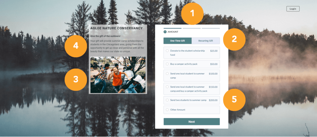
1. Multi-Step Donation Form Format
This is a multi-page form. When a donor first lands on this donation page, they’ll only see an impact statement, a compelling image, and options for choosing your donation amount and frequency. Because they don’t yet see the form fields for personal or payment information, the process feels simpler than it would if all fields were visible at once.
Long donation forms can feel intimidating or burdensome for your donors. Splitting your nonprofit’s donation form into multiple steps can help reduce what’s called a “mental load” by splitting the process into smaller steps.
You may not actually be making your donation form shorter—but it will feel shorter.
2. Recurring Donation Options
The donation form example above displays options for making a one-time gift. But it also includes recurring donation options! If a donor were to click on “Recurring Gift” instead of “One-Time Gift,” they’d see slightly different suggested donation amounts and descriptions.
There are all sorts of reasons to encourage recurring donations. Recurring donors give more over their lifetime as a supporter, and they’re much easier to retain than one-time donors. Simply adding the option to make a recurring gift is a powerful way to begin building sustainable revenue for your organization.
3. High-Impact Image
Not everyone who lands on a nonprofit donation form is ready to make a gift. Some people may reach this page as they’re learning more about you. Some may have clicked on a link to your donation page with the intent of checking out your website. Some may get there entirely by accident!
You can catch their attention and help them understand what you do by including a compelling image.
Donors who land on this page will be donating to send students to summer camp. This image will help them envision the outcome of their gift—students having a wonderful time in the great outdoors.
Psst: Looking for other tips for designing a great online donation form? You might like our Website Optimization Action Plan! There’s a whole section dedicated to building a great form.

4. Impact Statement
Including a brief impact statement on your donation form (or even a longer one, if it suits your needs) will serve two purposes.
For people who are unfamiliar with you or haven’t decided to give yet, a quick note about how their gift will be used helps them understand their potential impact. This impact statement and your featured image can quickly communicate to them what it is you do and why they may want to donate to your cause.
For people who have landed on your nonprofit donation form with the intent to give, your impact statement can reinforce that decision. This is exceptionally powerful if the image and impact statement on your form mirror the appeal that inspired them to give in the first place.
5. Suggested Donation Options and Descriptions
You may have noticed that the form includes suggested donation amounts. This is a great way to help people decide how much to give, if they haven’t already.
It may also even inspire people to give a little more than they usually would. If someone lands on your donation form intending to make a $20 gift, they may decide to increase their donation slightly if you offer them a $25 option.
This is an even more powerful tactic if you can include descriptions for each suggested amount. The impact statement and image on the form connect donors to their gift’s outcome, and the descriptions for each of the suggested donation amounts take it a step further. Donors understand exactly how their gift will contribute to the overall campaign.
Note that there’s an “Other Amount” option here! If someone lands on this form intending to give $20, they may not want to give at the $25 level. They should always be able to select their own donation amount.

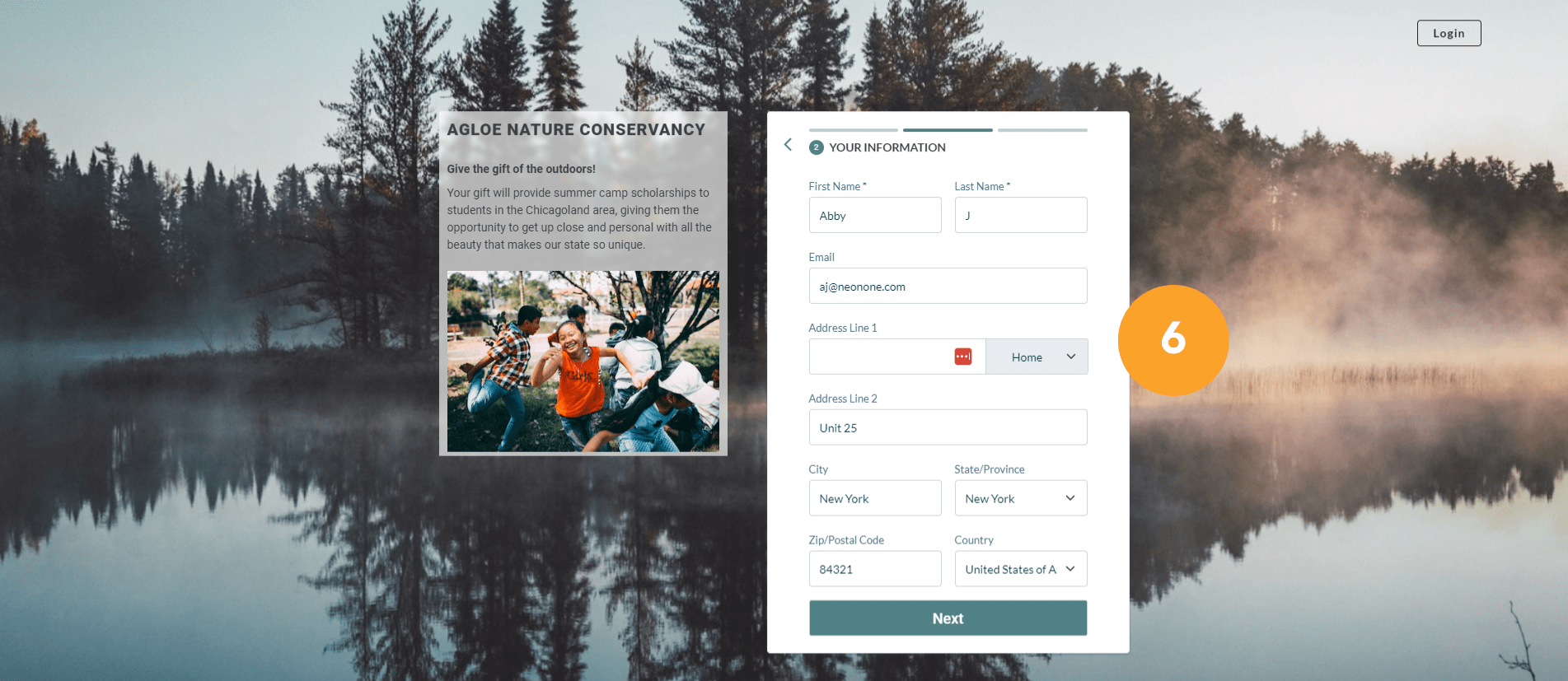
6. Minimal Additional Fields
After the donor selects their donation amount and frequency, they’ll click “Next” and land on this page. On this screen, they’ll enter their personal and contact information. Notice that this form doesn’t ask them for anything that isn’t necessary to process their gift!
It can be tempting to use your nonprofit’s donation form to collect lots of valuable information from the people who supported you. But, even on multi-page donation forms that feel shorter, asking a ton of extra questions will harm your conversion rates.
Instead of asking donors for information about their employer, interests, motivations, or how they heard about you on your donation form, keep your form fields simple. You can always send them a donor survey after they’ve made a gift.
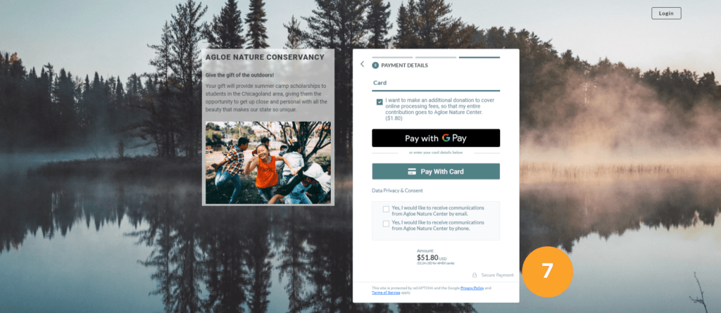
7. Security Indicators
When the donor has finished entering their personal information, they’ll click to the page where they’ll enter their payment information. Pay attention to the lock icon and “Secure Payment” annotation here. This is a simple way to signal to donors that their information will be secure.
As a general rule, these security indicators will be built into your nonprofit’s donation forms automatically—they’re a standard feature of most online fundraising platforms. They’re not the most aesthetically pleasing elements of a donation form, but resist the temptation to remove them with fancy coding. Your conversion rate will thank you.
Additional steps you can take to signal to donors that you’re keeping their information secure are using your donation form on an encrypted page (hint: If you see “https” at the beginning of your donation page’s URL, you’re covered) and staying PCI compliant.
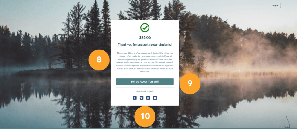
8. Thank-You Message
After a donor has submitted their gift, they’ll land on this page. A simple but sincere thank-you message and note about what to expect next will make a positive impression.
This is a fantastic opportunity to start building a relationship with your donors, especially if they’re donating to you for the first time. Taking the time to celebrate your donor’s kindness will make them feel good about their gift, and that can set the stage for successful donor retention strategies.
9. Next Steps
This page gives donors the opportunity to stay engaged with the nonprofit by giving them something to do after their donation is complete. The form doesn’t include additional fields to capture nonessential donor information, so including a link to a donor survey is a good next step.
While inviting people to take a donor survey is a great next step, you have lots of other options. Ask them to watch a thank-you video, subscribe to your newsletter, follow you on social media, attend an event—the possibilities are endless. Just don’t ask for a second gift!
10. Social Sharing Options
Another potential next step the donor may take is sharing this donation page with their friends and family. Including social sharing options on the donation page’s exit page makes it easy for them to share this campaign with their networks.
This can be a fun way for your donors to share your work—and why they’re passionate about it—with the world.
Build Beautiful Nonprofit Donation Forms with Neon CRM
Looking for an online fundraising platform that makes it easy to create online donation forms? Neon CRM can help!
You can put together effective donation pages in minutes with our intuitive form builders. And, since Neon CRM users can create unlimited donation forms, you can build unique forms for different donor segments, campaigns, or initiatives.
Get a feel for what Neon CRM can do for you by joining one of our group demos. They’ll give you a high-level overview of the tools and features you can use to support your nonprofit without the pressure of a one-on-one sales call.
Join the discussion in our Slack channel on connected fundraising

