As a nonprofit organization, your website plays a crucial role in communicating your mission, services, and impact to potential donors, volunteers, and beneficiaries. It’s important to ensure that your website not only provides valuable and relevant information, but is also easy to use and inviting so that the user engages with the web content. Here are six rules for web design that will build trust and credibility with your audience:
1. Every Page Should Lead Somewhere Else
Avoid dead-ends; not only do search engines penalize them, but users find using the “back” arrow awkward. Include ways to navigate to additional content, whether it’s another internal page or an external source of information. This helps to keep the user engaged and encourages them to explore more of your website. For example, Africa Uplifted includes some continued reading options at the end of all their internal pages, providing a clear path for users to follow.
 There is one near exception, which is your Donate page. You should remove all distractions from that page in order to direct the user’s focus to completion of the Donation form. Just don’t make the mistake of dead-ending after the donation is complete. Rather than a simple “Thank you” message, display content about your impact. Half of the joy of giving is the reaction of the recipient. Increase the warm glow a donor experiences after giving to your nonprofit with a meaningful demonstration of its impact, and donors will come back to give more frequently and generously.
2. Don’t Give Information All at Once
Provide just enough information to pique the visitor’s interest and guide them towards their desired destination. Examples include highlighting key points or offering a brief overview, while reserving more detailed information for dedicated pages. Below, ZEMA highlights short-term volunteer options on their homepage, while providing all the details on a separate page.

3. Consider the Needs of Older Users
Not all users have the same level of familiarity or comfort with technology. Studies have shown that people over the age of 55 are twice as likely to make mistakes when using websites, take longer to complete tasks, and are more likely to abandon tasks. A remote user test of 257 participants found that the failure rate for tasks was almost double among older users when compared to those under age 20. If your target audience skews older, it’s important to make your website as easy to use and clutter-free as possible. This includes fewer layers of navigation as well as fewer steps to complete a task, i.e., stripped-down menus and simplified check-out.

4. Good Photography Matters (More Than You Think)
Images that convey strong emotion have a positive impact on conversions. Research has found that a person conveying emotion can have a larger impact on conversions than a calm person looking at the call to action.
Several heat map studies have also shown that people follow the direction of a model’s eyes. If you need to get people to focus not only on the beautiful model but the content next to them, make sure they’re looking at or orientated towards that content.
Your best option may be to combine the last two approaches—choose an emotional display from a person who’s also looking at the desired spot on the page, like Dreamscape does below. Just don’t use generic stock photos: high-quality, relevant photos have a vastly larger impact. Whenever possible, opt for real images that show your organization in action (ask a volunteer to be in charge of taking photos)!

5. Most of the Time, Be Conventional
Readers are able to readily identify a book’s title, its table of contents, a dedication, the start of a new chapter, etc., thanks to print norms. For websites, the same purpose is performed by usability guidelines, which help visitors to navigate websites. When you stray from established web conventions, users take 50% longer to understand and use your website. Follow best practices and stand out from the crowd using design elements. Express creativity through color choices, voice, and tone and by incorporating your organization’s brand and values into your website. The site below incorporates Texan identity into its colors and logo–instead of designing a menu shaped like the Texan flag where you navigate by clicking on different flag components.

6. Know Your Audience
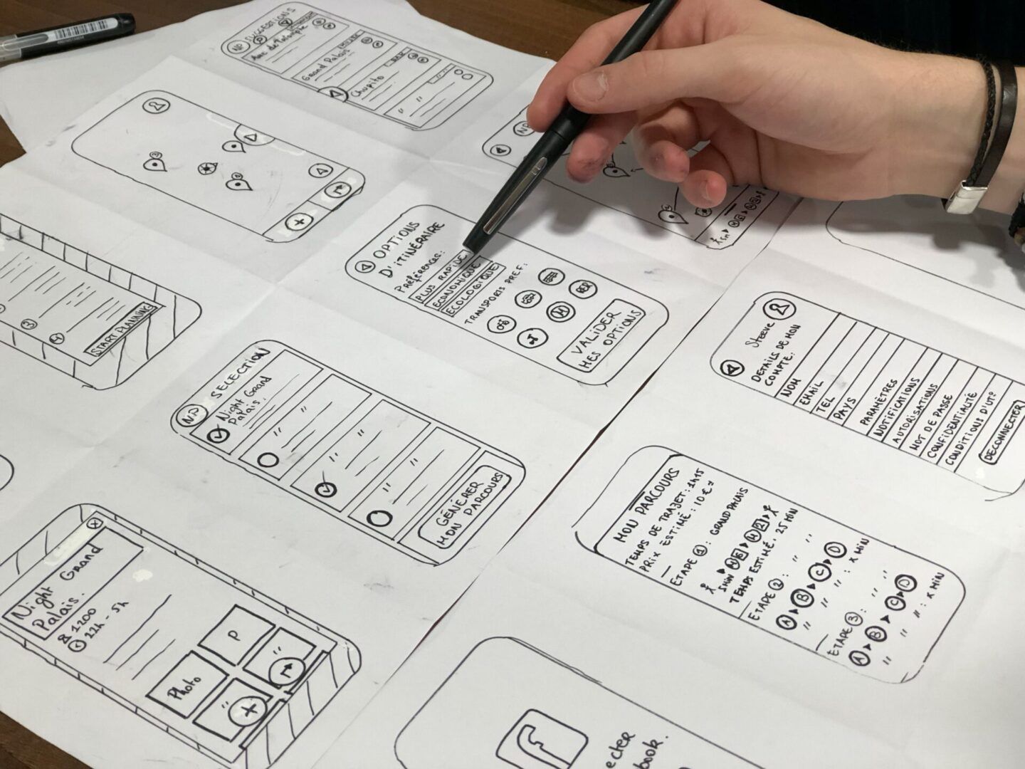
There’s a surprising amount of science that goes into designing a functional website. The field of user experience (UX) design emerged in the 1990s as a way to focus on human-computer interaction and the overall experience a person has interacting with technology. Despite its relatively short history, UX has had a significant impact on web design. It combines a variety of disciplines, including psychology, sociology, and computer science.
Today the most popular websites and applications are those that which were designed with the strongest focus on user experience. UX design entails having a clear understanding of who your target audience is and what they are looking for when they visit your website. Through exercises such as creating user personas and mapping out user flows, you help ensure that your website creates a seamless and intuitive experience for users.
When you know your audience, provide helpful information, and use convention to make tasks easy, this conveys trustworthiness. By following the above six rules, you will create a website that effectively communicates your mission and builds trust with your beneficiaries and supporters.
This article was generated with minimal assistance from the GPT-3 language model trained by OpenAI.