The power of illustration: branding, storytelling and its impact


Visuals and imagery are a core part of establishing an organization’s brand identity. When considering how imagery can be used to convey the desired tone, most people immediately think of photographic representation, but illustration also plays a key role in nonprofit brands and campaigns. Illustrated imagery has the power to create a signature emotion and reflect a brand’s personality uniquely; it can be a great way to differentiate a special initiative or campaign. Illustration can also be an agent for inclusion and representation when showing real people in photographs can be sensitive or challenging.
Some of the brands and campaigns that we develop at Big Duck feature unique illustration—and because it is a specialized skill, we often rely on professional illustrators to partner with us to co-create solutions.

We recently partnered with Raffi Marhaba on a campaign for The Ms. Foundation for Women, which centers women and girls of color in their work. In the absence of a powerful photo library, we aligned on featuring a diverse representation of women through illustration. We were thrilled to work with Raffi who approaches all their work through a lens of social justice and is steeped in thinking through issues of representation.
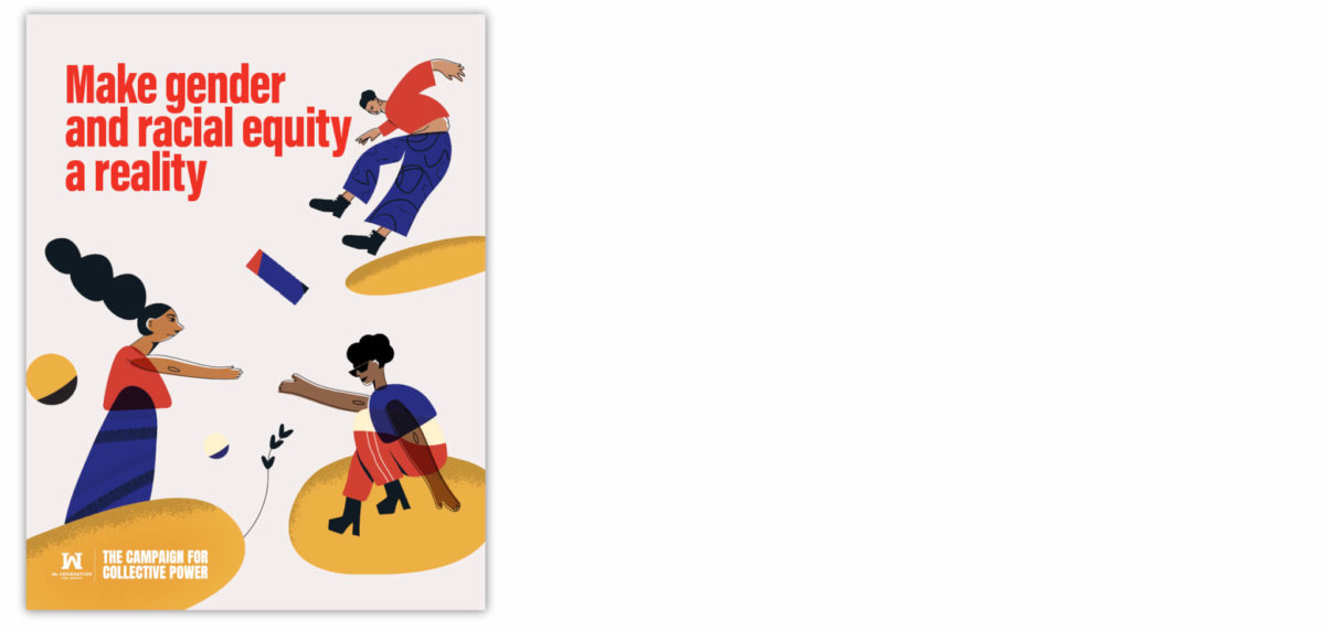
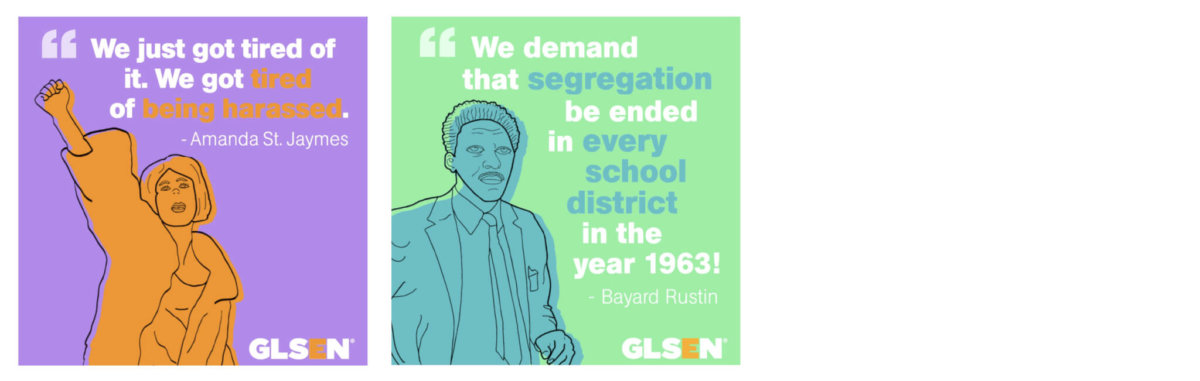
Raffi (they/them) is a queer, trans, bi-racial Arab immigrant designer who specializes in branding, graphic design, and illustration through a social justice lens. With over 12 years of experience, Raffi has created powerful branding through stories and design for forward-thinking clients like Kimberlé Crenshaw, who coined the word and framework of intersectionality, The Center for Institutional and Social Change, several LGBQT organizations like GLSEN, Transgender Law Center, Transforming911 and many other organizations who focus on shaping a better world.
Q+A:
What unique value can illustration bring to a brand or campaign?
RAFFI: For a brand or campaign, it’s important that audiences connect with its goals and its vision but above everything else, with a memorable story. Illustrations can be utilized to visually create worlds, characters, and scenes, and depict ideas that cannot be achieved with photography. Illustrations open so many unexplored doors in storytelling and help viewers develop new associations.
In a way, it makes it easier to connect with the audience’s emotions when the right style of illustration is utilized. Whether you’re going for something more abstract or realistic, the artistic component of well-rounded illustrations can add that extra oomph and more depth to a brand or campaign.
How do you explain the difference between the role of illustration vs. photography in branding?
RAFFI: When working with brands, I always ask about their aspirations, dreams, and goals but I also ask about what kind of assets they already have available.
When a brand or campaign is seeking to reimagine something in the future that has yet to be seen, understood, and felt, illustrations can be so powerful at leveraging that goal. They are also powerful in depicting stories of the past, even things that are extinct. When data is needed to support a story, illustrations will add connecting points for the audience, making the data easier to digest. Heavy and triggering topics can be softened and strengthened with illustrations because there’s so much more control of a scene and style. Illustrations simplify complex topics by removing the noise and focusing on what’s important. It can also help a brand stand out, as long as the imagery is unique.
When it comes to photography there’s a lot more accuracy. Just think about a well-shot close-up picture of your favorite pizza and your mouth will start watering. An illustration wouldn’t necessarily incite that feeling. Or when you look into a photo of someone’s eyes…you’re drawn in, connected. The power of photography creates those powerful associations.
What do you need to be briefed on, or what can organizations share with you to help you create a successful illustration?
RAFFI: I like to dive heads in and learn about what they are looking for—the story, and aesthetics so that the creative direction can be locked down. I like to get a sense of what a client likes and dislikes and why. Going through imagery together is helpful. I will suggest styles that work better depending on the mood and topic that we’re dealing with so that the illustrations enhance the story. I feel like it’s my responsibility to identify points of growth and push boundaries around inclusivity, but also want to make sure that it’s being done authentically for that organization. So I like to ask clients about their internal culture and politics, why they are choosing to illustrate certain populations, and how the content is being distributed. The answers to these questions offer valuable information that steers my work in a specific direction.
How do you determine the right aesthetic tone for a project?
RAFFI: Both the story and aesthetics have to go hand in hand. The seriousness, playfulness, and everything in between of a story have to be mirrored in the illustration. If there is a particular feel that the project calls for, I’ll pick a style that matches that and that is relevant to the time and place.
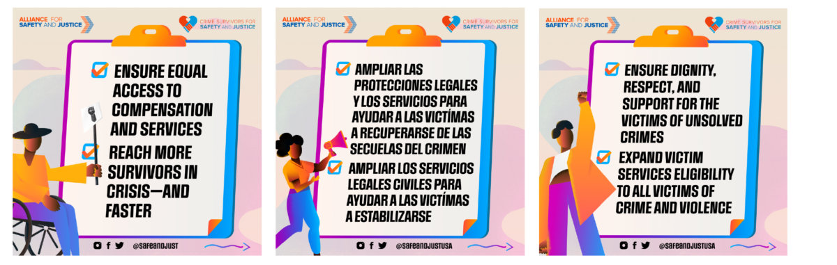
For example, for this social media series for Alliance for Safety and Justice’s ”National Victims Agenda: A plan to address the needs of diverse victims of crime” it was important to illustrate brown and Black people in active poses and with different body shapes and abilities. It was important to add a lot of bold and colorful colors since so often people of color can be illustrated in a muted scene with washed out colors, making the overall mood heavy.
What are some key ideas you keep in mind regarding inclusive representation in illustration?
RAFFI: The most important lesson for me is cultural humility and competency. It’s so important to keep actively learning about different struggles, people, cultures, etc., so that I can deconstruct my own biases which directly inform how I illustrate. Being committed to authentic representation is part of my process. I like to find out why a brand may be choosing to include or exclude certain groups and fill in those gaps.
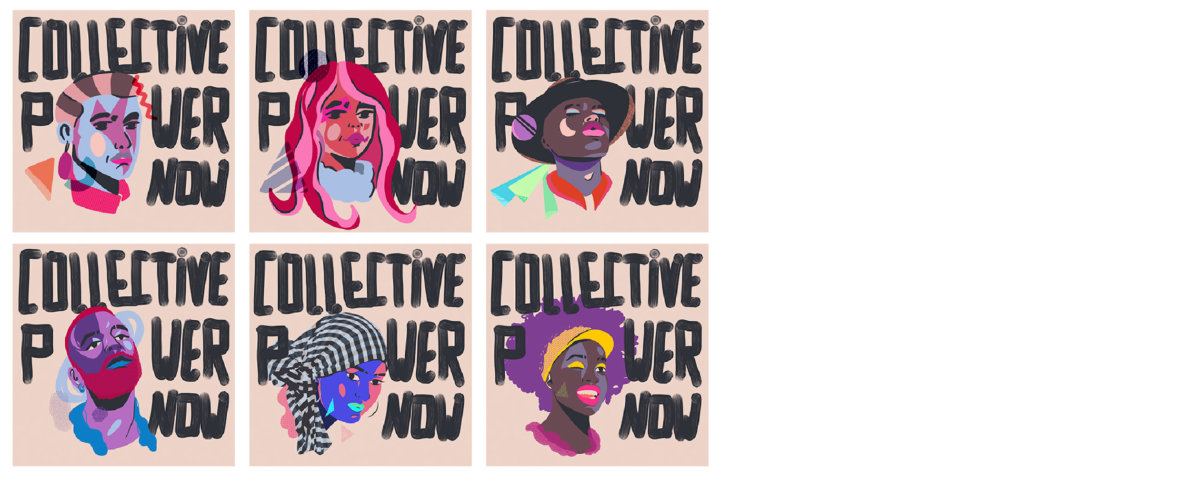
On the topic of inclusivity, we’ve noticed a decrease in what was a prominent trend around illustrating people in ambiguous colors and shapes, rather than actual human attributes. What are some trends you’ve noticed lately regarding the diverse representation of people in illustration?
RAFFI: I think many designers and brands have pushed the unrealistic and “universal” forms of illustrations away. Illustration systems like Alegria (aka Corporate Memphis, see article link in question above), are social colorblindness: if characters are purple and polka dotted then we don’t have to face our own contribution to exclusion and oppression.
I’ve noticed more and more brands stepping up and hiring artists that tend to be in the margins like illustrators of color, queer, and with disabilities. These hires are fundamental to having a team of people who can tell stories authentically. Characters look more familiar in terms of shape, skin tone, and accuracy of identity, instead of elongated limbs and rainbow colors for skin.
There’s a time and place for bright, colorful characters that are more about vibrant expression rather than accuracy. These illustrations rely on other “identifiers” as authenticity, for example, hairstyle, clothing, accessories, body, and facial features.
Anything else for nonprofits to keep in mind?
RAFFI: Make sure that the internal culture matches the external culture: if you’re putting out into the world illustrations of a diverse group of people but the only people in power at your organization are white, able-bodied cis men or women, pump the breaks and work from within to make changes. Hire people who are invested in the communities you’re serving, rather than hiring illustrators simply because of their style.