Note: This post is republished with permission from Connect Humanity's blog.
Connect Humanity is excited to launch the first ever data dashboard on the barriers facing civil society organizations and the people they serve.
On Tuesday, May 16, Connect Humanity will host a short live demonstration of the data dashboard, with examples of how you can use it in your work. Register to join us.
In 2022, Connect Humanity, in partnership with the TechSoup Global Network, Civicus, Forus, WINGS, NTEN, and others, conducted the largest mapping to date of the digital capacities and gaps of civil society organizations and the people they serve.
The survey, disseminated in 26 languages, was completed by over 7,500 civil society organization (CSO) participants from 136 countries, collectively representing over 190 million people. With digital equity as our framework, we presented their responses in the State of Digital Inequity report — the most comprehensive report to date on the digital barriers facing civil society organizations and the people they serve.
Now we’ve launched an interactive data dashboard to ensure others can benefit from the data shared by survey participants and to further understanding about the state of digital inequity.
Explore the Data
The dashboard lets you explore the data by geography, with drop downs to filter data by country or region. You can also select data groups for comparison — such as Chile and Canada, or Ghana and the Global Average — to compare capacities and challenges across geographies.
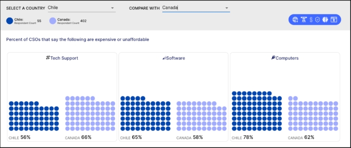
Screenshot from dashboard showing comparison function, with Chile and Canada
The data dashboard has four tabs: 1) the landing page with background information on the digital equity framework used to conduct and categorize the research; 2) the interactive dashboard; 3) a database of anonymized comments from survey participants; and 4) a methodology.
There are many reasons why we wanted to make the data available in a dashboard. Here are a few.
This Isn’t Connect Humanity Data — It’s Yours
When 7,500+ civil society participants take the time to share their experiences, we think we have a duty to make that data available to others. That’s why we promised to do so when we launched the survey.
We Want You to Use It!
Oftentimes, a huge amount of energy goes into research, only for it to be put into a report that’s rarely read. We hope this data will be used and be useful to as many people as possible. And so, while we’re proud of the report (you can read it here) this dashboard is a way to explore the data in another digestible and practical format. We’re thankful to the partners whose funding let us build it.
It Creates Space for Others to Do New Things with the Data
The data contains a wealth of information and insight — only some of which made it into our report. This research can be useful for people working across a range of sectors and institutions, from nonprofits and funders, to governments, schools, hospitals, and beyond who can all play a role in developing solutions to the digital divide. The dashboard is a flexible tool for you to use the data to support your goals.
We included all the data we had — even if a country has only one or two responses. Why? Because we hope you’ll use this to build your case for advancing digital equity and securing the funds to do so. Together we can build an even better dataset in the next iteration of the survey.
Finally, we have made the original questions available in all 26 languages here in case you want to run all or part of this survey for yourself. And, if you’d like a custom slice or analysis of the data by another grouping other than geography (such as program area), get in touch: community@connecthumanity.fund.
This is your insight into the needs of your organization and community. We hope you will use it. Explore the data dashboard.
Join us Tuesday, May 16, for a short live demonstration of the data dashboard, with examples of how you can use it in your work. Register now.