Share this article

Digital marketing is the norm now, and today nonprofits of all sizes are expected to have professionally designed websites. Of course, few professionals out there are experts in nonprofit website design, but fortunately, you don’t need to be to create a killer website for your organization.
Some aspects of nonprofit website design are complicated and require a deep understanding of coding languages. However, many of the essentials only need a little research and a basic eye for design and user experience.
If you’re unsure about your web design expertise, rest assured that your own experience browsing professional websites has likely already helped you form a solid foundational understanding. You might just need a little professional help to put it together into words and concepts you can apply to your own website.
To help you get started, we’ll explore tips and tricks of nonprofit website design by answering these four questions:
- How can good design help your nonprofit?
- What does nonprofit website design encompass?
- What should a nonprofit website include?
- What are the best practices of nonprofit website design?
As you read through these best practices, consider how you can apply them to your own nonprofit website. While some advice might require help from a professional web developer, many of the tips in this guide can be applied yourself. Let’s get started!
How can good design help your nonprofit?
A strong website design sends a message to your supporters telling them that your organization is modern, dynamic, and financially healthy. It creates a strong sense of professionalism and will make donors feel more confident about making a contribution.
Research has shown that good design can help nonprofits earn more and higher donations. 70% of donors are more likely to give a second time to a branded page, and donations made on branded pages are on average 38% larger than those given through generic pages.
Plus, a strong website design is easy to navigate and can help your supporters learn more about your cause and how to get involved faster than they could with an outdated design.
What does nonprofit website design encompass?
Website design is a broad term and includes a variety of elements from design choices and content to user experience (UX). For nonprofit organizations, design choices will center around how their design can:
- Help convey their message in a memorable and easy to understand way.
- Earn increased donations and create a positive giving experience.
- Make their website easy to use through UX choices.
Your design will also include aesthetic and marketing elements to help draw visitors in, such as images, videos, and graphics. When designing your website, think about how all of these elements can work together to create one cohesive experience

What should a nonprofit website include?
No two nonprofits are exactly the same, so every nonprofit website out there will need to include at least slightly different content and design elements. However, nearly all nonprofits share many core website design choices to help facilitate common user actions, such as making a donation.
To help your nonprofit plan your new website or take inventory of your current one, here are eight aspects of website design to look out for:

1. An easy-to-find donate button
Creating an easy, streamlined donation process should be one of your website’s top priorities. Make sure every page on your website has an easy-to-find donate button by:
- Using effective color contrast. Our eyes are naturally drawn to bright colors that contrast with their backgrounds. You can use this principle to play with your website’s color design and create a bold donate button that doesn’t clash with the rest of your color scheme. For example, if your nonprofit’s colors are red and white, you might make a mostly white header with a bright red donate button to make it pop.
- Placing your donate button in locations that make it stand out. Fundamental UX principles have trained many website visitors to look for things in a few specific places. This means that most of your donors will likely first look to your menu and the upper corners of your website for your donate button. Make sure you meet their expectations by placing it in one of those spots.
- Embedding a donation form directly onto some pages. Some nonprofits go a step further to earn donations and embed their donation form right onto key pages, such as their homepage. This ensures that your donation form will be impossible to miss and that supporters will have multiple places on your website where they can complete a donation. If you’re interested in this strategy, make sure to partner with a fundraising platform that lets you easily embed donation forms (like Qgiv!).
Don’t forget about your donation page’s design either. Once visitors navigate to your donation page, what they find should have the same level of high quality design as the rest of your website, creating a seamless giving experience.

2. Simple, clear site navigation
A website’s menu and navigation system are some of the most important aspects of its UX. A helpful menu allows visitors to find what they need quickly and easily, while a confusing one can lead to visitors exiting your website entirely.
You can create a simple, user-friendly navigation system by:
- Using a sticky navigation. Sticky website elements “stick” to a user’s screen as they scroll, ensuring they are always available. For your menus, a sticky navigation ensures visitors won’t need to scroll back up to the top of the page to find key links to the rest of your website.
- Keeping dropdown menus limited to one level to avoid burying pages. Dropdown and submenus allow you to provide easy access to more of your website from your otherwise limited navigation space. However, sub-submenus can test visitors’ patience and might result in pages getting buried. Avoid this by keeping all dropdown menus to just one level.
- Limiting main navigation links to 2-3 words. Your menu items should have specific titles that indicate their general content, but make sure to keep them short and to the point. Long menu links can lead to navigation menus that look odd or even format poorly on mobile devices.
When creating your navigation, put yourself in your visitor’s shoes. This will require thinking about what a visitor is most likely to look for on your website and how they’ll try to find it.
For example, a visitor interested in learning more about your organization may have the first instinct to go to your about page when the information they’re looking for might be under a different label such as “mission” or “our work.”
Making these calls isn’t always easy, so consider doing some user testing when first setting up your menus to make sure you and your visitors are on the same page for your navigation.

3. Your nonprofit’s story
Donors give to organizations that have a story they connect to. Your website is one of your nonprofit’s strongest tools for conveying that story in a unique, engaging way. Get creative with how you present your story through your website design by using different types of media, including:
- Videos
- Infographics
- Photos
- Testimonials and quotes
- Case studies
For your text-based content, make sure to tell your nonprofit’s story using “you” language, which centers the story’s focus on donor impact rather than your organization. This helps donors envision themselves as heroes of your story better than “we” language as they can visualize themselves making a difference rather than communicating a more generic sense of helping your cause.

4. Impact statements
To help explain what your nonprofit does and why your cause matters, your website should include several impact statements. Impact statements are brief statements that explain the impact your nonprofit has made in fulfilling your mission, often using statistics and quantitative measurements to give visitors a frame of reference.
Here are a few examples of effective impact statements nonprofits might feature on their website:
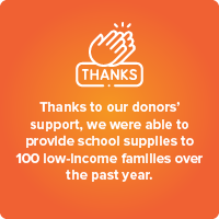
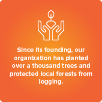
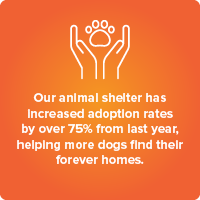
These statements explore several different strategies, including attributing the impact to the donors. Just like using “you” language as previously mentioned, this approach centers donors as the nonprofit’s focus, helping build new relationships and maintain existing ones.

5. Clear calls-to-action
When used well, calls-to-action are effective statements that encourage supporters to complete a specific task on your website such as donating, volunteering, or even just signing up for your newsletter to learn more about your cause.
However, nonprofit website design experts warn that too many calls-to-action can end up cluttering your message. After all, when every element of your website demands your visitors do something at that very moment, each successive call will feel less and less impactful.
Not to mention, treating everything with equal importance can confuse donors as to what actions actually matter most in making a difference. Avoid this by choosing a select few calls-to-action that align with your organization’s current goals. For example, if you have an upcoming event, you might switch a few of your email signup calls-to-action to instead encourage guests to buy an event ticket.

6. Indicators to make your donors feel secure
Unfortunately, sometimes scammers masquerade as nonprofit websites. This can make your donors feel unsure about giving out their sensitive financial information, even to legitimate organizations.
However, there are steps you can take to protect your donors from fraud and help them feel secure:
- Brand your donation page. If your donation form opens in a new window or navigates your supporters away from your main website, they may become unsure about who they are giving their hard-earned money to. Add your logo, colors, and other brand details to every aspect of your donation process to create one streamlined giving experience.
- Choose a PCI compliant donation processor. PCI compliant donation processors protect your donors from having their information stolen. Research donation processors and choose one that has verified safety standards. Plus, consider including information on your donation page about what you’re doing to keep your donors safe so they can feel more at ease about giving you their information.
- Embed your donation form into your website. Another solution for reassuring your donors is to add your donation form straight to your website. After all, when your donation form is on your homepage right under your logo, there can be little doubt who their donations are going to.
Additionally, make sure you have cybersecurity measures in place in the event of a data breach. These will usually include a plan to stop the attack as soon as possible and how to contact impacted donors and explain the situation. You can also consider cybersecurity insurance if your nonprofit is concerned about potential financial damages.

7. Matching gifts options
Your supporters’ donations can go further with matching gifts. Matching gifts are additional contributions made by your supporters’ employers when their employees give to charitable causes. In other words, matching gifts are essentially free money for nonprofits.
You can start collecting matching gifts by adding a searchable database to your donation page. Donors can then use it to find their employers and discover if they are eligible for a donation match. If they are, some databases may even help point donors to the necessary forms they’ll need to fill out to process their matching gift request.

8. Make sure your contact information and social media icons are in the footer
Once a donor reads through all of the content your website has to offer, you can encourage them to continue engaging with your organization with well-placed social media icons. This is why many savvy nonprofit website designs include social media icons in their footers, ensuring that visitors will always have access to the links whenever they reach the bottom of a page.
You may hesitate to direct supporters away from your website with these icons, but insead, social media engagement can be an effective way to promote cross-traffic between your website and your social media accounts.
Supporters who discover you on social media will be likely to visit your website, and visitors from your website might hop over to social media to start sharing your posts, inspiring even more people to visit your website.
What are the best practices of nonprofit web design?
Nonprofit website design can be thought of as more of an art than a science. And although what makes a strong design can be subjective, there are many website design principles that are generally considered to lead to better web browsing experiences.
To help your nonprofit improve your website design and learn a little about why these strategies work, here are thirteen best practices to consider when designing your website:

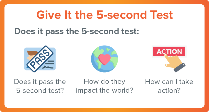
1. Do a 5 second test
People move fast when browsing the internet, and few visitors will give a website more than a few seconds to catch their attention. You can make sure your website conveys everything fast-moving visitors need to know by conducting the five second test on your homepage.
The five second test is a method for gauging your website’s ability to convey information in a quick and engaging way. You can conduct it by taking the following steps:
- Recruit a willing volunteer who is unfamiliar with your website.
- Set a timer and pull up your website.
- After five seconds, ask them to tell you what your organization is about and how they can get involved.
If your volunteer doesn’t have an answer, that’s your cue to start brainstorming ways to make your website’s design more effective. After the initial five-second viewing, you can also ask your volunteer more questions to get a deeper understanding of what is and is not coming across in your current design. Ask questions like:
If your volunteer doesn’t know or has an incomplete understanding of one of these questions, then start your redesign focus there.

2. Know your audience
Your website should be as closely attuned to your visitors’ interests as possible. This can help you convert more visitors into donors and help you build up a core audience of supporters. However, before you can design your website with your audience in mind, you need to know who your audience is.
Audience and market research can be conducted through a number of methods, but we recommend these three standards that work specifically for nonprofits:
- Use previous donor data. As you interact with donors through their contributions, engagement rates, and event attendance, you should collect data on them. This information can be used to create a more tailored donor experience both to individuals and your base as a whole. For example, if you notice that your donors have a high text-to-donate donation rate as compared to your regular online donations, you might consider adding your text fundraising number to the top of your homepage.
- Create donor personas. Marketing to a crowd of people is far more difficult than marketing to an individual. To help you better conceptualize your core audience, consider creating donor personas. Personas are fictional representations of your donors that have many of their shared characteristics. Organizations with diverse audiences often create multiple personas to ensure they are appealing to their entire audience. For example, your organization might create a persona that reflects your older supporters who are in retirement and another persona who represents your younger, more active support base.
- Use the donor journey to guide your website creation. Sometimes it can be helpful to think of your website as a place that donors visit to complete specific tasks. For many of your donors, this will (or at least should) be donating. Take a moment to put yourself in your donors’ shoes and envision how they would navigate a nonprofit website to decide whether or not to make a donation. Additionally, collect information on how and why your donors give, as the more data you have, the more informed your design decisions about the donation process will be.
Learning about your audience is an ongoing process, and what you know may change over time as your audience grows, gets older, and develops new interests. Ensure you have strong data management and collection practices in place to gather information continuously, providing insight for future website updates.

3. Just say no to auto-playing videos
Strong nonprofit website design catches visitors’ attention, but not every method for attracting your visitors’ eyes is a good idea. Auto-playing videos, especially ones with sound, tend to irritate visitors more than they entice them.
While silent, slow moving visuals can be attractive headers, fast-paced, bright, and loud videos can be both an annoyance and an accessibility hazard. Ensure videos on your website can be stopped and started at your visitors’ discretion and have easily accessible subtitles and transcripts for visitors who may be hard of hearing or are navigating your website with a screen reader.

4. Keep it simple
Minimalist website designs are popular for a reason. While you likely have a lot about your organization and mission that you want to tell your visitors about, too much information can be overwhelming and inadvertently cause nothing to stand out.
When planning your website layout take the following design principles into account:
- Display only copy and images that are immediately relevant. A variety of text, photographs, and videos can help make a website feel interesting and dynamic. However, as you design your website, you will likely need to be selective about what pieces of content to include. Choose only the copy and images that are relevant to your visitors’ current goals, and don’t hesitate to cut unnecessary elements.
- Use white space. White space, margins, and other content-less spaces on your website might seem like a waste. However, these blank spaces give your visitors’ eyes a chance to pause, helping them to take in your content in manageable pieces. This means that strategically placed white space can help your visitors avoid getting overwhelmed and help them better understand your content.
- Choose a non-distracting background. Patterned and brightly colored backgrounds certainly catch the eye. But do you want your visitors looking at your website’s background instead of your content? Simple patterns can add a lot to your website’s overall look and feel, but ensure that whatever background you do choose remains firmly in the background.
Remember that for nonprofit website design, less is often more. With fewer options, your visitors will be more inclined to engage with the limited range of pages available, which will likely include your information and donation pages.

5. Pay attention to hierarchy
When designing your website ask yourself what you want your visitors to see first. Content placement and hierarchy will shape how visitors interact with your website and what elements will seem important to them.
You can improve your website’s hierarchy by:
- Placing the most important content higher up on the page. The section of each page that is visible without scrolling is referred to as “above the fold,” a name derived from newspaper folds, with items above the fold being most important. Just like with a folded newspaper, your website’s visitors will decide if they want to read further based on what they see above the fold. Ensure that your most important page elements will be noticed by placing them in this section of your pages.
- Leaving space around important content. Placing content close together will make visitors assume that the elements are related or of equal importance. Ensure that your most important elements, such as your donate button, have dedicated space on all sides to signal their unique importance.
- Using descending headers as needed. Your visitors will use your headers and subheaders to help guide how they follow your content. Using appropriate headings creates a more logical reading experience and also helps improve your website’s accessibility. Ensure each page has only one H1 and that H2s are above H3s, which are above H4s and so on.
Strong visual hierarchy will help visitors navigate your website, and strong technical hierarchy will help search engine crawlers read your website. This means that maintaining good hierarchy best practices can help your page’s overall search engine rankings, potentially gaining your organization more organic traffic.

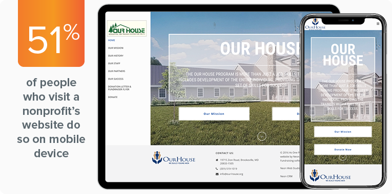
6. Mobile optimization matters
Research shows that 51% of people who visit a nonprofit’s website are doing so from a mobile device. Subsequently, it makes sense that mobile-responsive donation pages yield 34% more donations than unoptimized ones.
Make sure that your nonprofit isn’t turning away your potential mobile audience. Create a website that is fully functional on all devices. You can improve your website’s mobile friendliness by:
- Creating large, easy-to-click buttons. Computer mouses are more nimble than fingers, which are naturally less precise and don’t allow users to click specific pixels. Avoid frustrating your users by making sure all buttons, links, and navigation elements are large and easy to click.
- Ensuring that data fields can be easily filled out on a mobile device. Information fields can be more difficult and time consuming to complete without a keyboard. Improve your mobile users’ experience by offering more multiple choice options and requiring fewer questions that need a typed answer.
- Resizing and compressing images to optimize page speed. Mobile browsing is popular as it can be done quickly and while on the go. This means that your visitors will be expecting fast load times. A page with too many large images can slow your load times. Compress images for mobile usage and even consider removing unnecessary ones to create a faster browsing experience overall.
- Using large, easy-to-read fonts. Screen size will impact what visitors are able to notice on your website. With an already small phone screen, your visitors may need a bigger font to read everything clearly.
In addition to these positives, make sure your website is also following fundamental mobile design principles, such as reducing both horizontal scrolling and the need to zoom in and out to see content properly.
Fortunately, most modern website builders and website themes automatically take mobile optimization into account. However, if yours doesn’t, consider reaching out to a nonprofit website developer to reformat your content for mobile.

7. Keep it visually interesting
Modern websites are visually dynamic and engaging. While you can deliver all of your most important information about your nonprofit through text alone, doing so can create a monotonous and generally unappealing website design for your nonprofit.
Here are a few elements you can use to add visual interest to your website:
- Custom fonts
- Animation
- Icons
- Photos and images
Additionally, consider how your website uses color. Your brand colors will dictate much of your website’s overall color scheme, but you can get creative with a simple palette to make a more visually appealing experience and strategically draw attention to important elements.
For instance, many websites will have a color palette of two or three colors for their backgrounds and text. Then, they’ll add one or two contrasting colors to draw attention to important content, such as their donate button. If you’re not confident in your eye for colors, websites like Coolors and Canva can be helpful for choosing a cohesive palette.

8. Use responsive design
Some organizations create separate mobile-friendly versions of their website, while others invest in one responsive website design. Websites with responsive design work on every type of device, including desktop, mobile, and tablets. Responsive design gives your visitors added flexibility in how they access your website, which has the potential to increase your overall audience and donation revenue. In fact, research has shown that donors are 34% more likely to give to websites with responsive design.
Follow mobile optimization best practices, and ensure your website is set to adjust to all sizes of screens. You can view how your website will appear on different size screens on your desktop, allowing you to make more specific changes for various screen types.

9. Be wise when using pop ups
When used strategically, pop ups can be an inventive way to encourage increased engagement. When used poorly, they can be annoying and distract from your content. This doesn’t mean you should swear off pop ups altogether, but instead, carefully consider where and when they can make the most impact on your visitors’ web browsing experience.
Here are a few ways you can ensure your pops up are helpful for visitors rather than irritating:
- Time your pop ups. Many plugins, modals, and other tools for adding pop ups based on your CMS will allow you to set when pop ups appear. For example, some pop ups can be set to appear after a certain number of pages are visited, if a visitor scrolls past a certain point on one of your pages, or after a specific action has been completed.
- Don’t have it open in a new window! Pop ups that open new tabs or windows will look like spam, and might even make visitors question your website’s professionalism and validity.
- Whether a pop up or an alert banner: just use one! Alert and notification banners are useful for quickly drawing your visitors’ attention to one element of your website. If your pop up aims to draw attention to the same content as the alert banner, instead of reinforcing the message, you’re more likely to annoy your visitors.
Additionally, consider how you use pop ups for different devices. On mobile, it can be much more difficult for users to exit out of pop ups. Mobile pop-ups can also hurt your website’s mobile search rankings for search engines like Google.

10. Use consistent branding
Your website is one of your nonprofit’s core outreach tools, and its design should fully represent your brand. Plus, while social media websites and other third-party channels might restrict your ability to represent your organization’s brand fully, your own website has no limitations.
Ensure your entire website follows a consistent branding scheme that includes your choices in:
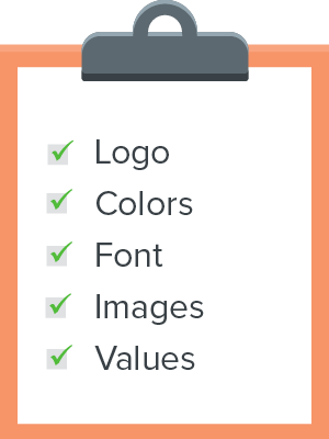
- Logo
- Colors
- Font
- Images
- Values
While uses for these visual elements are likely the first thing to come to mind when you consider your brand identity, don’t neglect the power of strategically presenting your organization’s values.
As mentioned previously, your nonprofit website design can be used to convey your organization’s story and impact in unique and memorable ways, which can make a difference for supporters on the fence about donating.

11. Accessible design is imperative
Your nonprofit’s website needs to be accessible to all of your visitors. If your website isn’t you may be inadvertently turning away potential supporters, limiting your audience. Plus, search engines tend to reward websites that follow accessibility guidelines with higher rankings in search results.
While the Americans with Disabilities Act does not explicitly apply to websites, it can be a useful checklist for determining if your website is accessible to all visitors. Specifically, it advises organizations to review their websites for:
- Images without text descriptions. Every image, video, and graphic on your website should have alternative text. Alternative or alt text is a basic text description of visual elements that allow visitors using assistive technology to get a general idea of what the non-text element looks like.
- Documents that are inaccessible for screen readers. Screen readers are great at picking up text written on a web page. However, text that is written in formats such as images and PDFs is unreadable for these types of assistive technology, and you’ll need to provide a plain text equivalent to maintain good accessibility practices.
- Color contrast. Poor color contrast or color contrast that relies specifically on shades of green and red can be hard to read for some of your visitors. When choosing colors, test your page in grayscale to ensure everything is readable.
Additionally, take extra care when formatting your forms. Donation and registration forms have many potential pitfalls when it comes to accessibility, including disappearing directions, missing labels, and lack of well-marked required fields. Use a web accessibility checklist when reviewing your website to ensure no key elements get overlooked.

12. Don’t forget that receipts and confirmation pages matter
With so much focus on getting visitors to your donation page, it’s easy to forget the steps that need to be taken after the donation is made. Once a donation is processed, your donors should immediately be greeted by a confirmation page thanking them for their contribution. This ensures they won’t second guess if their gift actually went through and is also your first chance to say thank you.
Donation receipts contain relatively straightforward information, such as your organization’s name, your donor’s name, and the amount donated. While you don’t need to add anything else to your receipt or confirmation pages, this can be an opportunity to make a strong final impression. A particularly effective confirmation page might even persuade one-time donors to give again.
Some nonprofits use their confirmation pages to try and upsell by marketing merchandise or recurring giving opportunities. By contrast, others focus solely on saying thanks and emphasizing their organization’s brand with photos and key visuals that represent their mission.

13. Speed matters
Modern nonprofit websites are expected to be dynamic, engaging, and fast. In fact, Google rewards websites with fast load times in their search results rankings and recommends all websites aim for a load time of just 2-3 seconds. Websites that take longer than three seconds are at risk of seeing significant drop-offs in traffic.
You can ensure your website’s load times stay short by:
- Keeping plugins and javascript to a minimum. Plugins, javascript, and other add-ons to your code can provide your website with new, engaging functionalities. However, ask yourself if every element is necessary, as too many—or even just one poorly-optimized piece of code—can end up slowing down your website.
- Optimizing images. Images often take the most time for websites to load. You can increase your page speeds by resizing and compressing your images. For flat color images, you can compress them and maintain quality by making them a png or gif. For photos, save them as jpegs with a quality percentage of 60-70%. Lastly, for high quality images like your hero image, use free online tools like tinyjpeg.com to save file space without distorting the image.
- Using Google PageSpeed insights to test your pages. After you’re finished making your page adjustments, use Google PageSpeed to test your load times. That way you can see if your changes really are making a difference or if you need to keep working to find a faster solution.
As your website grows and you add more content remember to check your page speed times regularly. More content gives your visitors more ways to engage with your organization, but it will also give their browsers more to load.
Best Nonprofit Website Examples
Developing your website from scratch can be difficult without a little guidance. Remember, you’re telling your organization’s story through your website design, and it’s often the first real impression supporters get of your organization. Here are a few examples of dynamic and well-organized nonprofit websites you can check out and draw inspiration from.
Kuda Vana Partnership
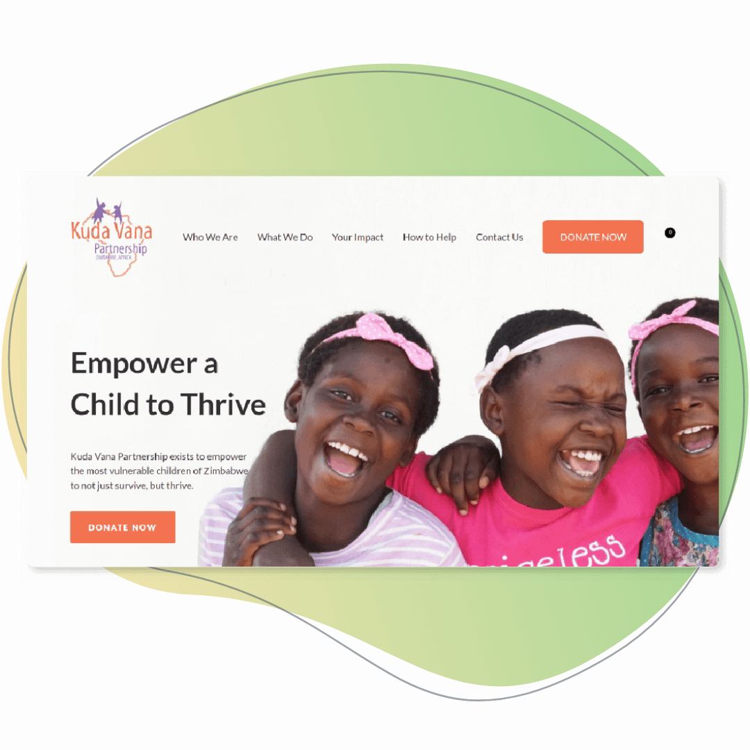
The Kuda Vana Partnership’s website is a dynamic and engaging look into their organization and the work they do. To make their donation button easy to find, they placed it in the top right-hand corner of their homepage and colored the button orange so it stands out. Next to their “Donate Now” button, the Kuda Vana Partnership placed their site navigation bar. Hovering over the various navigation categories pulls up sublevel menus clearly outlining how their website is organized.
Their homepage is broken up into sections. One of the first sections includes statistics about Zimbabwe to emphasize why the Kuda Vana Partnership’s work is important. They also include impact statements from members of their community who benefit from their work. For the sake of transparency with their donors, the Kuda Vana Partnership also features a section that breaks down where donations are spent.
San Francisco City Impact
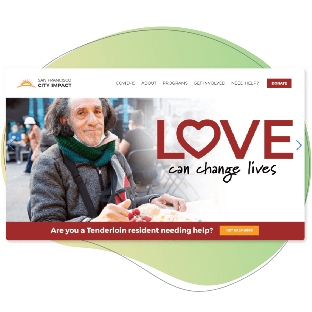
San Francisco City Impact’s website is all about showcasing the impact their organization has on the Tenderloin neighborhood of San Francisco. They have a simple navigation bar that makes it easy to find what you’re looking for. Their homepage leads with real-time statistics about the number of people they help and the number of meals they serve before moving on to a video that explains who they are as an organization. They also showcase ways to get involved with their mission beyond donating.
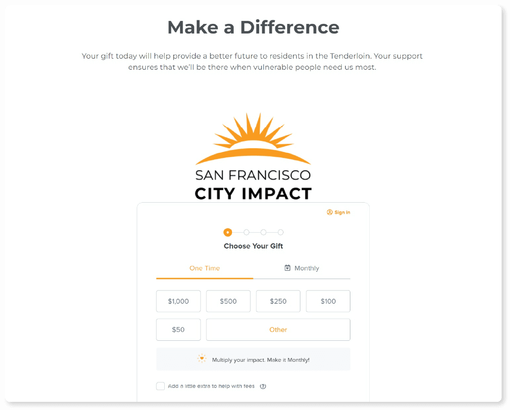
When you click on their “Donate” button, it takes you to a page with an embedded and branded donation form. They’ve included their logo at the top of the donation form and also kept to their brand’s color scheme so donors know they’re donating to a secure donation form. Beneath their donation form, they’ve also provided supporters with a unique way to give to their organization—by donating stocks.
Pet Resource Center of Kansas City
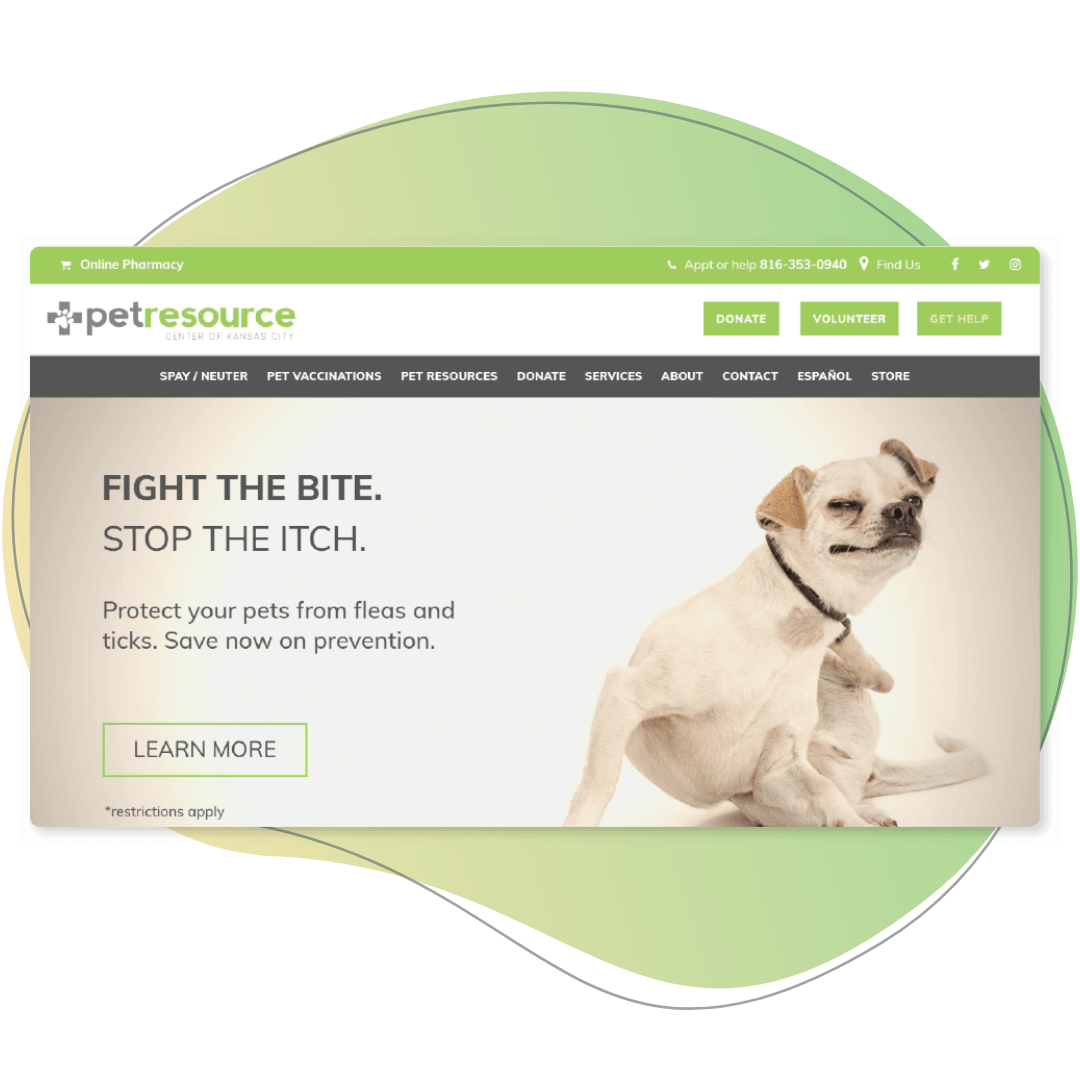
The Pet Resource Center of Kansas City (PRCKC) uses lots of colors and images to showcase their mission through their website. However, one feature that really stands out on their website is the contact information they have in their footer.
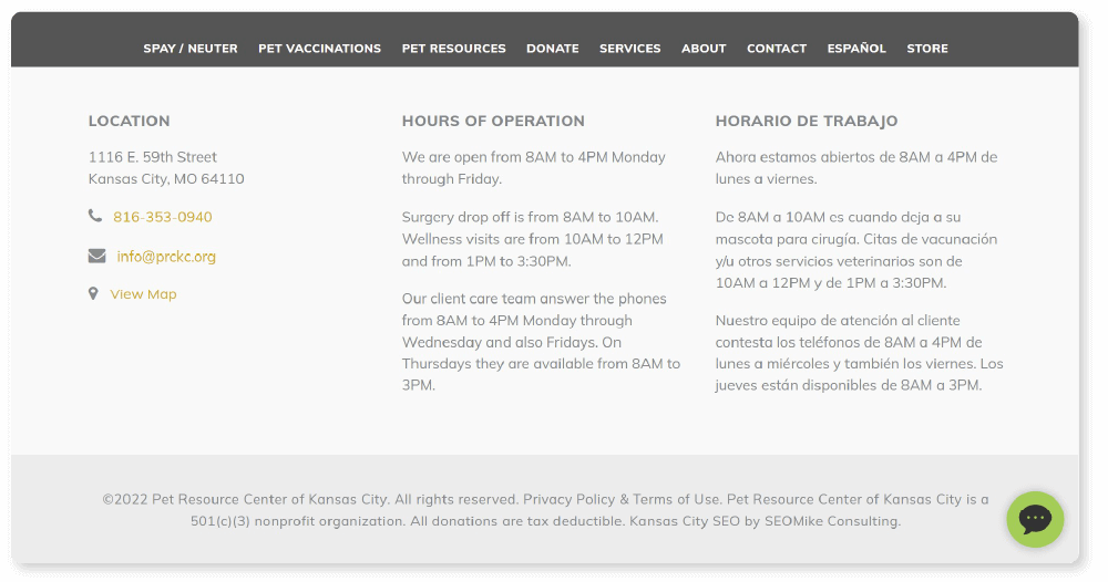
In order to make this section as helpful as they can, the PRCKC includes their location, basic contact information, and more detailed information about their hours of operation. They specify when their facilities are open, when you can drop pets off for surgery and wellness visits, as well as when you can reach their care team on the phone. They also present the information in Spanish to cater to their entire supporter base.
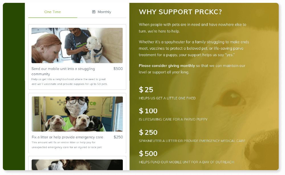
Their donation page is another standout feature of the PRCKC website. In addition to branding their donation page with their organization’s colors, they have also attached photos and descriptions to each donation amount they list. This helps donors better understand how they can make an impact on the organization with their donations. They also provide a list of other donation options from planned gifts to item donations.

Greater Pittsburgh Community Food Bank
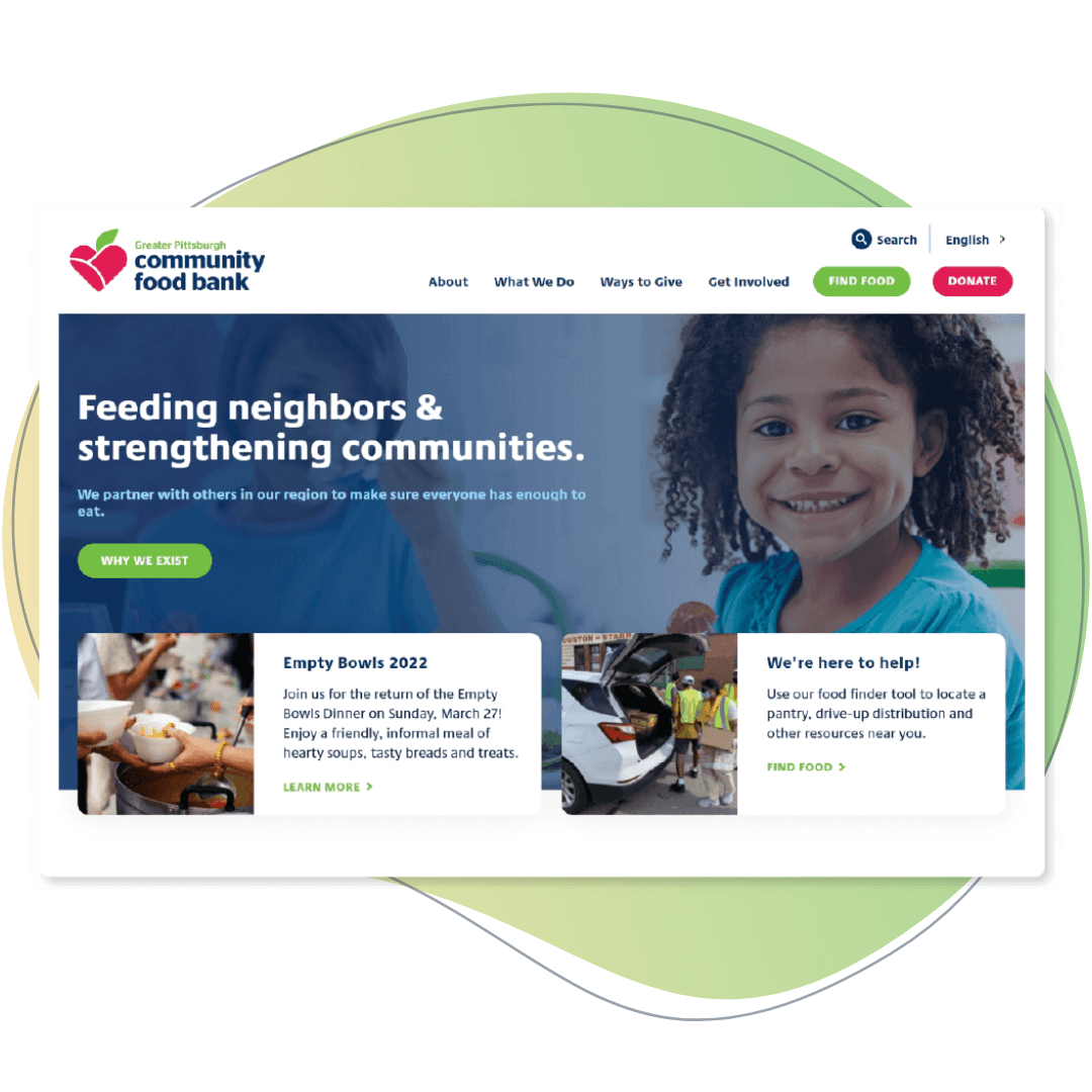
The Greater Pittsburgh Community Food Bank has a dynamic website to display the work their organization does. They feature statistics and stories from individuals who have benefitted from the aid of the food bank so that donors can see how their donations are making a difference. They’ve also dedicated a section at the top of their homepage to donations, where people can easily pick from a selection of donation amounts and quickly get to the donation form.
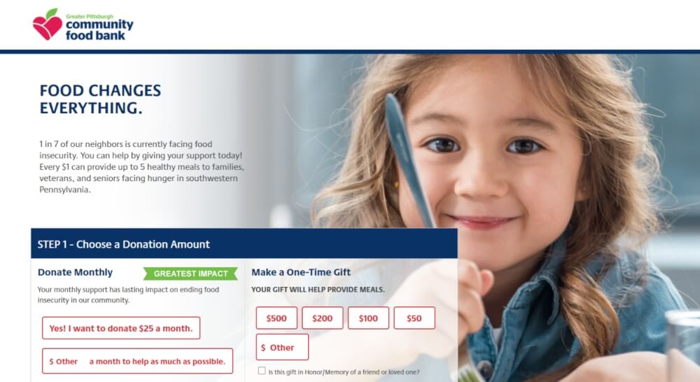
While their donation form isn’t embedded into their website, the food bank uses their organization’s branding and colors to make their donors feel more secure. They provide a short blurb about how donating will help and then feature two giving options upfront—monthly recurring donations, which they emphasize has the greatest impact, and one-time donations.
Providence Animal Center
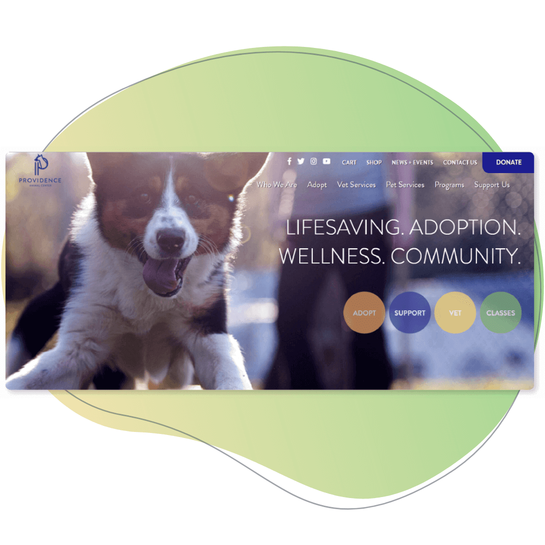
The Providence Animal Center has a simple but impactful website. It’s easy to navigate and every element they use is relevant to their mission and useful for directing people to donate to or adopt from their center. They’ve kept their copy short and made it clear how to find what you’re searching for quickly. Their “Donate” button is highlighted in the top right corner of their website with a dark blue contrasting color that makes it stand out. They also have real-time, updated statistics on their homepage that put numbers to the work that they did in the previous year and the number of lives they’ve saved to date in the current year.
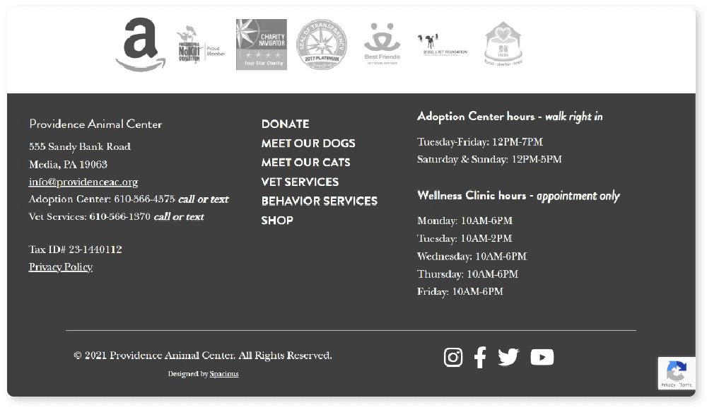
In their footer, the Providence Animal Center provides lots of useful information about their hours of operation for both their adoption center and their wellness clinic. They specify what services need appointments and what services allow walk-ins. Next to their listed phone numbers, they clearly note that they provide both texting and calling options for getting in touch with their organization. Beneath their contact information, they’ve placed large social icons so supporters can reach their many social media pages in a single click.
Final Thoughts
Strong nonprofit website design can do more for your organization than you might first assume. Your design will impact visitors’ first impressions of your organization as a whole and can directly influence whether or not they continue interacting with your content and end up supporting your cause.
Building and maintaining a nonprofit website is a continuous process. Explore possible design options and learn tips and tricks that you can implement yourself to better leverage your content. Here are a few resources with more tips on how you can put your website to good use:
- 25+ Virtual Fundraising Ideas | A Guide for 2021. Virtual fundraisers are here to stay. Learn how you can optimize your website and improve your ability to host them.
- Mobile Fundraisers: Explore Best Practices and Campaign Ideas. Your website should be optimized for mobile use, and with the right application it can become the basis of a successful mobile fundraising campaign.
- End-of-Year Giving: 21 Best Practices for a Great Campaign. The end of the year is a popular time for charitable giving, and your website can help your nonprofit make the most of it to capture new leads and potential lifelong donors.
You might enjoy

The Nonprofit’s Guide to Legacy Giving
Donor Acquisition and Retention

The Ultimate Guide to Social Media for Nonprofits
Marketing and Social Media

70+ Free Nonprofit Resources to Help You Raise More
Nonprofit Management