Three Nonprofits Pioneering Responsive Web Design
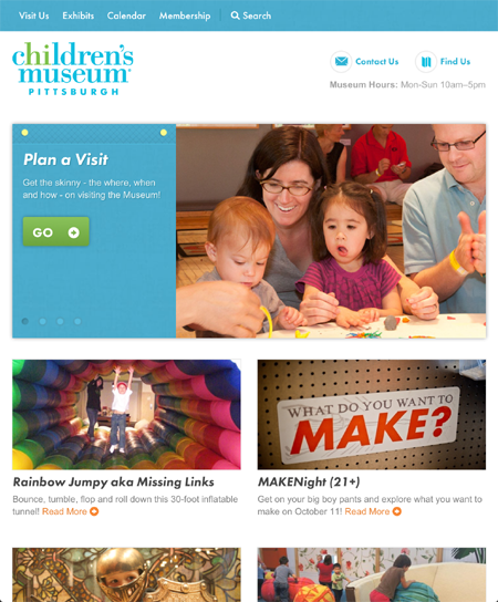
 Responsive web design (often abbreviated to RWD) is defined as an approach to web design in which a designer intends to provide an optimal viewing experience — easy reading and navigation with a minimum of resizing, panning, and scrolling — across a wide range of devices (from desktop computer monitors to mobile phones). Stated simply, a nonprofit website that is responsively designed will alter and format itself depending upon whether the visitor is viewing the website on a desktop, a tablet, or a smartphone. Why is this important? Because recent data from ComScore claims that mobile will surpass desktop in 2014, however, if smartphone and tablet sales continue on their current trajectory, that could easily happen late next year — and from my research, less than 1% of nonprofits are prepared for this fundamental shift in online communications.
If you have yet to view your nonprofit’s website on a tablet or smartphone, do so as soon as possible and be prepared to be a little shocked and somewhat dismayed — and hopefully inspired to take action. Nonprofits have been woefully slow at preparing for the Mobile Web. Responsive web design is rarely discussed or implemented in the nonprofit sector. At least twice a week on social media I see a pitch posted by a nonprofit to visit their new website and the first thing I do is enter their URL into my iPhone and then on my iPad only to sadly, tragically discover that their new website is already out of date from the moment it launched.
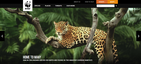
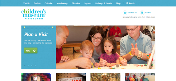
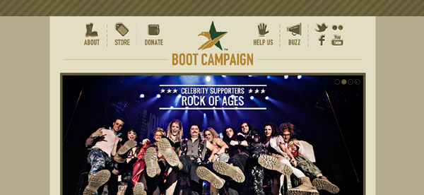
All that said, if your nonprofit is currently in the process of redesigning your website or it’s on the list for 2013, then please prioritize making your website compatible for the Mobile Web. To get you started, you can study the exceptional examples of responsive web design pioneered by the three nonprofits listed below:
1. World Wildlife Fund :: worldwildlife.org
2. Children’s Museum of Pittsburgh :: pittsburghkids.org
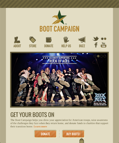
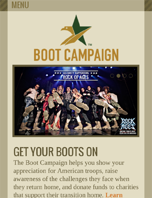
3. Boot Campaign :: bootcampaign.com
Related Links:
Webinar: How Nonprofits Can Successfully Utilize Mobile Communications & Mobile Fundraising
11 Mobile Website Design Best Practices for Nonprofit Organizations
Trackbacks
- Three Nonprofits Pioneering Responsive Web Design « Nonprofit … | inLine Media RSS Blog
- Three Nonprofits Pioneering Responsive Web Design « Nonprofit ... «
- Three Nonprofits Pioneering Responsive Web Design « Nonprofit … | Beachdrop
- Nonprofit Mobile Web Design: 3 Stellar Examples - Nonprofit Hub
- Responsive Web Design « Philanthropy Communication in a Digital World
- Nonprofits use of Mobile Websites « Philanthropy Communication in a Digital World
- レスポンシブ・デザインが美しいNPOのウェブサイト3事例 | NPOのソーシャルメディア活用支援 – テントセン
- 22 Must-Read Updates to Social Media for Social Good: A How-To Guide for Nonprofits « Nonprofit Tech 2.0 Blog :: A Social Media Guide for Nonprofits
- Free Webinar on January 9! Five Reasons Why Your Nonprofit Should Prioritize the Mobile Web in 2013 « Nonprofit Tech 2.0 Blog :: A Social Media Guide for Nonprofits
- Daily Raising Round-up 10-11 - Fundraising Blog - newdc.donorcommunity.com
- What’s All This About Responsive Design?





We are almost ready to launch our new site, which is RWD. So exciting!!
Good roundup of responsive design, Heather. I’ve been talking to others in the sexual health field about making content available on any device through responsive design. If you update your list, please consider adding Sexetc.org as an example of responsive design.
Will do. Thanks. 🙂
I recently launched a new Responsive Web Design for my non-profit client here:
http://www.helpstpauls.com
Their percentage of mobile visits is at 13% and rising.
Hello,
Future 500 just launched its RWD webiste: http://www.future500.org. Have fun playing around with it and feel free to give us feedback!
Kathrin
It’s a cool responsive web design stuff. It’s inspired me a lot… going to design something awesome responsive web designs today. To be sustain in future every web designers have to be experienced with responsive web designs.
Thanks for the update, is there any way I can receive an email sent to me when you write a fresh article?
Thanks. e-Newsletter subscribe it a the top of the blog, on the right.
Informative piece – our small non-profit is making good use of RWD with our recent relaunch: goldininstitute.org
Great post! Here are 20 more examples of cool responsive sites if you are doing research: http://socialdriver.com/2012/07/20-best-responsive-websites/
Good post Heather. While I get the value of RWD for non-profits (i.e., long-term lower costs of management and device optimization for a better UX), we’ve found that organizations deploying RWD mistake mobile optimization for strong UX design. Delivering a powerful UI design with great branding should not be confused with a great user experience. (Apple Maps provides a great case study of a wonderful UI execution but poor UX design.)
What we have found in talking to users of RWD online properties is that the sites are certainly optimized for the device but they often fail to perform the heavy lifting associated with context-driven use cases. So while users are pleased to have access to a legible site, they often can’t easily find what they’re looking for on-the-go or when they’re trying to respond to a TV/radio/outdoor call to action. Consequently, we’re seeing significant traffic dropoffs after the initial page of entry. Now that’s not a reason to avoid RWD but its a caveat emptor to those who choose RWD. Optimization is merely the first step toward developing a great UX. You still need to execute a UX that acknowledges the user’s context and empowers them \ to accomplish their mission in the most efficient manner possible.
Great post! Please check out this great post to learn more about the benefits of CSS in your web design. Extremely important for responsive design and mobile devices! http://www.megantegtmeyer.com/seo-blog/what-the-hell-is-css-anyway
I have read many times where your mobile site should not mirror your desktop site because people visit mobile sites on the go and don’t need so much info. What are your thoughts on this?
Correct. See: https://nonprofitorgs.wordpress.com/2012/09/26/11-mobile-website-design-best-practices-for-nonprofits/
I actually remembered reading your informative article and many others who agree with that. So how do you accomplish this and still use relative design?
I’m wondering the same things as Lori. Our organization is at a crossroads right now, deciding between responsive design or a distinct mobile site that is stripped down for the mobile user’s needs. The responsive design seems to have a lot of advantages to it, but the technology still seems new. Do you think responsive is where mobile sites are heading? We probably won’t have a budget to redo it again any time soon. Would love your thoughts!
I do think responsive design is the way to go. WordPress.org has is built in. If it were me, I’d hire a website designer that works with WordPress.org as a CMS.
While Responsive Design is a viable solution for managing in a multichannel digital world (especially for e-periodicals), using WordPress as a CMS won’t get you there. WordPress will merely optimize your content for viewing on mobile devices but it’s doing nothing more than rendering all of your desktop content on a very small plot of digital real estate.
Which takes me back to my earlier comment…that’s not delivering a great user experience. Your mobile supporter has very specific use cases in mind when interacting with your brand via mobile. You need to create a relevant experience for them that goes beyond providing legible content.
This perspective is shared by the leading retail sites–sites that have undergone extensive split and usability testing. These leading retail sites (e.g., Amazon, Staples, Walmart, Dell, etc.) have developed discrete mobile sites to support the mobile consumer and the priority use case: sales. Their decision to take a pass on simple content re-formatting (i.e., WordPress) and Responsive Design is that the user experience has a demonstrable impact on the UX and hence, performance against objectives.
So, how do these corporations efficiently manage digital content for multiple channels? They rely on CMS systems that help them syndicate content that drives the use cases relevant to the user’s context. The big guys have powerful CMS engines that makes this process manageable. Fortunately, the same digital data syndication is increasingly accessible and affordable for non-profits. These modules allow for easy, efficient content management that’s relevant to the users content.
So can you recommend a good, affordable, mobile-optimized CMS for the nonprofit sector that meets the criteria you suggest? That’s the question I get all the time. In my case, WordPress works just fine, but my content is simple and there is not an online payment requirement.
Muy interesante y lo voy a considerar para mis clientes de diseño de páginas web en Costa Rica. Gracias por el aporte
Very interesting! I will use it for my own clients about web design in Costa Rica. Thanks for the article.
This is a great case study of responsive nonprofit websites. WIth use of mobile increasing at a rapid pace, it’s critical to plan your website for mobile devices, and to make sure you have a solid content strategy to maximize effectiveness of your site on various devices. Here’s some other examples of great responsive designs for nonprofits (for our clients). http://wiremedia.net/7-secrets-3-winning-websites
I like World Wildlife Fund website. Responsive web is the great feature for modern web in 2013
Thank you for the detail explanation about the web design its really good keep sharing….best web design company in USA
Just came along your page. Thank you for sharing your thoughts. We think about RWD for our site (we’re a german npo). But did you realise, that the RWD-approach stops when it comes to the donation site (check at WWF and Bootcampaign). That’s quite bothering I guess.
Thanks. Just tested them on my iPhone and iPad… donation process is responsively designed for the WWF… not for the Boot Campaign on a smartphone.