article thumbnail

How to Design a Fundraising Landing Page that Makes Giving Easy and Inspires People to Give

Get Fully Funded

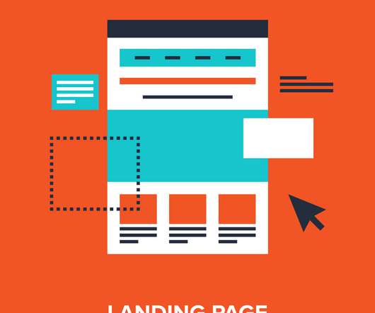
It’s one of the most overlooked places to seal the deal with your donor: the fundraising landing page. . Your fundraising landing page is a perfect opportunity to make a strong connection with your donor. But as important as fundraising landing pages are, they are often dull and transactional. Blah, blah, blah.”.

Giving 119
article thumbnail

Nonprofit Advocacy: 4 Strategies You Should Consider

Get Fully Funded

However, if your nonprofit lacks the canvassing tools necessary for traditional advocacy outreach, you can still reach supporters through multi-channel fundraising. CharityEngine’s guide to multi-channel fundraising advises nonprofits to get in touch with supporters on a variety of platforms, including: Email.

professionals

Sign Up for our Newsletter

This site is protected by reCAPTCHA and the Google Privacy Policy and Terms of Service apply.

article thumbnail

Jocelyn Harmon: People, Words, Technology & Truth: How I Have Fun, Do Good

Have Fun - Do Good

Jocelyn is also a recognized blogger and speaker on online marketing and fundraising. You can read her writing in Fundraising Success magazine and her personal blog, Marketing for Nonprofits. This is the headline of my Twitter account and accurately expresses what makes me happy and keeps me in “ flow.”

Fun 60
article thumbnail

[VIDEO] 4-Step Plan to More Donations and Greater Fundraising Results

Bloomerang

And if you’re watching this recording, I hope you’re having a good day, no matter when and where you are because we are here to talk about the four-step plan to get more donations and greater fundraising results. So like you said, the four-step plan to get more donors to grow your fundraising results. I’m Steven.

Results 81
article thumbnail

Transform Your Donation Landing Pages for Year-End Giving

NonProfit Hub

They have a good headline at the top of the page, and they use a three-column layout that mirrors their branding throughout the site. We changed the headline to convey value, gave the copy contextual placement near the form, and moved the email acquisition form into the eye-path of the visitor.