Share this article

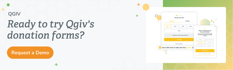
Donating to your nonprofit organization should be easy and effortless! The fewer decisions donors have to make, the simpler it is for them to give. Plus, a painless process means it’s less likely they’ll abandon the donation partway through. However, a clunky donation form with too many options has the opposite effect, frustrating donors and deterring donations. This article will help you design a donation form that reduces decision fatigue by making the process easy.
What is Decision Fatigue, and Why Does it Matter?
Imagine you’ve just spent a long day planning a gala event. You had to choose the entertainment, the venue, the decorations, and the food. And each of those decisions required a dozen other choices. You arrive home, and now you have to decide what to have for dinner. But you don’t want to make any more choices today! That’s decision fatigue. It’s the idea that after making a certain number of decisions over a period of time, we get tapped out and can’t make any more. So we choose the path of least resistance and pick whatever’s easiest.
Your donors may not be planning galas, but they’re making lots of decisions too. And after a long day of decision-making, they need your donation form to be the simple choice. You can help by designing a form that limits the decisions your donors have to make and streamlines the donation process.
How to Reduce Donation Form Decision Fatigue
Reducing decision fatigue for your donors is largely about reducing the number of decisions you ask them to make. The design of the form itself can also contribute by making the process seem simpler and, therefore, more manageable. Read on for our top tips!
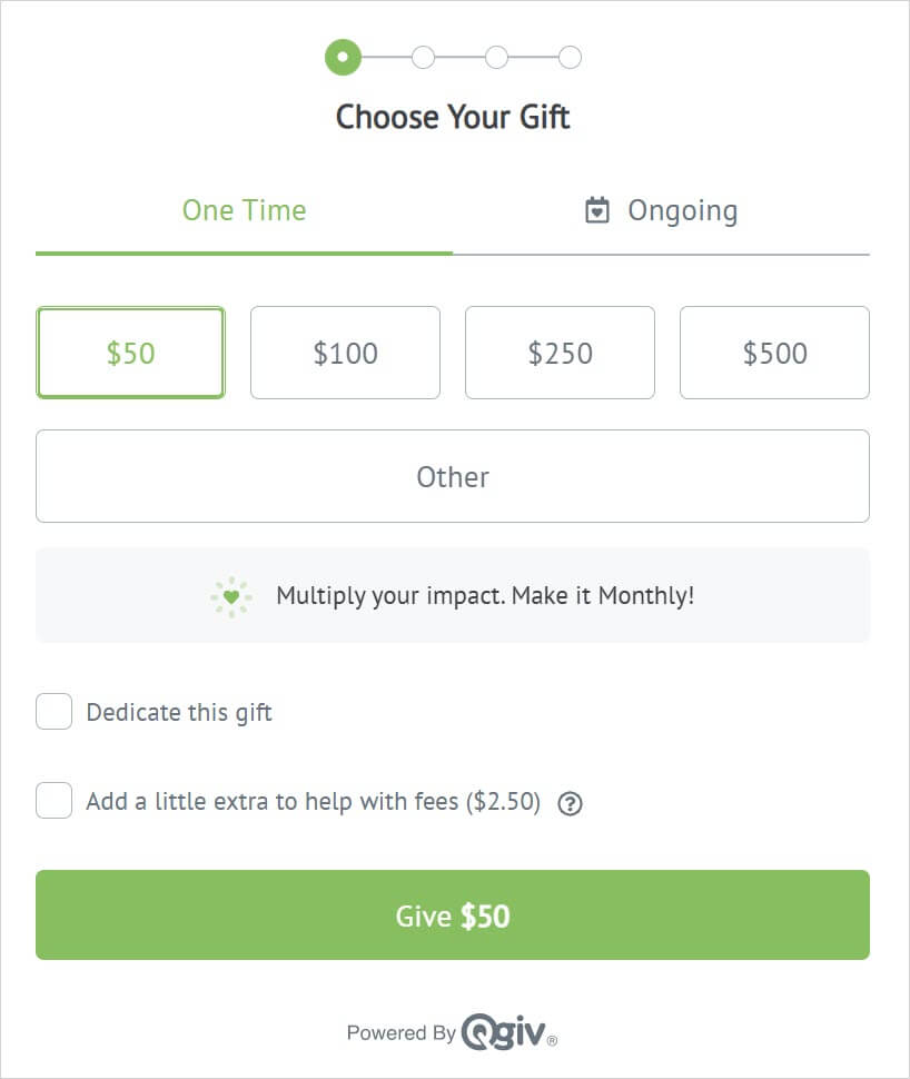
Be intentional about donation amounts
The first decision your donors will make is how much to give! Ideally, your donation form should provide a few donation amount options, but you don’t want to have too many. Try to keep the choice to three or four amounts that you’ve chosen intentionally. How do you pick the amounts?
If you don’t have much historical donation data, you may need to pick your initial amounts a bit arbitrarily. Aim for an “affordable” option, a mid-tier option, and a “stretch” option. Those amounts will look different for every nonprofit, depending on your constituents and how much they’re willing to give, but don’t be afraid to aim a little high. Seeing the option for a larger donation amount can convince some donors to give more than they initially intended.
If you do have historical donation data, look at your average gift size, and consider using that amount as one of the lower options. That way, the donation amounts on your form can help drive up the average gift. Also, even though you want to limit the number of choices, it’s good practice to include an “Other” option for donors who have a specific gift amount in mind.
If it fits your fundraising strategy, you can make things really easy for donors by offering just one option. For one of their campaigns, Communities in Schools of Central Texas set up a single recurring gift option of $12.50 per month for five months.
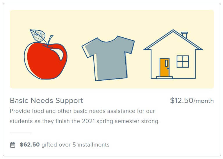
That may not work for your year-round giving form, but it offers a really direct (and easy!) option for donors.
Limit frequency options for recurring gifts
Next up, think about recurring gift frequency. Ideally, every donor will opt to make their gift recurring, sustaining your organization throughout the year. But how many frequencies do you need to offer on your form?
If the majority of your recurring donors give monthly, you may only need to provide a monthly gift option. If you think donors are likely to give weekly or biweekly, it can be useful to provide those options. Just like donation amounts, you should be intentional about the options you include and try not to overwhelm donors with choices. You can also reinforce the value of the options you’ve included by adding impact statements to your recurring donation amounts.
If you’re on the fence about how many frequency options to include, consider offering a “create your own plan” option. That way, donors who have particular preferences about recurring giving can get specific, while more “fatigued” donors can choose a pre-determined plan.
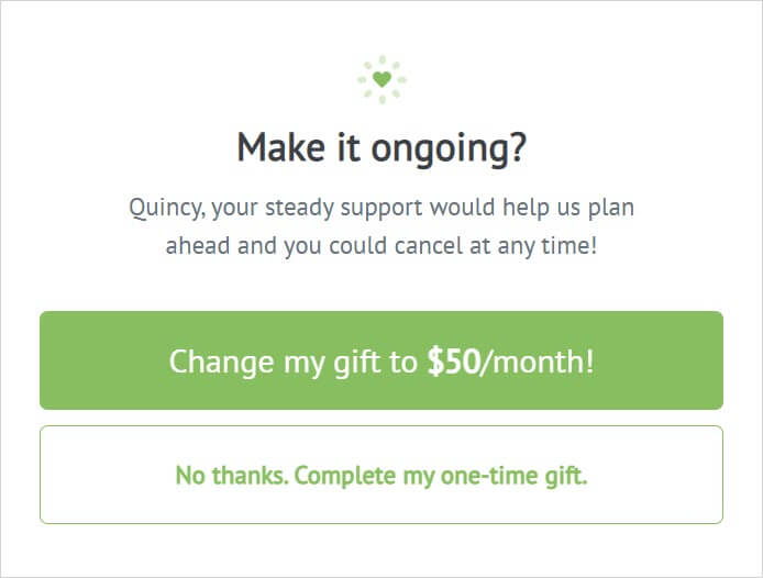
Speaking of recurring gifts, upgrade prompts have been shown to convert one-time donors to recurring. With Qgiv, you can include both a subtle nudge and a pop-up modal to ask donors to upgrade their gift. However, if you want to keep things simple, it’s best to choose one or the other. Having both can overwhelm donors and might stop them from completing the gift.

Use psychology to reduce decision fatigue
Let’s go back to our gala planning example for a moment. Looking at the gala as one big project is daunting. On the other hand, breaking the planning into small, bite-sized steps makes it much easier to complete. This idea is called “chunking.” In the same way that you break your planning tasks into “entertainment,” “catering,” “decor,” and so on, if your donation form is broken down into smaller “chunks,” your donors are much more likely to complete it. Chunking makes processing information easier, which reduces the mental energy required.
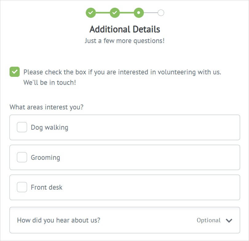
Create a multistep donation form with the “Give” option on the first page. Studies show that once donors make the commitment to give on the first step, they’re more likely to follow through with the rest of the process. Multistep forms increase conversion rates because the rest of the steps become a formality after the donor has decided to give.
Another nice thing about multistep forms is that additional fields can be grouped into their own step, keeping the rest of the form as streamlined as possible.
Combine or remove unnecessary fields
Speaking of additional fields, it’s important to limit those as well. Too many extra fields will make the donation process feel like a chore, increasing donors’ decision fatigue. The fewer the fields, the less likely a donor will give up on the donation partway through.
When limiting unnecessary fields, first review the default fields already set up on your form and make sure you don’t duplicate any. For example, an “opt-in” field for additional communication may already be part of your form by default, so don’t add another opt-in.
Keep in mind that some fields can be removed when viewing the form on a mobile device. The goal here is to gather only the information you need and remove everything else. You can always use follow-up communication if you want to gather more data.
And remember, if you do need several additional fields, move them to a different step of the form, containing them in their own bite-sized chunk.
Final Thoughts
The goal of donation form design is to make giving as easy as possible. Understanding the reasons potential supporters might not give is an important step in figuring out how to encourage giving. Be intentional about the number of options and fields on your form, and use multiple steps to make the task seem simpler. By limiting the number of decisions your donors have to make and keeping your form streamlined, you can reduce decision fatigue and convert more gifts.