


The other day, Matt Sharp shared this link to a social media policy generator called the Social Media Policy Tool. It asks you 12 questions mostly having to do with control and then spits out the biolerplate for your policy. It reminded of the Postmodernism Thesis Generator could spit out a thesis for you in minutes.
Here's the social media policy I created for Beth's Blog. Obviously, this is a just a beginning, not an end. The language, of course, needs to be customized to your particular situation and the biolerplate included may not be relevant. The process around policy - that is the discussion, buy-in, and education - is so critical for effective use of social media. You could do your organization a disservice if you think that the written policy that results from this tool is your final product. And, also it doesn't give you the best practices and tactial tips.
Creating a social media policy or any other organizational policy requires three steps:
- Establish the policy: Determine the policy and what you want to accomplish
- Educate: Important to train or make employees aware of the implications
- Enforce: Less about the top down control, but the fact that you need to consistently use the policy – shouldn’t sit in a drawer
The social media policy tool helps you with part of the of step 1.
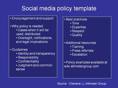
I think it is also very useful to review other organization's policies. Altimeter Group has a good collection (although mostly corporate) on its wiki. I wrote a post almost a year ago with a summary of what should go in a nonprofit organization's policy as well as a roundup of nonprofit and government policies. So, it is a good idea that if you use a short-cut like the policy tool, that you review other policies and think specifically what is needed in your organization's policy. There is also an operational aspect of the policy - all the tips and best practices that should be incorporated.
Does your nonprofit have a social media policy? How did you create an effective one? How did you educate people? How do you operationalise it? Have some thoughts? Netsquared is running a thinktank on this topic and you contribute your ideas here.
Resources from Beth's Blog:
Don't Moon People With Cameras or Atleast Hide Your Face While You Do It by Beth Kanter
Red Cross Social Media Policy and Handbook: A Case Study by Beth Kanter
The Pooch Porch Policy: Does Your Nonprofit Need A Social Media Policy by Beth Kanter
See my other posts on social media policy
Social Media Policies
- ASHA (nonprofit) social media guidelines
- Intel Social Media Guidelines
- Blog Council Disclosure Best Practices Kit
- IBM Social Computing Policy
- Charlene Li's Wiki of social Media Policies
- MindMap of Social Networking Policy Discussion
- Laurel Papworth: Social Media and PR Crisis (had lots of policy links)
- Laural Papworth: 40 Social Media Policy Links 40 Guidelines for web 2.0
- Robin Broitman, Social Media Policy Super List
Mashable, Should Your Company Have A Social Media Policy
Dave Fleet, External Policies
Dave Fleet, Social Media Policy Series
Dana Theus, Air Force Blog Policy Case Study
Peter Campbell, The ROI of Flexibility
Steve Heye, I Believe in the ROI of Flexibility, Don't You?
Colin McKay, Secret Understand Guide to Social Media Adoption
Mashable, Facebook Can Get You Fired
Mashable, YouTube Can Get You Fired
Sachachua, Gen Y Social Media in the Workplace Guide
Drew McLellan, Who Really Owns Your Social Media Persona
Mashable, How To Manage Multiple Social Media Profiles
Phil Gerbyshak, Fired for Facebook and Twitter
Nonprofit Management Library, Internet Acceptable Use Policies
BeaconFire Technology Policies that Make Sense in a Web 2.0 World
Very sweet tool, better than a thesis generator.
So how many employee and subsidiary companies do you have to manage at Beth's Blog? ;-)
Posted by: twitter.com/cogdog | March 08, 2010 at 11:30 AM
Thanks for mentioning the Social Media Policy Beth, I work at rtraction, the company that developed the tool with a technology lawyer here in London.
Posted by: Titus Ferguson | March 08, 2010 at 05:40 PM
It's also important to note that your organizational policies also need to be legally enforcable. Whatever policy your organization creates, consult a lawyer. Often staff who break the policy receive disciplinary action or worse - and if your policy can't be upheld by law, you may want to revisit it.
Posted by: twitter.com/laurie_pringle | March 09, 2010 at 05:38 AM
Love the generator tool!
Socialmedia.biz has probably the best collection of Social media policies on the Web (there's a nonprofits section):
http://www.socialmedia.biz/social-media-policies/
And here are nonprofit SNCR's Best practices for developing a social media policy, many of which are applicable to the nonprofit sector:
http://www.socialmedia.biz/social-media-policies/best-practices-for-developing-a-social-media-policy/
Posted by: Jdlasica | March 10, 2010 at 02:46 PM
What else organizations need to keep in mind to use the internet effectively:
Why your web site will probably fail
And how to stop that from happening
Littering the landscape of the internet are large decomposing carcasses of web sites that failed. No one visits them. They don't function. They just lie there in the dwindling twilight.
What happened to them? How did sites started with enthusiasm end up like this? What mistakes did well-meaning but naive people make?
Getting giddy about technology
You hear the terms thrown about. Social networking. Blogs. Drupal. WordPress. Content Management Systems. I have seen people get tears of joy in their eyes talking about Web 2.0, Flash, and the new interactivity. These same people get worked up into a frenzy on the blogs about a new release of something or other, and how could anyone use the old stuff!
Calm down, folks. It's just computer code. It will not feed your kids nor bring on world peace.
The technology has now turned into a problem. The web started as a simple text and picture thing because of the low bandwidth. Someone needed information. They went and read it, maybe looked at a picture. They got all they needed.
And what the heck is wrong with that?
Now people add Javascript menus, Flash animations, active server pages, XML, and much more to something that was so simple and useful. Sometimes these things are needed. But often they are not, or they could be done in a much simpler way. And you know what happens when you add a bunch of cluttered, bug-ridden, unnecessary junk to a web site?
Nothing. Yes, nothing. No one buys anything. No one reads it. No one cares. Because someone else is doing the same thing, but doing it right. Your viewers hit the "back" key and get the heck out.
This is not a mystery. Customers state in survey after survey that they hate over-complicated, cluttered, buggy sites and prefer sites that are simple and easy to use. So why do designers and developers keep adding unnecessary junk?
Because they are not enlightened, like you just became. How do you avoid this kind of dead web site? Focus on what the viewers want. Not what you want. Not on what the boss wants. And nothing else. Then do it with the simplest technology that will work. HTML (the language of the web), CSS (Cascading Style Sheets add consistent formatting and more), and an email form is ALL YOU NEED for a straight informational site. If you are selling something online, you need to add a shopping cart. There are times when viewers might benefit from an animation, or pages customized to their choices, or the like, but do it in the simplest possible way. And heaven help us, don't have a Flash intro.
The advantages of a K.I.S.S. web site are huge. Much better customer response. Much lower design and development costs. Much less troubleshooting and incompatibility problems among browsers and operating systems. Much easier to update, adhere to usability standards, and make the web site secure, if needed. Much simpler to make 508 compliant (accessible to the disabled).
Just plain smarter.
There never was a reason for the web site to begin with
Too often I have heard people say "I have a web site. Now what do I do with it?" They have this backwards. You don't make a web site, then figure out what to do with it. You have a reason for the web site, then make it. A company needs to use the web site and other elements of the internet as part of a marketing plan. Government agencies and nonprofits also need to achieve specific goals with an organized, detailed plan. The web is only a tool. Something ELSE is what you really want to do.
The wrong people are working on it, with vague job titles
Web design and development is such a new field that people who had been pretty competent managers in the past really don't know what to do with it. You can tell this from the employment ads. One of many problems is that the job titles get all blurred. A job will require a few programming languages, excellent graphic design skills, AND writing skills. This type of job description will turn a web site into a carcass pretty fast. Programming, graphic art, and writing are different and separate professions, requiring radically different training. Although there may be some multitalented people who can handle more than one skill, they are very rare. If you use a programmer for graphic design, you are going to end up with a really bad design. If you use a graphic designer for writing, you are going to end up with really bad writing. And no customers.
In addition, we have the "on-the-cheap" people who want to get a college intern to do programming, design with Dreamweaver, deal with Drupal content management, set up blogs, edit Photoshop files, write great promotional text, and fix the transmissions in the other employees' cars for eight bucks per hour. These people say they don't have the money to pay a professional to do the job for real. Well, wouldn't they notice this really big financial hole in their business plan and avoid starting the business until they were ready? Or perhaps there was no business plan and they don't have a clue what they are doing. I have known many companies that have hired high school and college students on the cheap. None of them are in existence now.
Have a plan that includes a project manager, programmers, designers, and writers as distinct jobs. If your site is small you may be able to use qualified freelancers. Set up a budget and a schedule. Be sure you can pay market rate, and can compete with the hundreds of other companies who desperately need the same people. Hunt down the really great people, based, more than anything, on the work they have produced before (all pros have web portfolios). The project manager needs to have once worked in one of the other fields. During my 31 years in media production, I have only seen managers succeed who had already worked in one of the fields he or she was supervising. How to lure top talent? Pay well and on time. This is number one. Be organized. No one likes to work on a chaotic project, although everyone does, since chaotic projects are more the rule than the exception. Make the project fun and be easy to deal with. Get flexible with scheduling and telecommuting. As long as everything is done on time, what do you care what time of day someone does it? You will lure great talent out of the woods with flexible scheduling. Work on projects that are worthwhile and creative. And then let me know, because I would love to work for you.
Looking like just another template
People got excited when templates for web sites came out. "Oh goody, now I don't need to learn anything or hire a web designer. I will just use a template and stick stuff in it." Sure, great deal. Go for it, as long as you don't want to stay in business.
When a viewer goes to your site, they get an immediate impression of what you are about, based on the look and any large text. You want to be fresh and original and attention-getting (with a clean, simple site). You want to "set a mood" for what the viewer should expect that is tailored to what you are communicating. You want to use images and color and composition.
Are you really going to get that out of a template? Or are you going to look like an unprofessional organization with a generic site that considers its viewers such a low priority that you couldn't be bothered to learn anything or hire a web designer? On top of that you probably have an overcomplicated site (templates tend to be that way) that has viewers running for the hills.
Consider another approach. If that first impression, customized to your message, uses images and color and composition (plus a bit of text), then guess what? It is art. It needs to be designed as art, using illustration, photography, and composition skills. If you don't have these skills, find someone who does. I know many web sites are not designed this way. It is one reason they die.
Writing is low priority
Writing is the most ignored part of a web site. A company might get excited about the programming and design, and then just slop some text in there.
Viewers do not visit a site to see how the programming works. They really don't go to look at the cool design. They go to read the text. It is the most important part of the site.
The text needs to be concise, well-organized, and focused only on the site's goal. It needs to be interesting and maybe entertaining. It should not sound like a government document (government documents shouldn't sound like government documents). No passive verbs. No overlong sentences. No "impact" used as a verb. I am writing right now in a casual, direct-to-the-public style that doesn't even demand complete sentences. It is more like ad copywriting. This is not the right style for everything. The style depends on the targeted audience.
The text also should not be in one long document, even with a table of contents. This is THE WEB, not print. Break it down. Make it work as web pages. But do not have multiple layers of links. Viewers hate that. Organize it from the viewer's point of view, not yours.
Really stupid forms
Many forms on the web spit out error codes, demand information obnoxiously after being filled out that they never asked for to begin with, and are cluttered and confusing. This does not lure customers. It drives them totally insane. There is no quicker route to becoming a dead web site. You need to design the form as a simple, logical thing, and use a programmer who is experienced at this, if you are not. You also need to test the form with different browsers, on different computers, and on both Mac and PC (along with the rest of the web site).
English-only sites
Almost everything in the United States is now English-Spanish, except web sites. Whether you like it or don't like it, a very large and growing segment of the population prefers Spanish. And all those customers/viewers do not go to your site. You are also missing out on many other immigrant groups, and on possible viewers in other countries, by being English-only. If you possibly can, it makes sense to have the site written, not just translated, into other languages, with the content altered to fit the culture.
So . . . get excited! You can make a web site work. You just need to do it carefully and think it through. You need to do much more than what is outlined here to get people to come to your finished site. They won't come just because it is there. You also need a marketing plan. But the web site is the place to start. And yours will stand out. Because most of the other ones are only carcasses.
Patty Zevallos
media producer -- web, video, print
writing, directing, design, illustration, layout
located in the Washington, D.C. / Northern Virginia area
Visit www.pbzproductions.com to see her Green Living site, which uses only HTML and CSS, and her resume / portfolio site, which adds a Flash animation but it is subtle. See if you can find it.
Posted by: Patty Zevallos | March 11, 2010 at 09:36 AM
We also have a white paper deconstructing social media policies for associations at http://www.socialfish.org/whitepaper, just to add to your list! Thanks!
Maddie
Posted by: Maddie Grant | March 11, 2010 at 08:31 PM
Great Tool! Thanks so much for sharing. I get a lot of questions on how to create policies like this for organizations and this is a great way to get the conversation going!
Posted by: Elise | Vertical Measures | March 12, 2010 at 08:20 AM
Beth, here's another one for your list -- we just posted EDF's guidelines: http://bit.ly/9Fs3lC
Posted by: Kira Marchenese | March 17, 2010 at 08:13 PM