The benefits of a brand evolution–behind the scenes of RefugePoint’s brand refresh

As part of their active commitment to antiracist and anti-colonialist practices and efforts, RefugePoint recognized a need to update their brand. In 2022-2023, RefugePoint partnered with Big Duck to develop a new brand strategy, refresh their visual identity, and develop organizational messaging to reflect their mission and renewed commitments.
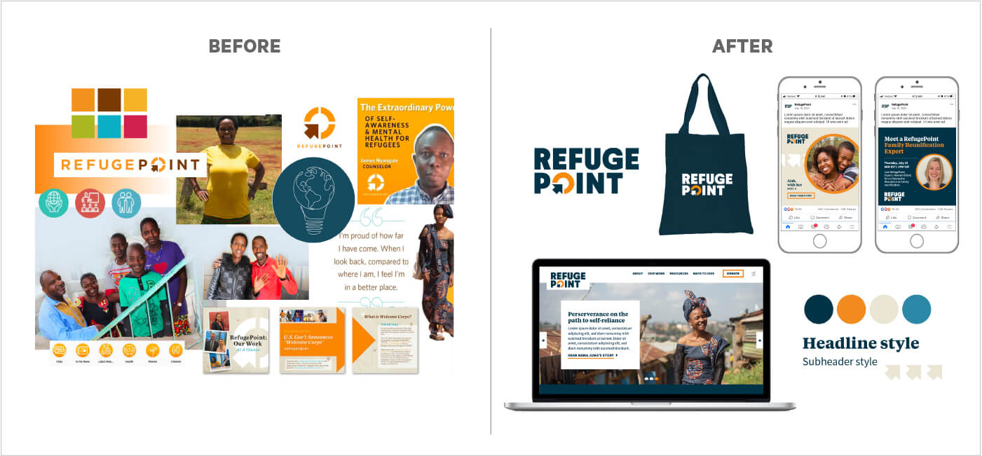
When surveys showed that their community felt positively about many aspects of their visual brand, we set out a pragmatic approach to refresh their existing assets, rather than fully overhaul their brand. We started with updating the logo—removing the problematic life preserver symbolism that tied into their old tagline and taking the opportunity to develop a more confident and versatile mark. We also defined a bold new color palette, typography, graphic elements, and set of icons to establish a flexible and robust toolkit that enables RefugePoint’s staff to create dynamic yet consistently branded materials. The brand refresh coupled with new messaging allows RefugePoint to express their new brand strategy everyday.
I chatted with Alexis Brooke Felder, Associate Director of Communications at RefugePoint, about the changes to their brand and the large impact that these changes have had.
What sparked RefugePoint’s rebranding efforts and why did you want to preserve the key ideas in the logo mark, rather than pursuing a full visual rebrand?
While there were a variety of reasons that we wanted to update our logo and branding, the driving force was that our previous logo featured an image shaped like a life preserver, which aligned with our former tagline, “A Lifeline For Forgotten Refugees.”
RefugePoint recognizes that colonialism and systemic racism are embedded in the field of refugee response, and in recent years we have recommitted to active anti-racist and anti-colonialist practices and efforts. Over time, it became clear that this tagline no longer accurately represented RefugePoint. To fully respect the dignity, autonomy, and agency of the refugees we serve, we phased out the old tagline in 2021. With our updated logo, we eliminated that visual representation of the former tagline.
You have an in-house team with solid design chops. What was the process of collaborating and decision-making with Big Duck like for your team?
Working on design and messaging can bring up a lot of personal preferences and emotions. Having an external agency to give ideas, input, and feedback based on knowledge about what works, what makes a strong logo, and what will contribute to a strong brand was incredibly helpful. The project management aspect of working with Big Duck kept us on track and moving forward toward the completion of the project within a specific time frame.
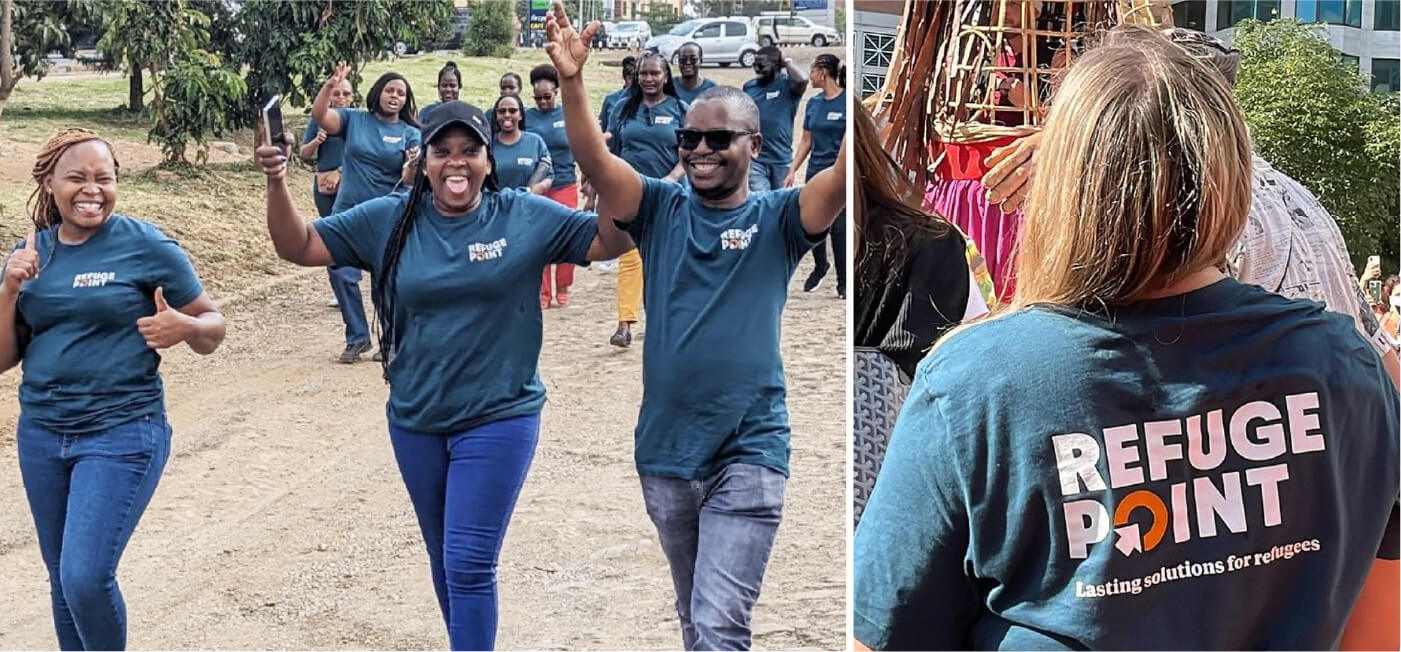
Beyond the logo, you also introduced a new tagline: Lasting solutions for refugees, updated vision, and values, new messaging, and more in 2023. What are some of the initial results of rolling out these new brand assets? How has your community responded?
So, specifically with the new tagline, we had a few t-shirts made with the new tagline and a few without the tagline and had staff wear them at an event. The staff that wore the t-shirt with the tagline were approached numerous times by people wanting to engage in conversation with us about our work. We then added the logo with the tagline to tote bags that we brought to another big event and received many compliments on our branding and had other organizations tell us that they wished they’d done the same.
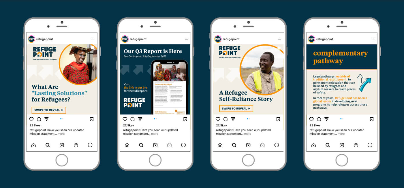
We also saw a big uptick in our social media engagement and impressions, especially in the final quarter of 2023. While it’s hard to pinpoint exactly what caused that surge, our branding work with Big Duck is absolutely a component of what our team was able to achieve in 2023 and what we are setting out to accomplish in 2024.
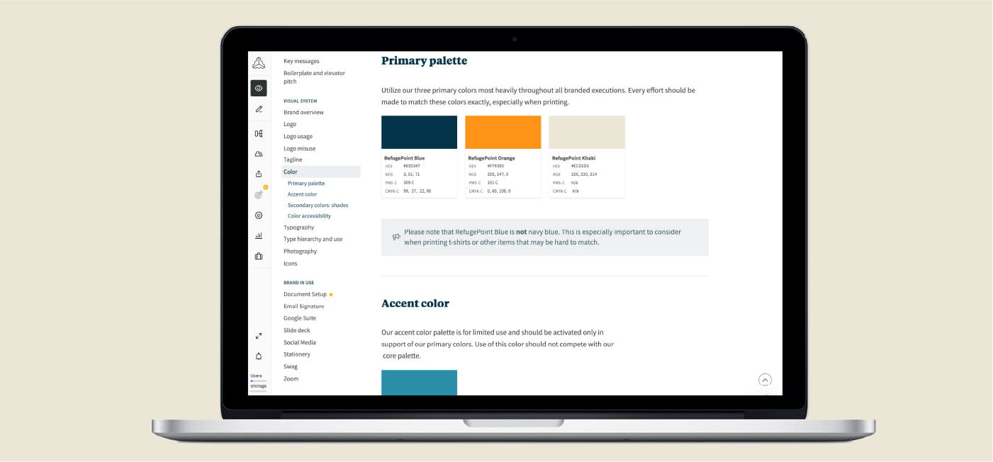
Big Duck developed an accessible online brand guide that contains key brand assets in addition to the rules of the brand. What impact has this resource made on your staff?
The brand guide has been indispensable for our team. I now feel very confident that every single person on our team has access to key talking points, elevator pitch, color palette, logos, etc. The brand guide is something we are adding to as well—for example, we are now adding a section with “pre-approved” photos (all of which have descriptions), so that people on staff have access to a library of photos that can be used for reports, etc.
The guide cuts down on the number of requests our team has to field, like: “Can you send me the logo?” We can simply reply with a link to the brand guide and remind people to bookmark it, which is helpful for everyone.
What advice would you give to other nonprofits considering an evolution of their existing brand vs. a full overhaul?
Great question! Big Duck helped us to conduct a thorough survey of different audiences (our team, former team members, refugees, and board members) to gain a better understanding of how people felt about our brand. The survey results told us that overall, people felt very confident about our brand, felt like it reflected our organization well, and didn’t think major changes were needed. As a Comms team, we felt the same way, so it felt good to know we were in alignment. If we had received feedback from our communities that indicated that a full overhaul was needed, we would have proceeded with that, but the survey confirmed that wasn’t the direction that was needed. So, I guess my advice would just be to take the time to do a thorough survey and get input from your different audiences to determine what next steps to take—all of which Big Duck helped us to do.