Blog Insights
Designing a Desktop Menu That Actually Helps Your Audiences Navigate
Navigation and menu. Two words often used interchangeably. From Andrew Hinton’s viewpoint, “Navigation is not the menu on a screen. Navigation is what people do.” So, how do we help our audiences find the information they need? Designing a desktop menu is one way; it’s one aspect of navigation that informs a website’s overall structure.
Before identifying which menu approach is appropriate, make sure your team is aligned on overall goals, audiences, and content needs.
- Business goals: What problem are you trying to solve? What gaps need to be addressed? Defining your needs and identifying past areas of success or opportunity provide a clearer direction to move forward.
- Audiences: Which audience groups are you prioritizing? What context is relevant to know (e.g., data literacy, device preferences)? How do people currently navigate your site? What issues do they have? Remember: you are not your audience. Your audience is ultimately the one interacting with the site, and so you want to be certain that you’re solving the right problems. You can do this by asking users directly or indirectly. Interviews, usability testing, card sorting, and reviewing analytics can give you a better understanding of your audience’s needs and behaviors.
- Content: What content (e.g., articles, interactive media, storytelling elements) do you have? What needs to be created or removed? No matter which menu approach you go with, the top-level needs to be defined. Identify what content you actually have and organize (and possibly rename it) based on how your audience talks about and uses it. This will aid in figuring out what those top-level information buckets are and, more importantly, help craft audience journeys.
Once these foundational elements are fleshed out, you can start to identify which menu is the best fit.
Choosing the right navigation menu type
There are different types of primary navigation menus, also known as main and global navigation menus. The following four types are the most common ones that we recommend.
1. A standard basic menu
With a standard basic menu, users can go directly to individual pages.
Example: Marketlinks, a USAID-supported platform that helps users consume and contribute online content along a spectrum of issues. uses a standard basic menu. Links to lower levels are accessed from these top-level pages.

When to use a standard basic menu
- You want to link directly to a landing page or listing page. These are opportunities to highlight featured items or encourage exploration into different parts of the site.
- You’re working with a smaller site. It may be easier to organize content into a few high-level buckets.
- Your site has a flat structure where audiences don’t need to spend a lot of time on lower levels.
- The primary items are easily understood by your audiences and you don’t need lower levels to give a preview of what to expect.
- You’re looking for something easy to build and maintain.
- You’re looking for an option that’s easy to use. This is a very common pattern and there are few usability and accessibility concerns.
When not to use a standard basic menu
- Your site is larger and users frequently access lower levels.
- You want to feature content more prominently than on landing pages.
- Audiences need more context to understand what’s in each section.
2. A dropdown menu
Dropdown menus display a list of items in a particular section.
Example: Alliance for Justice, a national association of over 120 organizations representing a broad array of groups committed to progressive values, uses a dropdown menu. Web users have the option of getting a higher-level overview (e.g., “Take Action”) or going directly to a specific part within that section (e.g., “Join the Fight”).
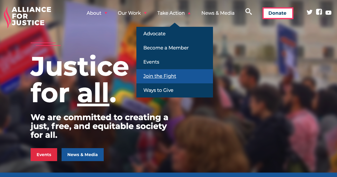
When to use a dropdown menu
- Audiences need to get to the second level (e.g., “Join the Fight”) quickly. Returning users who are familiar with your content could speed up their process and immediately access what they need.
- Audiences may not be familiar with your site’s offerings, so the list of items in the dropdown gives some context for each section.
- New visitors may also benefit from a landing page (e.g. Our Work) that tells them the differences between the second-level items. The first level in a dropdown menu can link to a landing page.
When not to use a dropdown menu
- There’s a long (> 10) list of items in the second level. These can be difficult for users to scan through. Sometimes the top level, or the information architecture as a whole, isn’t refined. Dropdowns aren’t intended to be a “dumping ground” for irrelevant pages. A meaningful structure still needs to be defined no matter which approach you choose.
- Audiences need to spend more time on the first-level pages for the primary section. Sometimes the first level in the dropdown is a heading and doesn’t have a link at all. Instead, it serves to group content. If you have top-level landing pages and want to encourage users to interact more with them instead of the pages below, a standard basic menu may be a better alternative.
Note: Some dropdowns may have multiple levels and become functionally similar to a megamenu (see next). There are some accessibility concerns with that approach; for example, users may have difficulties trying to hover over a combined set of menus.
3. A megamenu
A megamenu takes up more visual space and allows you to show a lot of related content at once. Megamenus generally show up to three levels. In some cases they can be interactive, where selecting a second level will then open a lower level. Megamenus are commonly used on e-commerce sites; however, they are also used by organizations that have complex messages and/or numerous key issues to highlight.
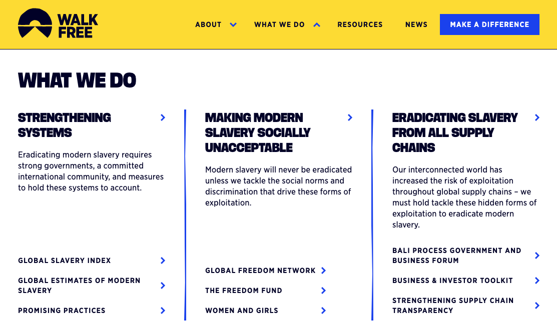
Example 1: Walk Free, an international human rights group focused on the eradication of modern slavery, has three different levels in its megamenu. The clear hierarchy emphasizes the second level as pillars of what they do. Brief descriptions are also included to further their message and give users an idea of what to expect. This example also shows two menu items, “Resources” and “News”, that don’t expand. They link directly to their listing pages. You may consider using this combination if you don’t have subpages for a section, or if you don’t want to feature content.
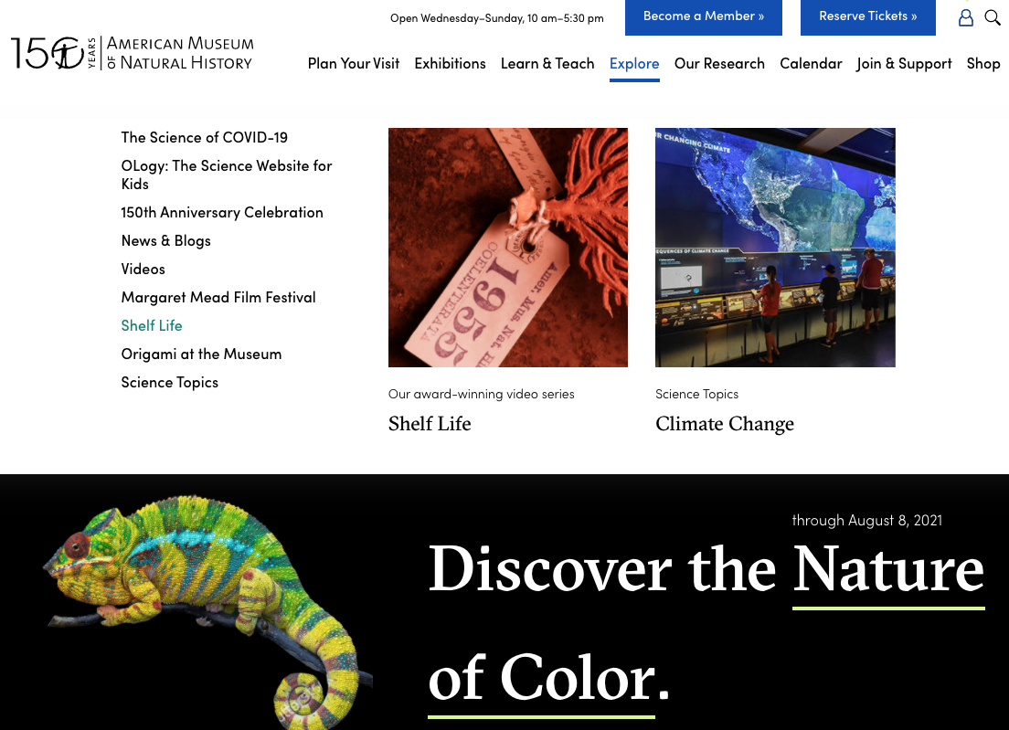
Example 2: The American Museum of Natural History in New York shows a clear hierarchy of content. Audiences can view exhibitions and also learn the different types that they offer. They take advantage of the space by including images as well. Featured items in the megamenu take the place of timely and relevant content on the landing page.
When to use a megamenu
- Your site has a lot of deeper levels and audiences need to access them frequently.
- More space is needed for featured content. Could be a great opportunity to feature key stakeholder content that may not fit on a landing page
- You want to give audiences a better idea of what to expect in each section
When not to use a megamenu
- Your site has a flat structure.
- If usability and accessibility priorities aren’t achievable. It may be difficult for low-mobility users to access the deeper levels of a megamenu. As with any design and implementation, you need to ensure that your content is displayed and can be read in a logical order.
- The featured content isn’t updated frequently. The content may feel stale to users.
4. A hamburger menu
A hamburger menu, while used mainly on mobile, does find its way to desktop as well. It may not always use the three-lined icon, but it has the functionality of showing and hiding a full menu.
Example: Discovered Wild foods uses a variation of the hamburger menu, using the word “Menu” instead of the hamburger icon. The site uses storytelling and the main call-to-action to learn about sustainability and its connection to cooking wild game. The main menu links are prominent both on the homepage and in the menu.

When to use a hamburger menu
- The key calls to action are clear and listed on the page.
- You have a smaller site and users don’t need to switch between pages often.
When not to use a hamburger menu
- Audiences need to immediately understand the structure of your site. This menu deprioritizes the site structure by hiding the menu items. It discourages exploration by creating an extra step for users.
Featuring content beyond your menu choice
As you continue to develop your website’s menu, be sure to also consider:
- Local menus: Will users need quick access to sibling pages?
- In-page navigation: Would tabs or anchor links be helpful to users?
And remember: a menu is just one part of how users navigate. How your users navigate their way through your website goes beyond your main menu, and you’ll want to make sure you are also taking those other touchpoints into account.