
Picture this: you’re scrolling through a nonprofit’s website, feeling inspired by the organization’s mission. As you browse their homepage, you’re wondering how you can show your support. Then, you see it: a bold, eye-catching button urging you to “Donate Now.” The button takes you right to the organization’s online donation page, where you quickly complete the donation form. This is an example of an effective call to action.
A call to action (CTA) is a short statement or button that urges audience members to take a certain action. This might mean inspiring individuals to donate, volunteer, advocate, become a peer-to-peer fundraiser, or take any other action that supports your nonprofit’s mission.
As a fundraising or marketing professional at a small nonprofit, you may not have the resources to reach out to all supporters on a personal level. You likely rely on your digital communication channels to stay in touch with supporters and engage them in your activities. Therefore, your CTAs must be clear and compelling to ensure you’re using your online platforms to support your fundraising efforts, volunteer program, and other initiatives.
In this guide, we’ll review proven tips for creating more inspirational calls to action, including:
- Use urgent, actionable language.
- Make your CTAs stand out on the page.
- Place your CTAs in strategic locations.
- Optimize your landing pages.
- Use A/B testing to assess the effectiveness of your CTAs.
Your nonprofit’s supporters and website visitors want to help your organization succeed. Effective CTA statements and buttons give them an easy, convenient way to get involved. Let’s take a closer look at each tip.
1. Use urgent, actionable language.
Use your CTAs to encourage supporters to take actions that align with your nonprofit’s goals. For instance, do you want website visitors to donate, volunteer, become advocates, or sign up for your newsletter? Think strategically about the different ways you want to prompt supporters to get involved in your mission.
When you determine your most important supporter actions, you can use your CTAs to help boost conversions. These are the number of supporters who actually follow through with the desired action. For example, donation conversions are the number of individuals who visit your online donation page and complete a transaction.
One of the most practical ways to increase conversions is by making your CTAs as urgent and actionable as possible. Your CTAs should:
- Be straightforward and brief. If you’re prompting supporters to get involved with an advocacy campaign, you wouldn’t want to use a long-winded CTA button that says “Click Here to Advocate for Animals In Your Area Today.” Instead, create a button on your homepage that simply says “Become an Advocate.” The more straightforward and specific your CTAs are, the more useful they’ll be for supporters.
- Incorporate urgency and strong verbs. Remember, your CTAs are meant to inspire supporters to take immediate action. Weak verbs won’t motivate them to get involved. Use strong, actionable verbs that don’t leave any room for interpretation. For instance, you might include powerful CTAs that encourage visitors to “Become a Monthly Donor,” “Explore Our Volunteer Opportunities,” “End Hunger Now,” or “Protect Endangered Species.”
For example, here’s what the homepage CTA buttons might look like for a community animal shelter:
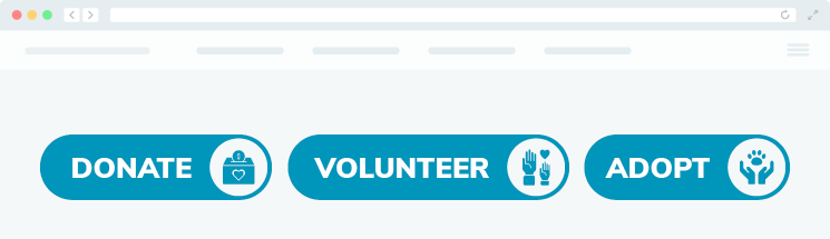
These CTAs are effective because they help website visitors find exactly what they’re searching for without having to click the website’s menu or use the internal search function. They’re also concise and straightforward, making it easy for visitors to understand what their purposes are.
Consider how you can refine your CTAs to ensure your message gets across in as few words as possible. This will help you retain supporters’ attention and make your engagement opportunities more clear.
2. Make your CTAs stand out on the page.
To create a truly eye-catching call to action, you can’t just rely on using urgent, inspirational language. You also have to be strategic with each CTA’s design so that it catches supporters’ attention while meshing with your organization’s branding.
According to Double the Donation’s fundraising statistics page, making your digital donate button stand out can result in a 190% increase in donations. Here are a few ways to help your button pop on the page:
- Use contrasting, eye-catching colors. Incorporate your organization’s brand colors into your CTA buttons and links. Use a combination of brand colors that offers sufficient contrast so supporters can easily interpret the text. For instance, if your organization’s main brand color is red, you can create a red button that features the word “Donate” in bold white text.
- Use white space surrounding your CTA to draw attention. When it comes to digital design, white space is your best friend. Be sure to surround your CTA buttons with plenty of white space to draw audience members’ attention to these important elements.
- Make your CTAs highly specific. Using specific buzzwords and phrases gives supporters even more context for your CTA buttons and links. For example, you can say “Donate $25 Today” or “Volunteer With Dogs In Need.” These phrases let supporters know exactly what to expect when they click through to your landing page.
You know that your digital design choices play a major role in encouraging supporters to engage with your organization online. Your CTA design is no different. Ensure your CTAs are legible, bright, and branded to your organization to present supporters with a professional, streamlined digital experience.
3. Place your CTAs in strategic locations.
Now that you know how to create an effective call to action, consider where to place these statements. CTAs should be used across a variety of digital platforms. This ensures you provide supporters with different ways to connect with your organization no matter what platform they’re using to connect with you. Let’s walk through a few different digital platforms where you should use CTAs to inspire engagement.
Your Website
Salsa recommends placing your donation button CTA at the top of your website in the menu or header area. This ensures anyone who visits your website knows what actions are most important to your organization, no matter what page they’re on. Also, use text and photo CTAs throughout your blog posts or informational pages to direct readers to take certain actions. You can create these CTAs by placing a link over a line of text or an image that tells readers to click to reach a certain page. Most website builders will also allow you to insert buttons, too.
For example, a photo call to action in a blog post might be a graphic that says something like “Interested in volunteering with local schools? Discover opportunities near you.” When visitors click on the photo, they’d be directed to your volunteer opportunities page.
Emails
Your emails offer multiple opportunities to use CTAs. The subject line acts as a call to action itself. In this case, you’re using the subject line to encourage recipients to open your email. It’s important to keep your subject lines brief and use urgent language to encourage recipients to open the email immediately.
Here’s an example of an email subject line that an environmentally-focused nonprofit might send to a supporter:

This is an eye-catching subject line because it personally addresses the recipient by name and inspires a sense of urgency with the words “act now” and “save.” The recipient will be intrigued to click through and learn more about why they must take action right now to support the organization’s mission.
Then, within the email itself, incorporate CTA buttons and in-text links to encourage supporters to visit important pages on your website. You can also include widgets in your emails that direct supporters to follow your social media pages.
Social Media
Along with developing a supporter community, you likely also use your social media pages to encourage followers to check out your nonprofit’s website. You can use text or photo CTAs to point audience members to important pages. For instance, if you’re running a 24-hour fundraising campaign, you can use graphics to demonstrate how much progress you’ve made and encourage followers to continue giving by clicking the links in your posts.
Your CTAs should be placed naturally throughout your digital content, and it’s important to avoid overusing them. Too many links or buttons can look cluttered and confuse your audience. Make sure you only use a few strategically-placed CTAs to keep your audience’s attention on the most important activities.
4. Optimize your landing pages.
Another important aspect of your CTAs is what lies on the other side of the link. Make sure the pages that you’re promoting to supporters are well-designed and useful. Visitors will feel duped if they click on one of your fundraising CTA buttons or links to learn more, only to be sent to a poorly designed page that doesn’t align with their expectations.
For instance, if your “Donate Now” button sends users to a third-party donation website, visitors might feel more hesitant to donate because they don’t recognize the page. Instead, the button should send visitors to a streamlined, internal fundraising landing page that aligns with your organization’s branding and tone.
Your landing pages should offer simple forms that supporters can fill out in just a few clicks or clear-cut information on how supporters can get more involved in what you’re offering. For example, if you’re using a CTA to direct supporters to your volunteer registration page, be sure to just ask for necessary information like names, addresses, shift preferences, skills, and phone numbers.
By offering useful, well-designed landing pages, you encourage visitors to stay on your website for longer and follow through with their intended action. When you meet and exceed supporters’ expectations, you can increase their satisfaction and improve their experience of connecting with you online.
5. Use A/B testing to assess the effectiveness of your CTAs.
In terms of call to action- A/B testing is the process of designing two different versions of a CTA and determining which is more effective for driving conversions. You can use A/B testing to determine the best way to design them and the most impactful language to use.
For instance, let’s say you’re creating a call to action (CTA) button for your website’s homepage that guides visitors to sign up for your email newsletter. You can create one version of the button that says “Be In-the-Know with Our Newsletter” and another that says “Stay Connected with Our Newsletter.”

Test out one version of the button for a certain time period, and then the other version for the same amount of time. Then, review your nonprofit’s key performance indicators for your website such as the click-through rate and conversion rate to determine which version of the button was most effective.
The A/B testing process allows you to make data-driven decisions, leaving you with the most effective CTA strategy. Along with the wording of your CTAs, you can run different tests to assess the placement, color choices, and font size to see if any changes lead to a major difference in conversions.
Your CTA strategy is one of the most important components of your supporter communication approach. Your CTAs give your supporters an immediate way to engage with your organization and get more involved. They’re most effective when they are urgent, specific, and well-designed.
Just because you work at a small nonprofit doesn’t mean your impact is small. With powerful, inspiring CTAs, you can harness the power of your passionate and dedicated supporters to help make a difference for your mission.
About the Author

Craig Grella is a Content Marketer at Salsa Labs, the premier software for growth-focused nonprofits that combines CRM and engagement software with embedded best practices, machine learning, and world-class education and support. In his role, he serves thousands of nonprofits and advocacy organizations across the U.S.
Craig focuses on digital strategy using email marketing, online advertising campaigns, SMS campaigns, CRM management, reporting/analytics for KPIs, and more. He’s also the founder of Think Big Campaigns, a full-service consulting firm that specializes in political consulting, digital organizing, and issue advocacy.


Leave A Comment