Accessibility and the Harm of Simple Symbols
In honor of GAAD, our second blog focuses on the harm symbols have on the disabled community. Read part one here.
Symbols have always been a way for people to communicate. From cave drawings and petroglyphs to street signs and emojis, symbols serve as a universal language that can cross cultures and extend generations. As designers, we use symbols to communicate complex subjects, change perceptions, and unify people around a specific cause.
But what if some of the symbols we create unintentionally create negative perceptions, and divide us rather than unite us?
Harmful Designs
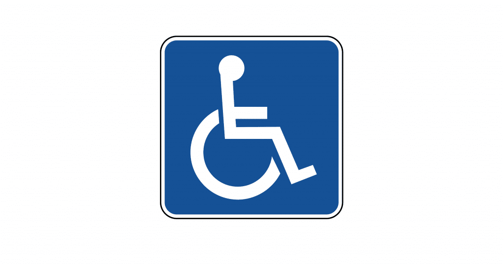
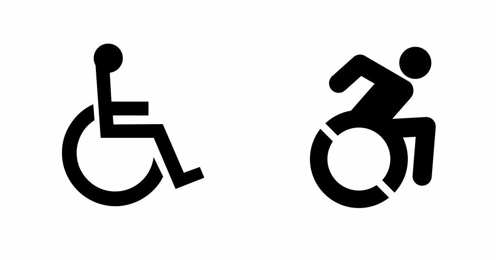
In 1968, the International Symbol of Access was created by a Danish design student. This simple and clean visual uses lines, dots, and half-circles to create the shape of a person sitting in a wheelchair. This universally adopted and internationally recognized symbol is often used to show improved access, such as the removal of steps and the availability of ramps, and many decades after it was created, we still see it in bathrooms, parking spaces, and sometimes, in places, we would not expect.
The symbol was created as a way to raise awareness around accessibility, and help people living with disabilities better navigate their surroundings. But what was meant to unite has actually caused a divide for many people in that specific community. Critics often highlight how the symbol gives the perception that people with disabilities are dependent on a caregiver, rather than reinforcing a sense of independence.
In 2013, accessibility activists Sarah Hendren and Brian Glenney redesigned the symbol to be more forward-leaning as a part of the Accessible Icon Project. This change was meant to reassert that sense of independence. Even though not adopted as an international standard, it was a small step in the right direction. However, when you take a closer look, the problem isn’t the tactical design of the symbol, but rather the fact that it is a symbol at all.
Both the old and new versions give a narrow view of what living with a disability is actually like, as expressed by many critics, after the release of the new and updated version. Because many disabilities are invisible, they are often ignored or not taken seriously. Many people living with an invisible disability often experience hostile behaviors if they use accessible parking spaces or restroom facilities because the public’s perception of what it means to be disabled is colored by the visuals they’ve been exposed to. The visual of a person in a wheelchair.
Even though designers aim to use symbols to make complex things simple, this example shows how any group of people cannot be reduced to a simple symbol. Telling the story about a population requires more than a singular visual. Disability isn’t just this one thing, and if we are not careful, the people we’re trying to help end up getting hurt in the process.
The Power of Storytelling
Groups of people are complex and rather than trying to make one symbol work for everyone, we should look for more ways to tell individual stories as a way to increase awareness and understanding of different groups. As designers and marketers, we know the power of storytelling as a way to build empathy. Stories help create new pathways in people’s minds—connecting on a human and emotional level. So as we try to tell the visual story of groups, we must look for ways to tell stories that highlight the complexity, but also the beauty of people. When it comes to humans, design shouldn’t be so much about making the complex simple, but rather showing how complexity and diversity make communities stronger.
The final visual outcome of our work might not be a universally recognized, one-color thing made up of lines, dots, and half-circles. It might not be easy to reproduce in black and white and spray painted on parking lot spaces. But in the long run, it will reinforce humanity and educate people around the world that things are not so clear-cut and simplistic as symbols make them out to be.
For more design tips, check out our whitepaper, Designing for Good.