Seven Responsively Designed Nonprofit Websites to Study and Learn From
 At least 15% of all traffic to nonprofit’s websites now occur on mobile devices and across all sectors mobile is set to surpass desktop browsing in 2014. Over the last few years as I have studied the rapid rise of the Mobile Web, I have become more of an advocate of launching a responsively designed website over launching a mobile site separate from a desktop site. Many nonprofits do not currently have the financial means to launch a new website, so a separate mobile website is a good interim solution. However, those nonprofits that are in the process of launching a new website or considering it, ensuring that it is responsively designed would be a wise step forward for your nonprofit’s future.
That said, last week I received an email from large national nonprofit announcing that they had launched a new website. Before even reviewing the site on my laptop, my first instinct was to grab my smartphone and tap the website URL into my mobile browser to see if their new site was responsively designed. Sadly, it was not. How is it that a large national nonprofit and the consultants, the design firm, and the web and graphic designers on the project did not take into serious consideration the rapid growth of browsing on tablets and smartphones?
Even more baffling, this nonprofit hosts multiple fundraising events each year at locations around the United States and has a huge Facebook and Twitter following. The nonprofit won’t be able use their new website to communicate with supporters at these events because their website is essentially unreadable on a smartphone (no back up separate mobile website) and every time they post links to their new website on social networking sites, their smartphone-based fans and followers won’t be able to read their website inside of Facebook, Twitter, Google+, etc. With Facebook mobile users now surpassing desktop users… have you ever clicked on a link to your desktop site inside of Facebook, Twitter or Google+ on a smartphone? Doing so will illuminate why responsively designed websites (or adaptively designed websites – here’s the difference) are becoming more essential to be successful online.
Nonprofits please don’t make the same mistake with your next website launch. Study and learn from the nonprofits listed below who had some foresight, got some good advice, and launched responsively designed websites:
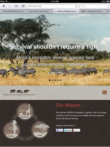
1. African Wildlife Foundation :: awf.org
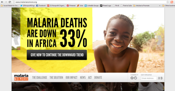
2. Malaria No More :: malarianomore.org
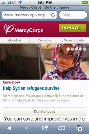
3. Mercy Corps :: mercycorps.org
4. ONE :: one.org
5. Partners in Health :: pih.org
6. Water.org :: water.org
7. World Wildlife Fund :: worldwildlife.org
Finally, if your nonprofit has recently launched a responsively designed website, please post the link in a comment below. I’m always glad to find nonprofits that are pioneering the Mobile Web,
Related Links:
5 Reasons Why Your Nonprofit Should Prioritize the Mobile Web in 2013
[INFOGRAPHIC] 2013: The Year of Responsive Design
The Difference Between Adaptive and Responsive Web Design
Webinar: Mobile Communications and Mobile Fundraising for Nonprofits (Live)
Webinar: Mobile Communications andMobile Fundraising for Nonprofits (On-Demand)
Trackbacks
- Seven Responsively Designed Nonprofit Websites to Study and Learn From | Nonprofit website: donate now button, donation page, thank you page | Scoop.it
- Seven Responsively Designed Nonprofit Websites to Study and Learn From (via nonprofit tech 2.0) | Mission-Minded Media
- Is Your Nonprofit’s Website Mobile Friendly? It Should Be. | Tech ImpactTech Impact
- Seven Responsively Designed Nonprofit Websites ...
- Nonprofits Tapping Into Mobile Technology & Responsively Designed Websites | AMP Web Agency
- Three Nonprofit e-Newsletters to Subscribe To and Learn From | Nonprofit Tech 2.0 Blog :: A Social Media Guide for Nonprofits
- Fundraisingwoche vom 08.04.-14.04.2013 | sozialmarketing.de - wir lieben Fundraising
- Mobile Platforms For Fundraising Have Pros & Cons
- 11 Tips for Making Nonprofit Press Releases Social and Shareable | Nonprofit Tech 2.0 Blog :: A Social Media Guide for Nonprofits
- 22 Must-Read Updates to Social Media for Social Good: A How-To Guide for Nonprofits | Nonprofit Tech 2.0 Blog :: A Social Media Guide for Nonprofits
- Seven Responsively Designed Nonprofit Websites ...


I think you are missing a huge part of the equation here. Sure, a website needs to work on multiple devices. But having a home page appear differently, with less navigation and less information depending on what kind of device you are on is not necessarily going to help you communicate more effectively with your users. I can’t tell you how many times I’ve just given up browsing a site, nonprofit or otherwise, on a mobile device, because I can’t figure out how to navigate to the information I am actually looking for. It is easy and available in a browser on my laptop. But they send me to a device-specific site that is so unusable I get frustrated and leave. What ever happened to device-independent user-centered design and UX?
This is an introduction blog post for nonprofits to get them to consider the importance of preparing for the Mobile Web. I can’t tell you how many nonprofits are launching new websites right now that haven’t even considered mobile users and are out date from the day they launch. That said, I think these seven websites are very good examples of responsive design that deliver a good user experience i.e., UX. Responsive design may not be a right fit for all nonprofits, but for those that are primarily publishers of content (news, images, and videos) responsive design is a good option.
With the growing size and breadth of mobile device use, there is no feasible way that any entity can keep up with designing separate sites that work on separate types of devices. The more that sites use responsive design strategies, the more users will become accustomed to the navigation techniques that are common across these kinds of sites. For example, you instinctively look for main navigation categories across the top or left side of any website on your desktop. Nav on the phone or a smaller screen is usually a pull-down at top-right. Our university went responsive and we did not have ONE user asking how to find something… students and other users figure it out and soon are on their way. We know, because analytics show that more and more users each month are viewing and using the site on phones and tablets.
After several months of work, The Salvation Army in Chattanooga, TN was able to redesign our website! What’s even more
exciting, we used a responsively designed website. Of course you can’t redesign your site and just be done with it, each week we update it with new photos, press releases, events and more. Check it out: http://www.csarmy.org. All constructive criticism is welcome!
Great article. We are going to be redesigning with responsive design this fall. Wish me luck! I’m a huge fan of wwf’s web site.
We recently worked with Charity Dynamics to redesign the Step Out: Walk to Stop Diabetes national and local websites. The entire thing was done with responsive in mind and we are thrilled with the results! http://stepout.diabetes.org
The National Breast Cancer Foundation’s site was recently updated from the http://www.nationalbreastcancer.org/ updated all responsive…
PATH recently updated the look and feel of our website to match updated brand guidelines. While doing that work, our web developer made the website–including our main site, blog, and program websites–responsive. Check it out: http://www.path.org/index.php. We are currently designing an online version of our annual report with responsive in mind. Stay tuned for it to launch by this summer!
When we (Options for Sexual Health) decided to redesign our website we went to the brilliant people at B’stro (www.bstro.com). At their suggestion we went to a responsive design. SO many of our clients are young people who expect to be able to get the information they are looking for easily over a number of different platforms. We’re very happy with our new look (www.optionsforsexualhealth.org).
Great Collection. I would like to say that when building a responsive website, we (designers) make sure all the content is available in different devices and displayed according to the device you are viewing it. The navigation changes its look depending on the device you are in, but all the navigation menu is available.
At AmeriCares (http://www.americares.org) we built our new site in-house (launched in March) in responsive design. With the growth in our mobile/tablet traffic, we made a commitment to serving that growing sector. It has given us immense flexibility going forward and allowed us to plan and add many new capabilities on the site. Now we are turning to our blog and sub sites to do the same.
Our nonprofit (ACFB) website is responsive at this point. We still have to convert the Donate page, but I’m in love with responsive design.