Share this article

Can you really get more donations in 5 minutes or less? Yes! A few simple tweaks will make your online donation form more effective, which will help you get more donations, inspire larger gifts, and lay the groundwork for future interactions with your donors.
Don’t have much time? That’s okay! These small adjustments to your donation form will inspire donors and facilitate donations… and all of them can be done in just a few minutes.
Want to see these tips in action? Check out our interactive donation form templates!
Add a high-quality photo to your online donation form
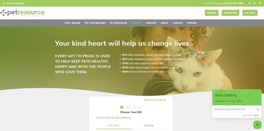
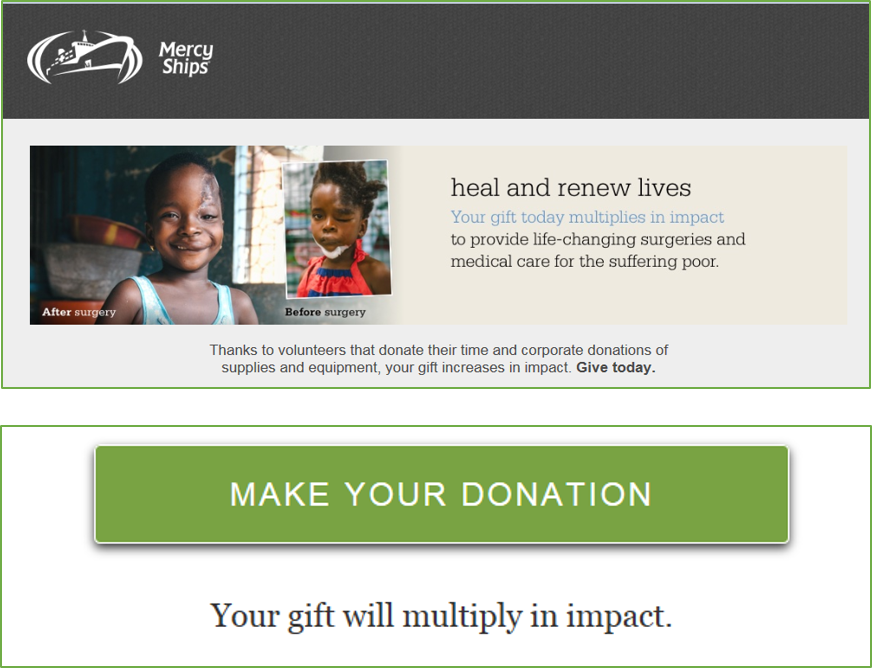
One of the simplest changes you can make to your online donation form is to add a great photo to the top of your page. A good photo will help your donors visualize their impact, create an emotional connection between your supporters and the people you help, and reinforce a donor’s impulse to give to your mission.
But how do you know which photo will work?
The most effective photos to add to your online donation form will generally feature an individual person or a small group people (three to four people, tops!). Ideally, the person in the picture is making eye contact with the camera: that makes donors feel more connected with the subject! Keep the overall tone of your picture happy or positive—uplifting photos generally outperform sad ones. If you want to use a before-and-after photo, make the happy “after” photo more prominent than the sad “before” photo.
There are always exceptions!
There are some exceptions, of course. Photos that give donors an “outside looking in” perspective can be effective. And not all subjects need to be people! Animals and other subjects can work very well, but donors must be able to personify the subject of the photo. If your mission doesn’t directly relate to serving people or animals, try showing photos of people enjoying your services. Environmental conservancies can show people enjoying the outdoors. Medical research nonprofits can show recovered patients, smiling doctors, or researchers. Art museums can show a small family enjoying an exhibit. The possibilities are endless!

Revamp your call to action
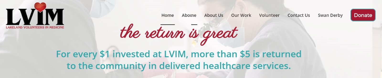
When a donor lands on your online donation form, the call to action they see should ask them to give. Reinforce that call to action by spending some time on the wording you use. Add one or two sentences at the top of your donation form making a case for support to your donors. Those sentences should answer the questions:
- Why should a donor give?
- Why should a donor give now instead of later?
- What impact will a donor have on the world if they give?
Here are some examples:
Weak: Lakeland Food Pantry serves Lakeland and the surrounding Polk County area by offering free or subsidized food items to qualifying families. Your donation to Lakeland Food Pantry is tax deductible.
Stronger: Thousands of families depend on Lakeland Food Pantry for access to affordable, healthy food. Your donation will help feed a family from the Lakeland community.
Strongest: When you donate to Lakeland Food Pantry, you help Margaret and other Lakeland parents feed their kids healthy, delicious food. When you give today, your money will go directly to ensuring our community is happy, healthy, and strong!
Update the text on your donate button
Want to make an even bigger impression on your donors? Update the text on your donation button at the bottom of the form!
If you’ve added a great image, case for support, and solid call to action at the top of your form, your donor will start the donation process with tons of enthusiasm and excitement. But, by the time they’ve entered their payment information, dug through their wallet for their debit card, typed in their info, and completed the rest of your form, they may have disconnected a little from the emotional connection that inspired them to give in the first place. Updating the final button with text that mimics the content at the top of your form can reinforce those good feelings.
Want to learn how to customize your donation button and other elements? Request a demo of Qgiv’s fundraising tools!
Get more donations by removing extra fields
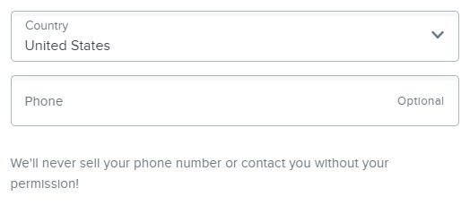
Did you know that having unneeded fields on your forms—even if they’re not required—can negatively impact conversion rates? Donating needs to be quick and easy or donors won’t complete their gift. You can boost the number of gifts made on a donation form by eliminating any extra fields.
Any field that isn’t totally necessary for the transaction should be removed. If you need to collect additional information, make sure your donors know why you’re asking for their information and what you’re going to do with it.
A good example of this is a donor’s phone number. Asking for a donor’s phone number, even if that field isn’t required, can discourage a donor from giving. If you MUST ask for a phone number, tell them why you need that information and what you’re going to do with it. Even a short line of text that says, “We’ll never sell your number or contact you without your permission” can help.
What if I need extra info from my donors?
Removing extra fields from your form doesn’t mean you can’t ask your donors for extra information. Instead of asking donors about their demographics, motivations, or preferences on your form, try sending first-time donors a survey asking them for extra information. Asking donors to tell you about themselves after they’ve made their first gift is a great way to learn more about them and start building a relationship with them.
You can also periodically send donors a survey asking them about their relationship with your nonprofit, their perception of your work, their experiences with you, and more. It’s a great donor retention tool, and it’s a wonderful way to make sure you’re meeting your growing donor base’s needs.
You can also use conditional fields to gather needed information from supporters. Conditional fields are custom fields that will only appear if certain criteria on the form are met. For example, you may be hosting a fundraising event that also needs volunteers. To keep your form simple, you may ask an easy question such as “Would you be interested in volunteering at this event?”
If the answer is no, then your guest is free to move on. If they select yes, you can have a dropdown that lists the various volunteer options that supporters can choose from. You get the answer you need … and your supporters get an easier form to fill out.
Add recurring options to your form
A simple method for raising more money online is enabling recurring donations. There are a ton of reasons to seek out recurring gifts: they provide steady, reliable income; recurring donors tend to give more overall than one-time donors; and it’s much easier to retain recurring donors than it is to retain one-time supporters. Simply giving donors the option to make a gift on a recurring basis is a great first step in building this base of loyal donors!
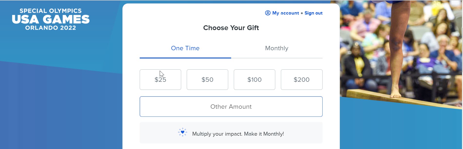
If you really want to attract recurring donors, reinforce your call to action with a note about the importance of ongoing gifts. Check out this example from our friends at the Special Olympics:
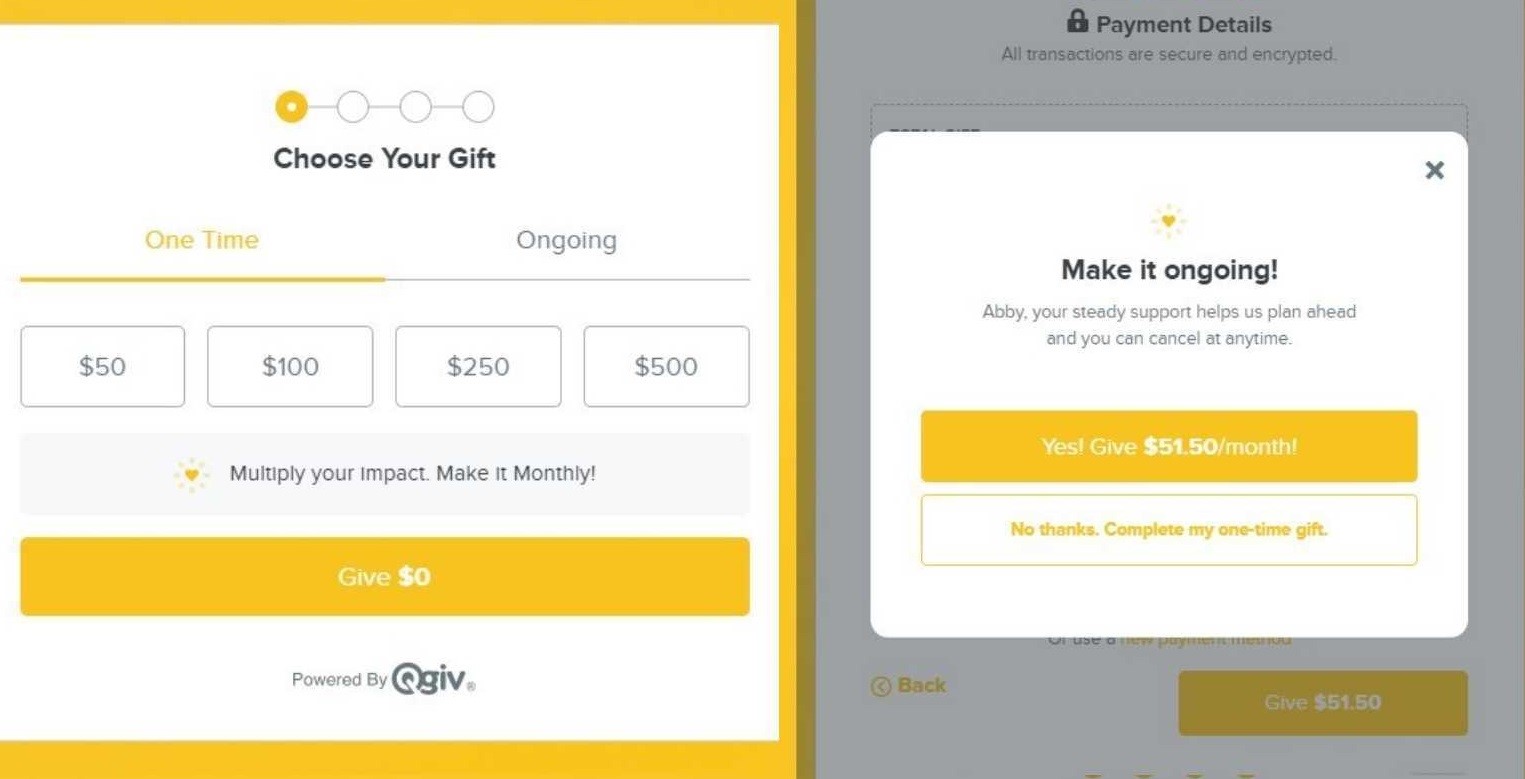
Qgiv users can make an even bigger impact by using the recurring nudges and modals in our online donation forms. Add a “nudge” to your donation form that invites donors to make a bigger impact by giving on a regular basis. Or, add a recurring modal that pops up as a donor makes their gift asking them to upgrade their donation by making it recurring. Both tools give you an extra opportunity to ask for recurring support and communicate how a donor can make an even bigger difference by making a regular gift.
Conclusion
You don’t have to spend hours tweaking your online donation form to make it more effective. Add some compelling content to the top of your form: a high-quality photo and a short case for support will make your form more compelling. Reiterating your call to action at the top and bottom of your form will make it more effective. Including recurring options on your form—especially if you back it up with a recurring nudge or pop-up asking for long-term support—can help you build a base of recurring supporters. Then, remove any extraneous fields from your form to increase conversion rates. You can make all these changes in just a few minutes!
Like what you see?
Qgiv’s donation forms are designed with your donors in mind! They’re easy to customize, which means you can make beautiful, effective forms in minutes. Learn how to get more donations with Qgiv’s donation forms by checking out our interactive donation form templates!
You might enjoy
Top 8 Text-to-Give Platforms for Nonprofits
Fundraising by Type

How to Use Donor Segmentation in Text Fundraising (with Templates)
Donor Acquisition and Retention