Design Tips for a Stellar Fundraising Page
“Design is the intermediary between information and understanding.” – Richard Grefé
Whether it’s the donate page on your website or the landing page for a fundraising campaign, design matters. Good design can encourage your website visitors to learn more and take action to support your cause. At worst, poor design can mean you lose donations. Luckily, you don’t have to be a design professional to use the following best practices to create a donation page that helps you raise more money.
Begin with strong branding
Your logo and brand colors create your nonprofit’s visual identity. And research shows that landing pages with branded colors raise up to six times more money. When a supporter lands on your fundraising page, they should immediately recognize that it’s yours. Incorporate your branded colors in the background and make sure that your logo appears at the top of the page:
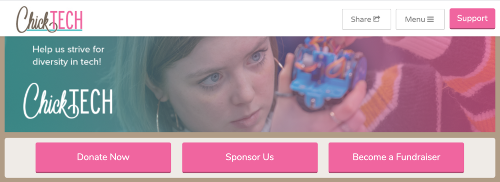
Our partners at ChickTech do a great job of incorporating their brand colors into their fundraising page that prominently features their logo.
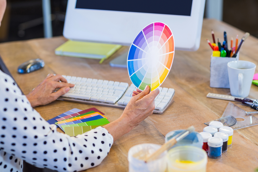
use complementary colors for calls to action.
Most of us can remember the color wheel from elementary school. Colors opposite each other on the color wheel are called complementary. They tend to go together well and provide high contrast on your page. If you want to quickly and clearly show your supporters how you’d like them to take action, use a complementary color to make your Call-to-Action button(s) stand out:

In the traditional color model, complementary pairs are red/green, blue/orange, and purple/yellow. If you have the hex code for your brand colors, you can use Adobe’s online color wheel to find its exact complementary color.
Focus on high-quality photos
Photos bring your nonprofit’s brand to life. High-quality photos will allow you to establish credibility and trust. Make sure the photos you use on your donation page are high-resolution, and not blurry or out of focus. When using photos on the web, you want them to be at a resolution of 96 PPI. You also want to keep in mind that large photos can be scaled down, but it doesn’t work the other way around! If you have a small image that is low quality, making it larger will also make it become pixelated, so don’t make that mistake.
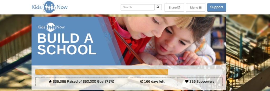
Add an image to your campaign header for a visually compelling page.
Pro tip: if you don’t have your own high-quality photos, you can find royalty-free images online.
Illustrate your donors’ impact
Encouraging monthly donations is a great way to build recurring revenue. When you’re promoting recurring donations, use an infographic! It’s a visual and straightforward way to show supporters how their contributions will make a difference:
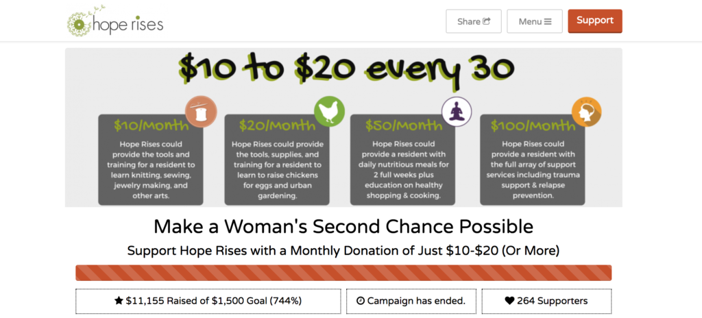
In their monthly giving campaign, our partners at Hope Rises created a single infographic to use as their campaign header. The graphic illustrates the impact of each monthly giving level – and helped them successfully raise 744% of their original fundraising goal!
Good design will help you communicate more effectively with your supporters and encourage them to take action. And it doesn’t have to be complicated! With these four best practices under your belt, you’ll be ready to create a visually engaging fundraising page for your organization.


Robert Addington
May 4, 2020I have been looking for information on this topic for a long time and thanks to this website for posting this article. I would love to get more encouraging posts on this topic. What an amazing style of writing at that.
Olivia Tsui
May 4, 2020Hi Robert, I’m so glad you found what you’ve been looking for! We’ve also written about Free & Easy Design Resources for Your Nonprofit, 7 Tips for an Awesome Nonprofit Website Redesign, and a Nonprofit Fundraising and Events Coronavirus Survival Guide— hope they are also helpful!